Showroom Strategies
Posted by admin on
A kitchen and bath design showroom is intended to inspire visitors and showcase a firm’s talents and abilities to make client dreams come true. How that is accomplished is as diverse as the number of companies trying to do it. Even for those that have multiple showrooms in different cities – or even different states – displays, vignettes and product offerings are typically never the same between locations since the markets they serve are often vastly different.
This month, KBDN asked several design firms to share showroom strategies that provide inspiration for today’s kitchens and baths.
Marvista Design + Build
Pittsburgh, PA
One of Michael Jacobs’ favorite spaces within the NKBA award-winning Pittsburgh, PA Marvista Design + Build showroom he opened in 2020 isn’t actually a display. Rather, it’s the finish selection room, where designers help clients pull together all of the elements for their new spaces.
One of the first observations visitors make is that the room is tidy and uncluttered, with samples neatly tucked behind doors or stored in drawers. The streamlined look is a concept that resonates throughout the entire 2,500-sq.-ft. showroom.

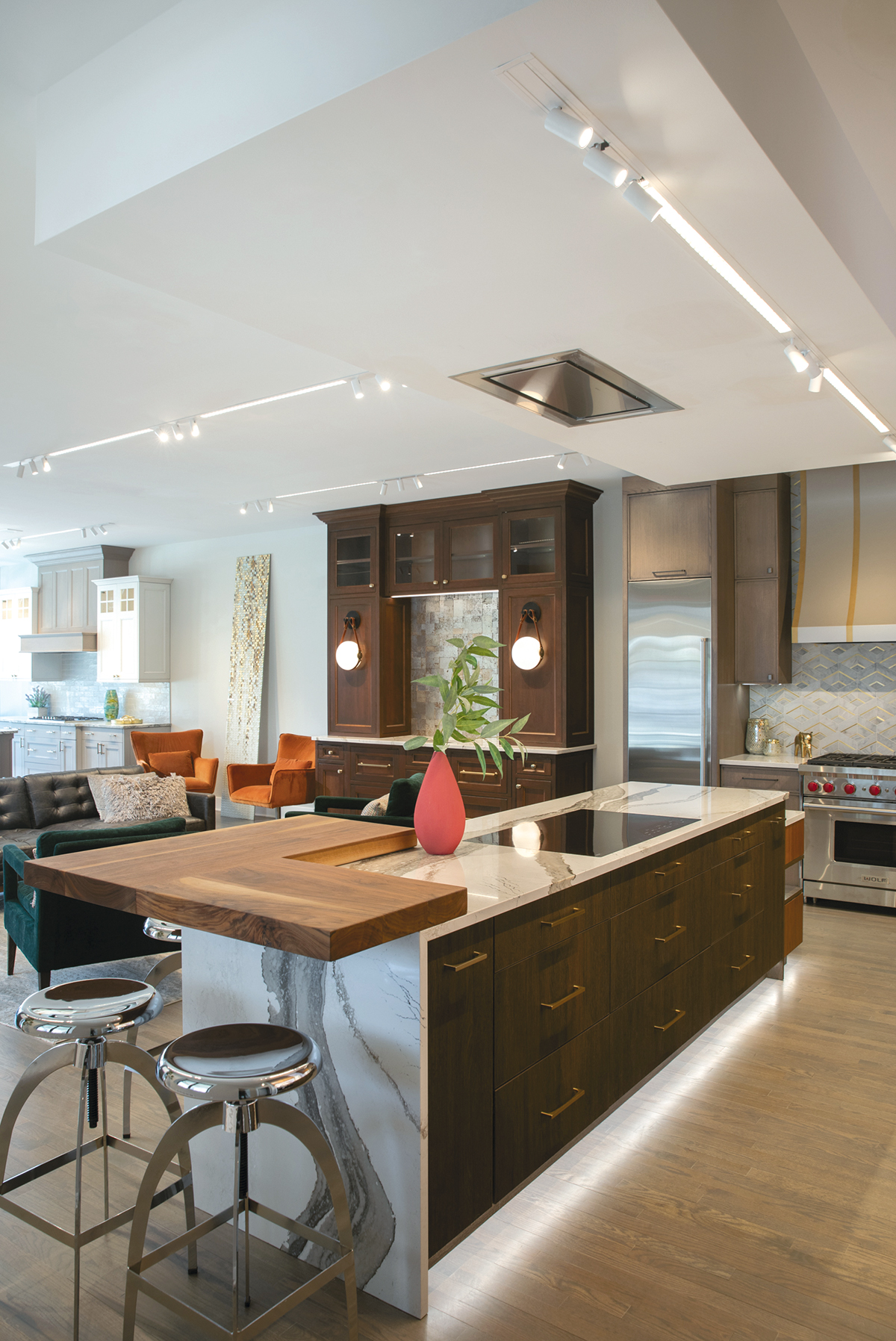


“We didn’t want a showroom that was cluttered with spindles of samples,” says the president of the design/build firm. “When visitors come in, they see a clean palette of displays. Then, when they want to look at samples or paint chips, they can move to our finish room.
“We don’t want to overwhelm our clients,” he continues. “Instead, after getting to know them, our designers can curate a look for them, pulling samples they feel are necessary. People are busy. They don’t want to have to sort through a lot of samples.”
Another special feature of the room is its lighting, which is important for the entire showroom. In fact, it is so essential that Jacobs hired a Los Angeles-based lighting expert to create a comprehensive lighting plan. In the selection room, she included tunable lighting that gives designers the ability to adjust the color temperature of the lighting within the room to match that of a client’s home. That capability also eliminates the need for clients to take anything home.
“We don’t want people to take home samples because oftentimes we’re updating the lighting, too, so it just causes confusion,” he indicates. “Many people in the industry have gotten that panic call from a client who took home a sample that doesn’t match. We’ve taken that whole experience off of the table.”
In the inspiration area, the lighting plan takes into consideration the colors of the displays and their placement within the showroom. For example, the light that shines on the teal colored cabinetry in the mudroom/drop zone display in the front of the showroom is different than what illuminates the walnut, textured laminate and rift-cut oak cabinetry in the kitchen display towards the back.
“It may be a little nerdy,” he admits, “but with my background, which includes a previous career in the movie business, it was important for me to have a showroom that is organized and up to date. And lighting is a huge part of that.”
Another important part of designing the showroom was to establish a creative place where people can dream…with inspiration that is applicable for the Pittsburgh market, which often includes renovating 100-plus-year-old homes. As such, a white and gray kitchen display shows visitors how lighter colors can brighten an older home laden with dark wood. For those wanting a ‘wow’ design element, the live kitchen display with the custom backlit ‘gemstone’ backsplash can inspire.
Likewise, the ‘Posh Prohibition’ bar features dry brushed cherry cabinetry that shows how updated cabinetry can fit into an older home. Other features include motorized shelves that move in and out of the cabinets, paneled appliances and accent lights with leather straps.
Jacobs also included a bathroom display, which serves as the public restroom. Its design vision relates to Frank Lloyd Wright’s famous Fallingwater home, with elements that include a walnut vanity with walnut-accented faucets and backlit sconces and wall lights that combine with a ‘leather’ tiled half wall, ‘water’ tiled accent wall and ‘coal’ tiled floor.
The Kitchen Bin
Winfield, NY
Debbie U. Pugh had worked as a CKBD in the kitchen and bath design industry for more than 14 years when, at the age of 59, she ventured out on her own and opened The Kitchen Bin in Winfield, NY last year. While she always dreamed of owning her own business, losing a dear friend to cancer gave her the nudge she needed to actually do it.
“I always thought ‘someday’,” she says. “But when my friend passed away, I realized that life is short, so I decided to go out on my own, chase my dream and invest in myself.”
Given her rural location, she chose to establish her business within a grain bin, which simultaneously blends in while standing out.
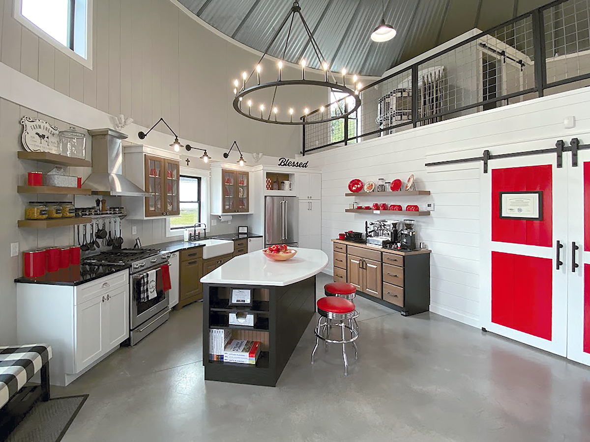
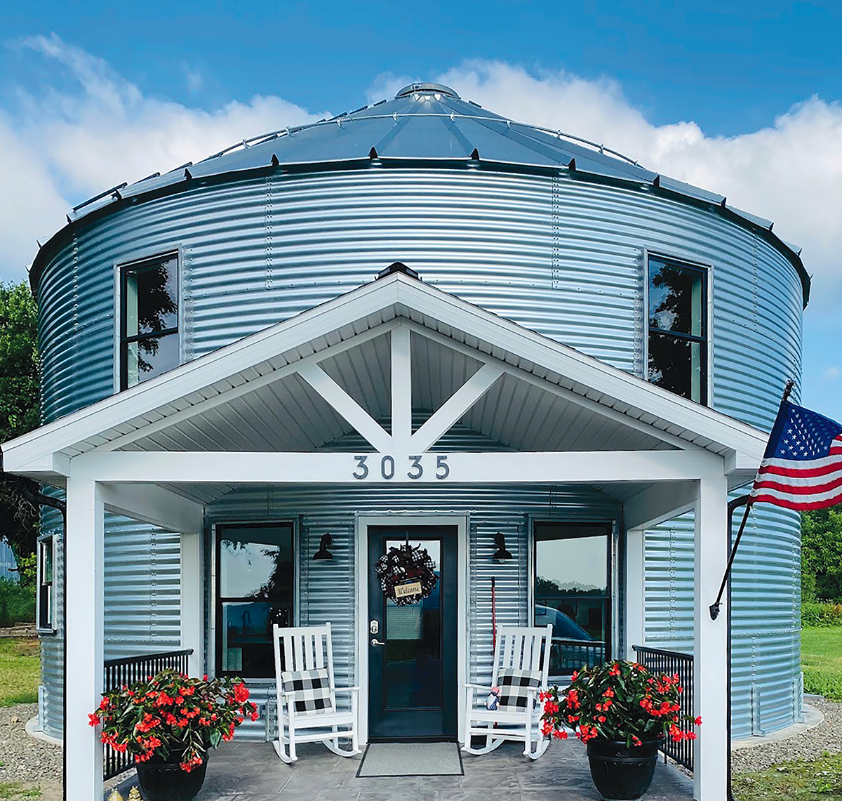


“I have people stop each day just to see what’s inside,” she says. “A grain bin evolving into a kitchen and bath showroom makes this a one-of-a-kind space where I think outside the box and design in a circle while giving clients a unique experience with one-stop shopping.”
While visitors may be lured in by the structure’s outward appearance, its 1,500-square-foot interior adds to the awe with soaring 30′-tall ceilings and a curved staircase that leads to a loft filled with flooring and tile samples. Further enticement comes from a full kitchen display with cabinetry that is shown in two paint colors and one stain with partial and full overlay doors, flat and raised paneled doors, glass doors with mullions, eight different hardware choices and a host of organizational accessories. She also included a pantry, bookcase, floating shelves, quartz countertop, dual-fuel range, refrigerator, paneled dishwasher and apron front sink. An adjacent espresso bar features a commercial espresso maker and grinder and a bar sink.
“I tried to include as many options as possible while still looking coordinated and well designed,” Pugh indicates.
Passing through the barn doors leads visitors into the presentation room where she displays cabinetry door samples from four manufacturers, including a local custom cabinet maker. Several base cabinets feature clear acrylic tops so clients can view interior construction. Granite and quartz samples are presented in a custom-designed unit to minimize clutter. Pugh even custom designed her hardware selection boards to look like a cabinet, which also houses a wall bed. Barn doors in this room lead to a half bath and a full bath with a tiled shower and stackable washer and dryer.
“I thought long and hard about my showroom,” she relates. “Everything is displayed in a home-like environment. Clients feel that coziness as they sit back in comfy chairs in front of the fireplace and watch their designs come alive on a large-screen TV…all while enjoying a cappuccino and a cookie. In fact, people often ask me if I live here!”
Given that her displays are fully operational, and that she included that bed behind her hardware display, living there is actually possible…and planned for.
“Fully working displays add value since clients can see, touch and envision products in their own spaces,” she explains. “But I also wanted to be able to use the showroom as a guest space, vacation rental or residence when I retire, or if the currently thriving kitchen and bath design industry tanks. Plus, my son and daughter-in-law can stay here when they visit. They even have their own ensuite!”
JM Kitchen & Bath Design
Arvada, CO
JM Kitchen & Bath Design is a company on the move. Backed by a 45-year history in the kitchen and bath design industry in the greater Denver, CO area, major changes came via new ownership in 2020.
As part of the transition, the firm opened two new showrooms last year to complement existing locations in Denver and Castle Rock. A 2,300-sq.-ft. location in Colorado Springs was renovated within an existing building to include a plethora of new kitchen and bath displays tailored to support its relatively traditional market.
Simultaneously, about 80 miles north in Arvada, the design firm situated its 3,500-sq.-ft. showroom within a new building in a busy outdoor mall surrounded by a furniture store, a warehouse club, a tile/flooring showroom and a couple of big box home improvement stores.
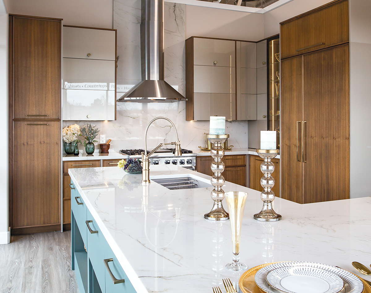
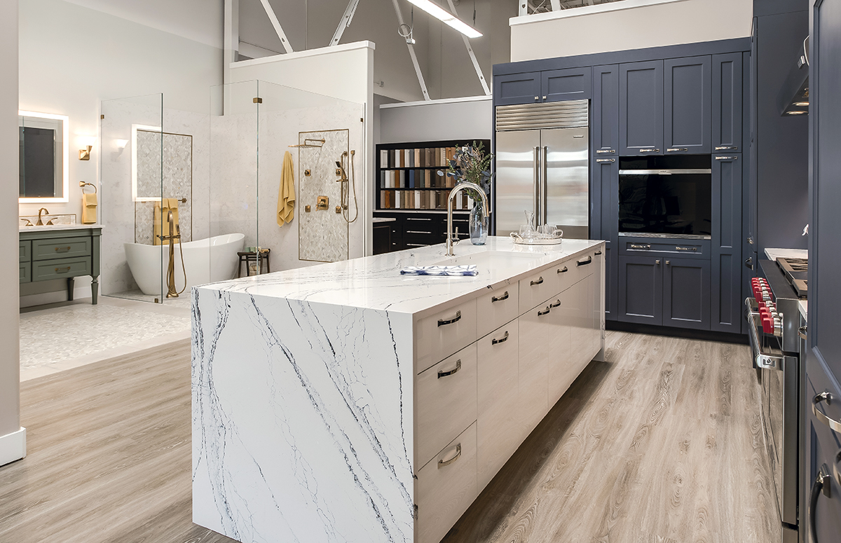


“Starting from scratch gave us the ability to choose our location, which in this case is a gathering place for people looking to do home improvement,” says Jason Price, CEO. “Starting with a shell of a building, rather than one with existing walls and rooms, also gave us more flexibility in designing the displays, consultation rooms for client meetings and working spaces for our designers.”
Those displays include five kitchens, which showcase the company’s ability to help clients with everything from cabinetry and countertops to tile, lighting and plumbing. Most displays are full-sized and fully staged and equipped.
“We want visitors to see how different options look in an actual kitchen setting,” he relates. “And they do seem to like that idea. We get a lot of people telling us that our showroom looks like a magazine.”
Many of the displays feature working appliances as well, which means the company can host events for local organizations and businesses, customers, etc.
“We’ll invite a chef to come in and cook in the displays,” he explains. “People can kick back and really see how the kitchens function…in an intimate, no-pressure environment.”
Visitors also appreciate the diversity within the displays, in color and style as well as budgets. For example, the perimeter of the kitchen at the front of the showroom features quarter- sawn walnut cabinets mixed with metallic acrylic flat-panel cabinets. The island showcases a monotonic matte surface and quartzite, the latter of which is repeated as a full-height backsplash behind the Viking dual-fuel range and Best ventilation hood. Appliances, including a Sub-Zero refrigerator, freezer, wine refrigerator and Cove dishwasher, are all paneled.
Mixed style and colored cabinetry is also showcased in a display with blue painted maple cabinets, high-gloss laminate cabinets and cerused quarter-sawn oak cabinets. A slab-style quartz backsplash is complemented with quartz countertops, including the island, which features a waterfall edge.
Homeowners who prefer all wood cabinetry can peruse the display featuring natural rustic alder for the perimeter and a darker stained alder for the island. This display also showcases two styles of quartz and a mosaic tile backsplash.
“We work with our vendor partners to show a variety of options…not only what’s popular today, but what will be popular tomorrow,” Price relates. “We want to be forward thinking.”
With a relatively large footprint, the showroom also boasts a full-size bathroom display with a wet room concept and double vanity, two public restrooms, two consultation rooms and a laundry/mud room/office, the latter of which encourages visitors to dream beyond kitchens and bathrooms.
One typical showroom item that visitors won’t find is spindles of product selections.
“We want the showroom to be clutter free,” he stresses. “We are encouraging people to envision what their kitchen or bathroom might look like…and they don’t include vendor spindles.”
DesignCraft Kitchen & Bath
Brentwood, TN
Since 2018, DesignCraft Kitchen & Bath has assisted customers in the Tampa, FL area with their kitchen and bath updating and remodeling needs via its 1,700-sq.-ft. showroom. Now, with the grand opening of the company’s new showroom in Brentwood, TN in January, homeowners in the counties of Davidson and Williamson as well as the surrounding communities can experience the same full-scale transformation services.
Tracy Urso, CFO and interior designer, moved to the Nashville area a few years ago and saw the need for the all-
inclusive services her company provides.
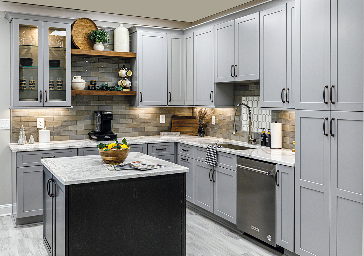
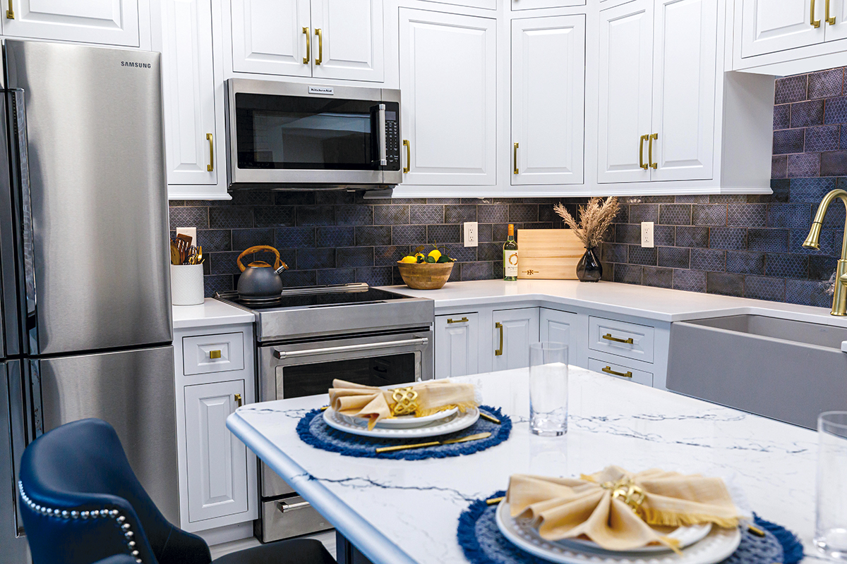

“A lot of homes in this area were built about 15 to 20-plus years ago, so homeowners are now looking to renovate,” she says. “It’s a great market to break into.”
Visitors to the 1,900-sq.-ft. Brentwood showroom can peruse two kitchens that showcase two-tone cabinets, one in currently popular shades of white and navy and the other in more timeless neutral hues. Both kitchens also feature quartz countertops.
Urso is especially proud of the showroom’s bath display, which features a full slab of quartz as an accent shower wall and as the countertop surface, which is set atop a floating vanity. The quartz’s high-contrast deep black veins, juxtaposed with more understated gold veins, shimmer with light. Matte Black plumbing fixtures and elongated black subway tile in the shower match the black veining while brass accents, including the framed mirror, cabinetry hardware and shower hinges/door handle, speak to the gold veins.
The showroom’s selection room complements the full displays and rounds out the firm’s cabinetry, hardware and tile selections. A large-screen television brings designs to life and gives clients the ability to see changes in real time. Additionally, Urso’s own office serves as a showpiece, giving clients the opportunity to envision built-in cabinetry in rooms other than a kitchen or bathroom.
“Our showroom functions as a design center,” she reports. “It showcases our inclusive, one-stop shop process where we take care of our clients’ projects from start to finish. We give our clients the ability to see everything, including cabinetry, countertops, tile, lighting and plumbing, all in one place so they can make selections without traveling to multiple stores. It makes the process easy for them.”
Jennifer Gilmer Kitchen & Bath
Easton, MD
Like Tracy Urso, Jennifer Gilmer opened a new showroom in response to fulfilling a need. For her, it’s a 750-sq.-ft. space in Easton, MD that serves as a satellite to her existing locations in Chevy Chase, MD and Ashburn, VA.
“I moved to the Easton area in 2019,” says the owner of Jennifer Gilmer Kitchen & Bath. “The architect who built the house we bought had their office in Easton, in an excellent location. When they announced they were moving, I jumped at the chance to take over the space.
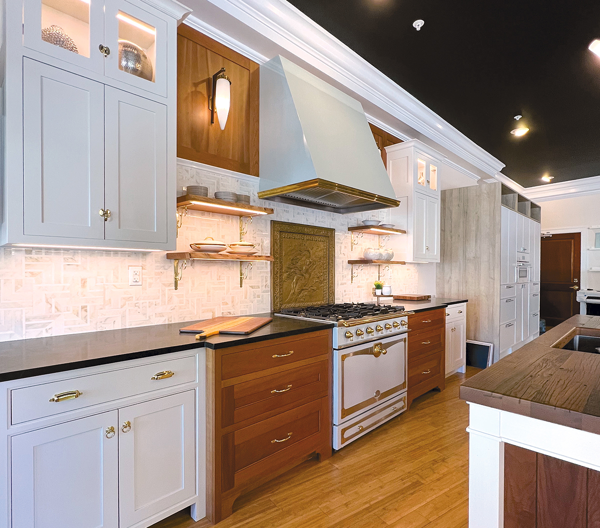
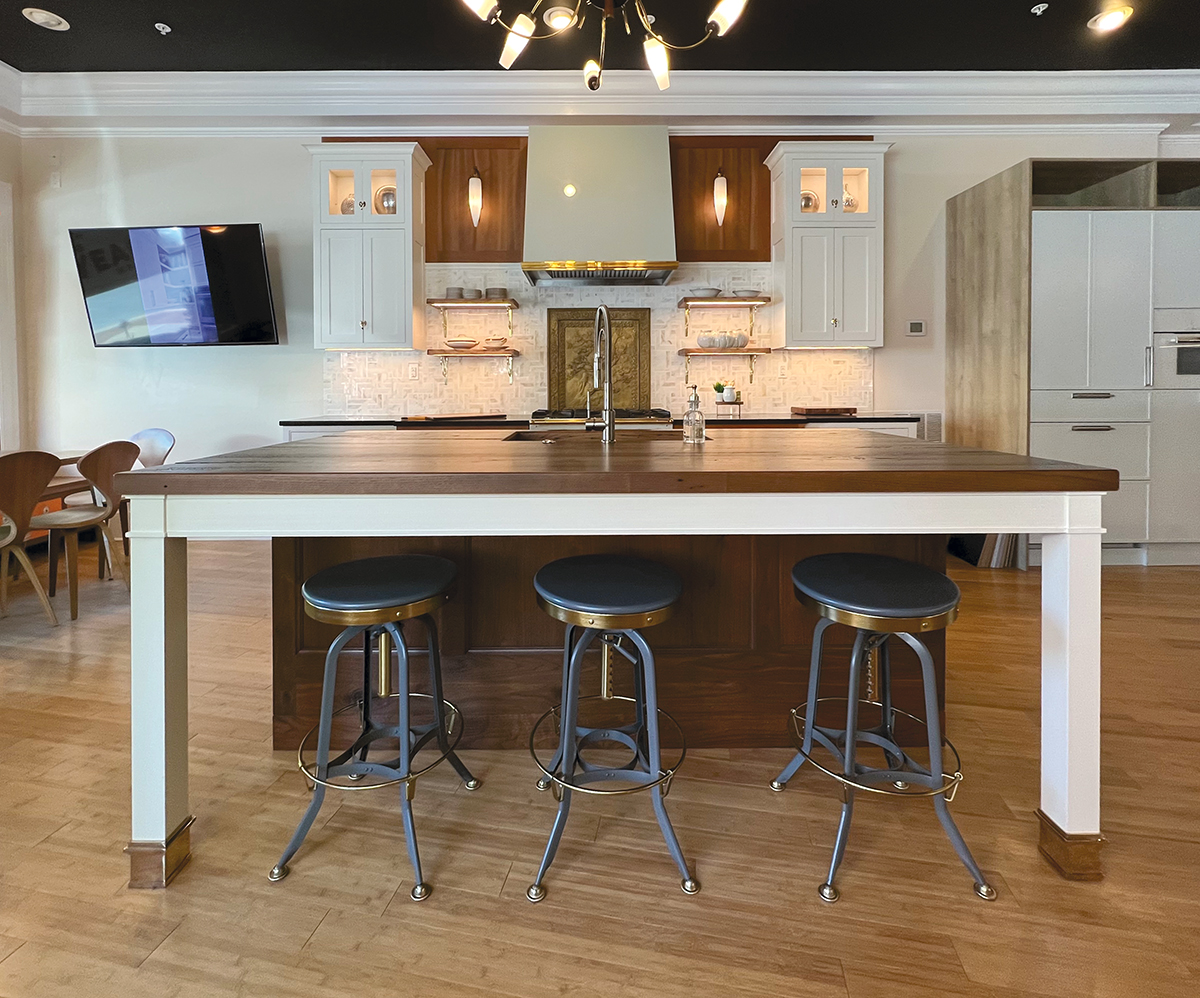


“I knew that Easton was lacking a good quality kitchen and bath design firm,” she continues, “and I wanted to be able to make excellent design available to clients on the Eastern Shore, many of whom have beautiful homes on the water. I also banked on the fact that there were a lot of potential clients who would appreciate our presence downtown. And I was right…we are getting a lot of business on a steady basis.”
Gilmer’s satellite location is an ideal meld with her firm’s Chevy Chase location since several clients either live full time in the Washington, DC area or are moving from the Washington, DC area to Easton.
“We can meet with them in either showroom,” she says, “…whichever one suits them.”
With limited space, Gilmer focused on making the most of the relatively petite showroom. As such, she concentrated her attention on six kitchen displays.
“I’ve found through the years that it really isn’t necessary to show bathroom displays since the cabinets in kitchens can also be considered for bathrooms,” she relates. “Sometimes, though, we do take a field trip to a plumbing supplier that has bath displays.”
Gilmer also wanted to showcase the unexpected and atypical. For example, the refrigerator, freezer drawers and coffee machine are built into tall cabinetry.
“Clients have no idea that the display houses these appliances, and every time we open the refrigerator or freezer drawers, they gasp!” she says. “Since these appliances are also live – along with the island sink, disposal and dishwasher – we can use them ourselves, as well as when we host events. Clients love it when we make them a cup of coffee.”
The designer/owner also incorporated authentic vintage lights, a beautiful reclaimed chestnut countertop on the island and solid wood live-edge shelves.
“These unique touches are impressive and make clients feel at ease with the fact that we can design uniquely beautiful kitchens,” Gilmer indicates.
KDC Remodeling
Lacey, WA
KDC Remodeling celebrated a grand reopening in March when the Lacey, WA kitchen and bath remodeling firm officially unveiled several new displays and celebrated a more formal transition from its original name of Kitchen Design Center.
“Our founder is taking a step back,” says Scott Allen. “After opening the showroom 32 years ago, he has decided to slow down and will transition into an advisory role.”
At just over 3,000 sq. ft., the showroom is home to about 15 kitchen and bath displays, some full size, others smaller 6′-8′ multi-cabinet segments that show snippets of several different design styles and cabinetry construction.
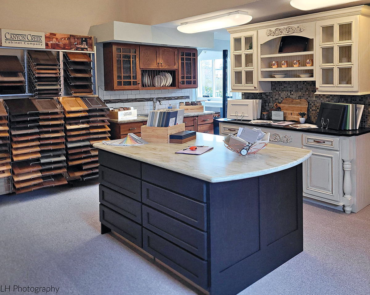


“They are large enough so people can get a feel for the style yet it allows enough floor space to show everything,” he explains. “Most of our competitors only have a couple of displays…or even no displays, just catalogs or samples. We are really unique for this area. We’re about 50 miles south of Seattle, which does have a big design area, but the way the topography is in Puget Sound, we’re really quite far away so we’re probably the biggest showroom outside of the city.”
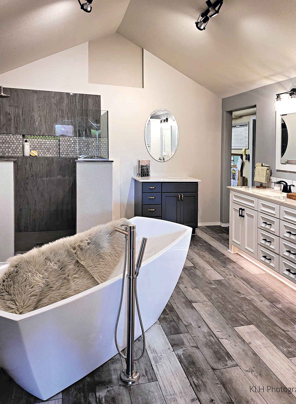
One of the newly unveiled displays is a much larger 15’x25′ bathroom that was once an office and library, both of which have found new homes.
“We now have a whole room dedicated to the bathroom,” Allen indicates. “It’s an important display for us since about 60 percent of our business is bathroom remodeling.”
It includes a single-sink vanity to illustrate options for smaller bathrooms and a nearly 80″ double vanity and tall cabinet for larger spaces. A freestanding slipper tub is accented with a Roman tub filler, and the focal-point walk-in shower features cultured marble and half-glass walls, niches and foot rests, a rainhead showerhead, an adjustable hand shower and valve controls mounted on the wall to show visitors that shower operation needn’t only be located within the shower.
“The shower is pretty luxurious, with the swirls of cultured marble, tile inset and brushed nickel fixtures,” he says. “People love that they can walk into it. It’s a focal point as soon as you enter the room.”
As an interior space, the display also showcases what can be achieved with lighting, especially LEDs, which are featured as an accent in the shower.
“We can dim the lights in the room to highlight just the shower, which is illuminated with a soft glow,” he explains. “It really feels like you’re going to the Hilton for a spa day.”
In addition to the larger displays, the showroom also includes samples of doors, countertop surfaces and cabinetry hardware.
“We have probably 50 different door samples, so visitors can see how something like alder compares to hickory and oak, or maple and cherry,” he explains. “Each takes stain differently, so we want to show them how different woods impact the design.
“People don’t know what they don’t know, so we incorporate a lot of different features to show them what’s possible,” he continues. “Sometimes it’s details like lighting or just the right cabinetry hardware that can inspire people. For us, the showroom is all about starting a conversation.” 
The post Showroom Strategies appeared first on Kitchen & Bath Design News.
