87 Interior Designers Share What They Think The Worst Trends Are Right Now
Posted by admin on
For as long we've had great design, there have been bad ones, too. Loose boulders on staircases, see-through toilets, windowless curtains—the list goes on.
So in an attempt to figure out which of them have become the most popular, Reddit user u/uwfan893 made a post the platform, asking, "Interior designers, what will this generation's version of shag carpeting be?" And they happily obliged, sharing all the trends they would love to see gone.
Of course, it doesn't mean that if your place has anything they mentioned, it automatically becomes tasteless—a lot depends on the execution. Plus, your home is your castle. You can make it whatever you want it to be. It's just a take on the general landscape.
#1
Open concept bathrooms.I don’t need to see you taking a dump from my bed.
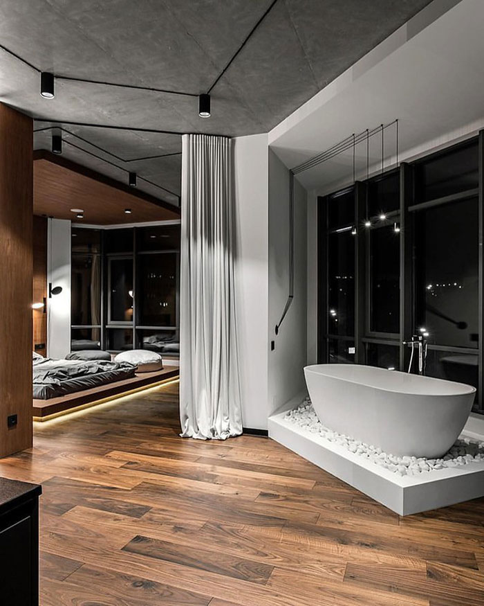
Image credits: 02K30C1
#2
Beating minimalism to death with a sledgehammer. Everything being grey/white, even painting over gorgeous natural wood, practically zero color anywhere. Just breaks my heart when they take beautiful vintage homes and renovate them to shit by making everything look so sterile.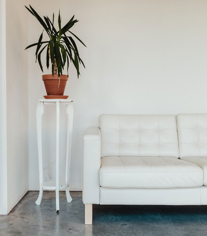
Image credits: notagoodusername183
#3
Gray. Everything gray.It’s the orange and brown of the 60s, 70s, and 80.
It’s the beige of the 90s and 00s
#4
Live laugh love.#5
All of the flat white and concrete is just going to make the houses look dated in about 5 years.Big concrete squares don't look good people!
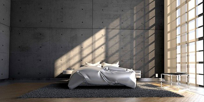
Image credits: BIGGEST_BOIIIII
#6
Removing stair banisters for a crisp look. Like your drunk friend Brooks is going to fall of the side and die one day. There are building codes for reasons#7
I hate the design of homes that have a massive garage in the front; “welcome to my garage, the home is in the back.”#8
No broom closets. Where the hell do people put their mops and vacuum cleaners? Or do the people who buy those McMansions just not do any of their own cleaning?#9
Someday people are going to realize that having entirely white walls and exposed concrete isn't very homey.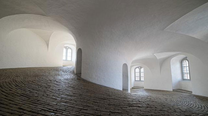
Image credits: aFineMoose
#10
Fake panelling. Grey everything.#11
Lack of storage space. Just bought a new home and didn’t realize how little space there was. We have one storage closet upstairs. That’s it.#12
Why is everything so damn bland? Why is white and grey the popular colors? Whatever happened to color? Why can't we have living rooms wallpapered with big bright flowers, long suede couches in deep fuchsia? And, mile-high blue carpets that you sink into when you walk? Whatever happened to walnut paneling and colored subway tile in the bathroom? Whatever happened to delicate stenciled flowers on the inside of the bowl of the bathroom sink?When did we lose our personalities? I just want a house that looks like a manic-depressive toddler version of myself was set lose in a JoAnn's with a limitless credit card.
#13
Cabinetmaker here: grey stained EVERYTHING dominated the early 2000s. White oak was most common. It’s also a huge pain in the rear, greys and whites are the hardest stain colour to work with. Trend’s not done either, I just did a consult with another cabinetmaker a couple months ago because he couldn’t get the damn grey stain to work.Oh, and sandblasting is only slightly less common and actually makes it even harder to apply. Not to mention to clean.
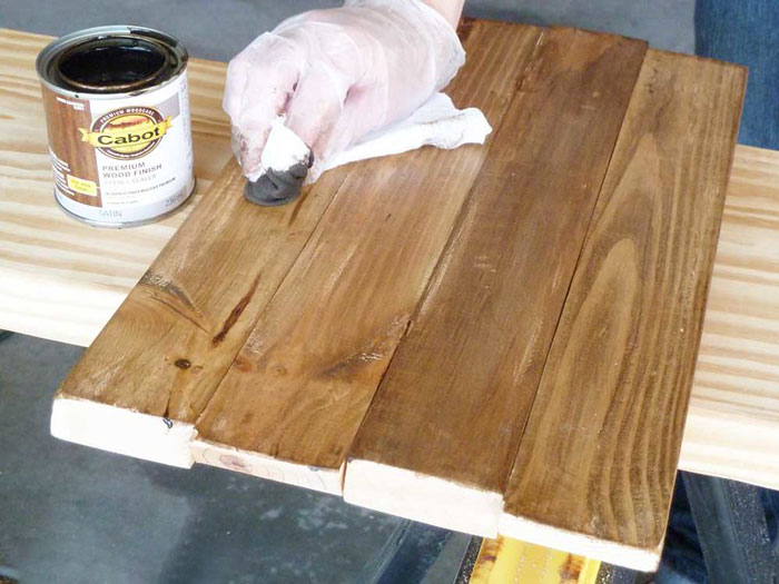
Image credits: Ryuaalba
#14
I’m still training in kitchen design for a retail store and in my short time in this department I can tell you everyone wants white shaker-style cabinets. EVERYONE. I’m so sick of doing basic, unimaginative kitchens. The white in-stock shaker-style cabinets are also our biggest sellers. In-stock cabinets are complete trash and fall apart if you look at them wrong.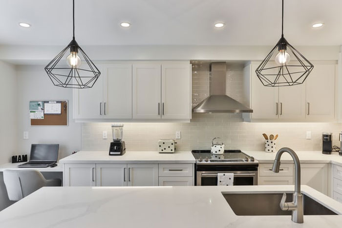
Image credits: bluegrass76
#15
Boho chic. I see a lot of former airbnbs needing full restyling.#16
Garages that fit two medium sized cars with about one inch to spare#17
No door between the master bedroom and master bathroom. It’s so annoying.The last 3 houses I’ve lived in have had this issue. I like to be able to close the door when I take a bath or shower.
#18
As an electrician; putting 600 spotlights in every room of the house. Sure it makes me money but it looks fucking ridiculous having so many lights every 4 feet of every room.#19
I really don’t like the fireplace design where you are intended to put your TV over it. A TV is way too high when over the fireplace.#20
Bedrooms that are only juuuuust big enough for a double or queen bed and a nightstand.#21
I've seen several homes with appliances integrated into the construction of the kitchen itself. Not just in an alcove but actually built into the wall. Sure, it's convenient that there's a fucking cappuccino machine built into the wall next to the cabinet over the center island countertop. But what happens when (not if, when) it needs maintenance? Do I have to call a goddamn carpenter as well as a cappuccino machine repairman? Do I have to consider if this is a fucking load bearing wall that contains my broken appliance? And something that's just a convenience like that is one thing, but they do it with stuff like fridges too.#22
might be an unpopular opinion but i don't need my home to be smart...I just need things to happen when they are supposed to happen and not completely shut off when some douche thought it was a good idea to play who can touch the powerline#23
Vinyl “hardwood” floors. I’m already tired of seeing them#24
The cookie cutter houses with no personality and no room, where the windows look directly into your neighbor’s bedroom. Ugh!#25
Rich people putting marble absolutely everywhere. It looks tacky#26
Small kitchens with little to literally no pantry. Some of us still cook!#27
Small laundry rooms, small pantries, no linen closets, but here’s a 20x20 media room to watch TV. My next house will either be laid out by me or made in the 70s/80s when they designed homes to be lived in.#28
Weird fixation perhaps, but I cannot stand kitchen cupboards that don't go all the way up to the ceiling. No cabinet storage + a big gap on top for my husband to pile all kinds of crap = no thanks.#29
Fake shutters. They dont even look like they would cover the windows on most houses and they just look like garbage. If you love shutters so much, install real ones.#30
All white kitchens is going to seriously date houses in a decade or so. You know the ones I mean - white cabinets, quartz countertops, white backsplash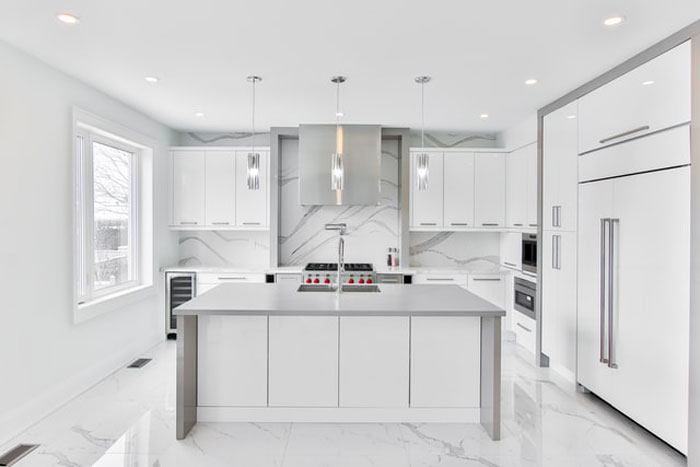
Image credits: Red_AtNight
#31
Most sinks are absolutely terrible. Looking better is nice, but not at the expense of hitting your hand on the bowl every time you wash your hands.#32
I don't know if it's new new, but it drives me crazy when people replace cabinetry with open shelves.Don't people understand dust? Bugs ring a bell? Pet hair? Speaking of pets, how do you keep your cats from messing around with that setup?
#33
The grotesque housing developments of the same like 4 models and 3 colors with no trees. Not to mention the houses are built like shit. The terribly inefficient road layout with a million cul de sacs.#34
Every single tile option in the store in one, small bathroom.Granite countertops.
Open concept floorplans.
All the other terrible designs they constantly flog on HGTV.
#35
Fake wood ceramic tile floors.#36
Open concept floor plans are great for smaller homes. Y'all are just classist lol#37
That modern metallic design that's taking over practically every new development. The homes just feel coldEvery new building in my neighborhood is like it. The only big positive is that they all are typically multi-purpose so there's like stores and restaurants at the bottom.
#38
No trim on doors and windows. The drywall comes up to the door jam and it's squared off. It looks like a Greyhound bus station.#39
Glass railing. Gets dirty really easy and a big pain in the ass to install.#40
I am not an interior designer but I cannot stand the whole “farmhouse chic” trend and can’t wait for it to go away, it’s everywhere. What’s everyone going to do when it becomes dated and they can’t sell their homes bc it looks like an effing farmhouse? Also like someone stated above I don’t think the open floor plan is something that’s going to last forever.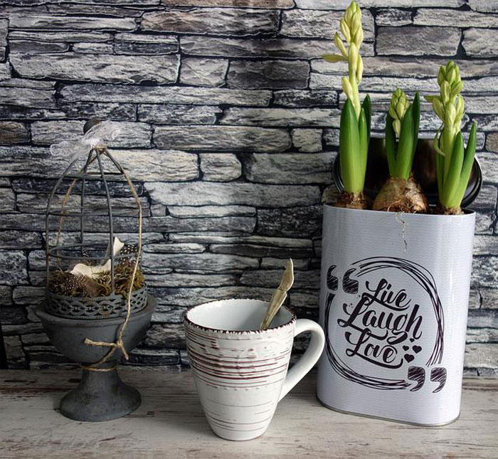
Image credits: lmitch89
#41
Windows smaller than portholes.British Leyland build quality.
Inadequate heating.
Drug gangs buying entire streets as production sites
#42
Definitely barn doors.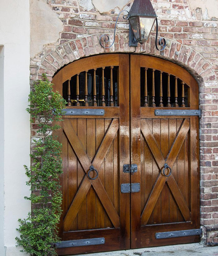
Image credits: GillianOMalley
#43
A lot of new box-looking modern builds near me and when it rains the eavestroughs freak out and don't know where to put the water. Overflow from the roof all over the freshly mulched gardens with two flowers and a tuft of giant grass in it.It's like the builder misunderstood that "rain" is a plural of raindrops and they were only expecting one singular raindrop to descend from the heavens.
#44
Humongous kitchen islands. I'm only 5 ft tall and I have to walk around the entire thing to get it clean. It's just too big to be convenient.Add to that open shelves instead of cabinets. I'm sorry my boxes of pasta and cans of soup are not going to be attractive no matter what I do with them.
I also want separation between the kitchen and the living space.
I guess I just hate modern kitchens...
#45
Hollow interior doors that don't keep sound out from within the house and hallways - especially hollow bedroom doors when you're trying to sleep.#46
Kitchens that they cram into a narrow rectangle. A lot of apartments and town houses come with these. They are so narrow that if you open the fridge door, nobody can walk past you.A kitchen should be open, not walled in all sides and shaped like a narrow rectangle. It drives me crazy when I see these.
#47
Open floor plans where the main floor is just like one big room.Houses that are only 25' wide and have a front double garage.
Master bathrooms with no door separating the bed from the toilet.
Backyard that is only 12' deep
#48
Not homes, but open plan offices are just cruel.#49
Floor-to-ceiling, clear glass showers. They look great when they are spotlessly clean, which means it looks terrible most of the time in most homes.#50
I hate that my laundry room isn’t near the bedrooms. The dirty clothes are generated in the bedrooms and bathrooms! Put a damn drain in the laundry room floor. I hate carrying laundry down the stairs. And it hate carrying the clean laundry back upstairs. It’s crazy.#51
I don't like it when they have like ten different rooflines that are only a foot or two deep. Are they hoping it looks like an older house that's had many add-ons done?#52
All-white insane asylum paint schemes#53
I absolutely hate brown/white/black “modern” designs. Everything looks boring and bland.#54
Wasted space. This includes enormous bedrooms with sitting areas, homes with equal number of bed and bathrooms, extravagant foyers that eat half the front of a house, formal living and/dining rooms that never get used. Etc#55
A gabled ceiling to make your room taller.Open floor plans that let your neighbor see completely through your house.
An undersized front stoop.
No landscaping or trees in your whole development. Or even worse when they half ass it in front of your 400k new house.
#56
Go to a high end gated community development ($800k - 2M price points in my area) front of the homes is beautiful stone, brick, etc but on the back every house has cheap ugly vinyl siding all the same color as far as the eye can see. I never understood this since you actually spend time in the back yard not the front.#57
Why do new modern houses have a butlers pantry? Firstly, who entertains to that scale and secondly they are not a real butlers pantries (that is, a place for minor food prep before dinner is served in the formal dining room that is far away from the kitchen. They have really become the real kitchen that gets used while the big kitchen in the open plan living area is just a show piece.#58
Not necessarily new but... If you put the bathroom light switches outside the bathroom.. you should be drown in your own shit.#59
The fact that they're all so big. Nobody is making homes that are smaller than 2500 square feet. Not everybody who hopes to own a home some day is looking forward to raising five children and vacumming 12 different rooms every week.#60
Having lots of glass doors, walls, and ceilings.#61
Terrible refrigerator placement. You can't open the door without slamming them on a wall.#62
Microwaves over stoves. That built in ventilator is not a substitute for a proper exhaust. All it does is turbocharge smoke/grease into the cabinets above the microwave. I just want a real vent over a stove so I don’t need to worry about setting a smoke detector off whenever I cook bacon or sear something.#63
I have not been inside a new home in quite a while, but the exteriors seem to be designed by a committee of people who can't work together. Every possible exterior finish is on there, faux brick/stone, stucco, siding at all angles, board and batten, shingles/shakes, you name it, some part of the house has it, often in disparate colours. It looks very bad.#64
those dumbass fake balconies#65
Shiplap.I don't even know what it is, but HGTV won't shut up about it so clearly there's going to be far too much of it in a few years.
#66
Shitty bathtubs. I grew up in a 100 year old house. It had a nice bathtub with a sloping back so you could comfortably lounge in the bath. Modern tubs are pretty nearly straight up on the back so there's no comfortable way to soak, smoke a joint, and read a book.#67
Big showers but no bathtub.Greyish colored floors.
Shelves instead of upper cabinets.
#68
Clear bathrooms in studio or one-bedroom apartments!#69
Not really a "new trend", but I've never understood mounting TVs high on a wall or above a fireplace. Not only is it a bad look to have a TV displayed like it's a piece of art, it's also very uncomfortable to watch TVs that are above you. TVs should be at eye level when you're sitting. I think the trend is finally dying, but it keeps cropping up in houses I visit.#70
Rounded corners. Sure. They look cool till you want to paint your kitchen a different color from your living room.#71
Total lack of solar panels/windmills. I think its criminal that new builds don't have any form of energy generator built in.#72
The obsession with space. So many people won't even consider anything under 2,000sqft. People don't even think about what it would cost to heat and cool. They just gotta have a McMansion.#73
Painting over bricks. It's just like how people used to put carpet over nice wood hard floors.#74
Barn doors are so stupid. It’s a heavier, more expensive, harder to open door. And then it still has a public bathroom-style gap that eliminates actual privacy.#75
The worst trend in home design is definitely the “welcome to my garage” front of suburban homes. Why can’t you let me park on the side? Why can’t I have a nice front of house without a huge ass utility door like a goddamn barn!? I AM PEOPLE!#76
Homes built on the cheap with so many corners cut in their construction that they end up being horrible places to live in, plagued by mold, damp, noise and plumbing issues and more.#77
Double washer and dryers. Really necessary?#78
Master bathroom is luxurious, has big bathtub next to small (nice) stand-up shower.When looking for a home last year, we walked into countless homes like that.
2 person walk in shower is where it's at!
#79
Having a built in faucet with swing arm over fancy dog bowls. They’re putting single, easy turn handles on them! It’ll take the dogs 2 or 3 days to figure out how to turn ON the water. They’ll never learn to turn it OFF! Lol#80
By-laws against clotheslines. I'm going to pay for electricity/gas when the sun and wind are free? In this day and age, who can be against solar and wind?#81
These toilets that don't even come up to my kneecaps with how low they sit.#82
That vase with a hole in the center with some sticks or scraggly branches in it.#83
I don’t get why people need a bowl full of ornaments or just shiny balls#84
4"x4" tile countertops... So many crevices to scrape and clean.#85
Microwave 'Vent hoods'.Building code should state that all new homes and apartments must actually take cooking fumes and misty oil, steam, heat, CO and blow them outside.
Whoever invented the microwave fan that sucks all the fumes up and blows them back out the top needs to be kicked in the dick three times.
