When This Family Bought a Maple Leaf–Shaped House, They Inherited More Than Its Tricky Angles
Posted by admin on
When Nya Irwin and her family bought their mid-century marvel in Alberta, Canada, in November 2020, there was one caveat: They had to be okay with a seven-month-long post-closing possession (the seller’s new condo wasn’t yet ready). But the waiting period turned out to be a blessing. During that time, Irwin befriended the homeowner, who had lived in the house since it was built in 1966. “I’d go over for tea and she would share all the intricacies of the house with me…the history, millions of little stories,” recalls Irwin. What she really learned was that the home was a love letter of sorts. The seller’s husband had constructed the place with the help of her brother and dictated its design around his wife’s needs. “Things like the counter height in the kitchen and bathrooms were lower for her stature,” Irwin points out. “She would ask for something and he would build it.”
For Irwin and her husband, there was never a question of changing the architectural integrity of the home. At the same time, it needed some TLC to feel fit for the couple and their two sons, ages 9 and 6. They tasked Tara Marshall and Meghan Bannon of Fort Architecture to help them put their stamp on the well-loved property, all while respecting the house’s ironic maple leaf–shape footprint. “The walls taper in, everything is at an angle, there’s no straight datum line,” says Bannon. Or as Irwin puts it, “It’s a trigonometry nightmare.”
Time Capsule Cool
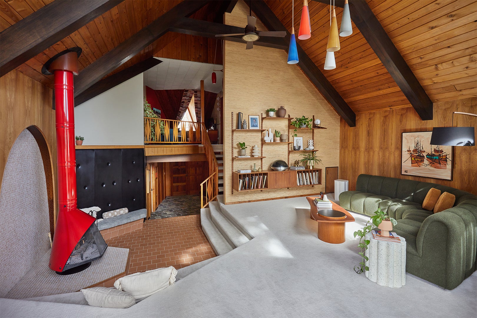
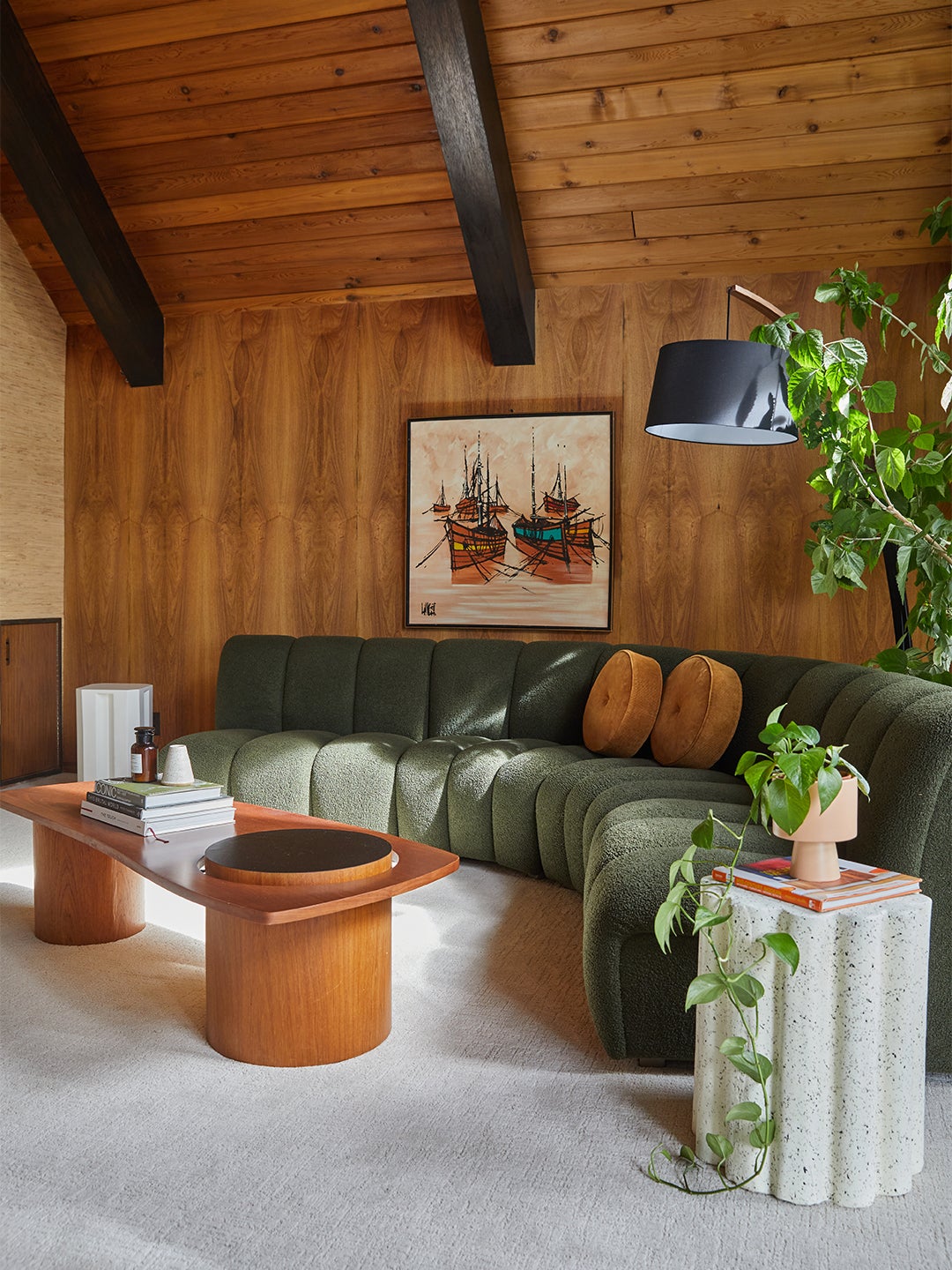
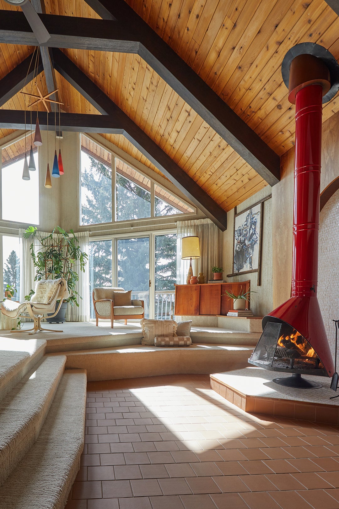
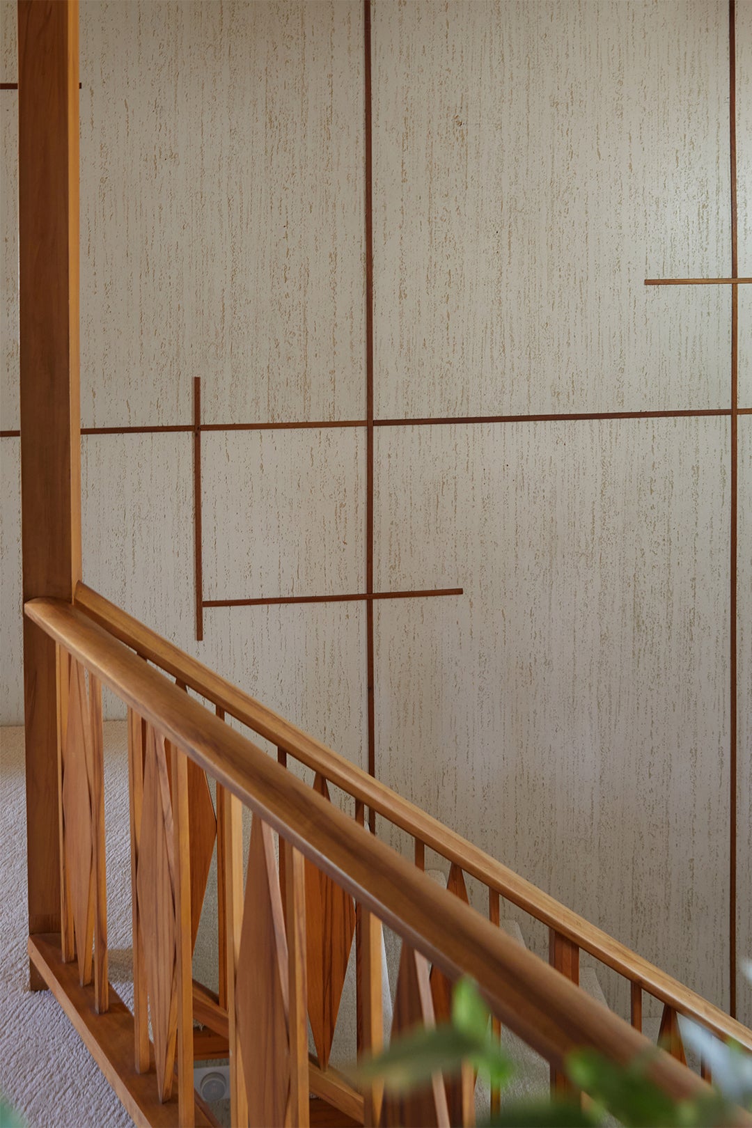
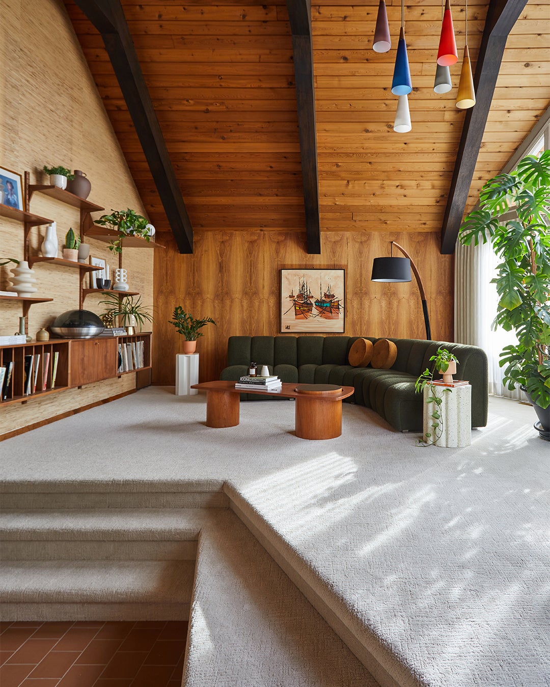
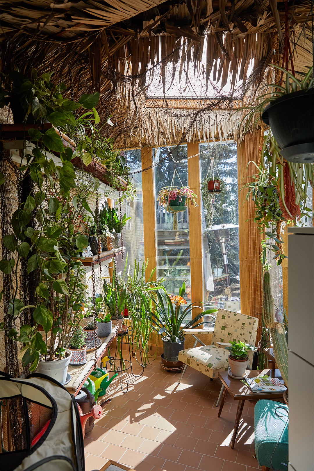
Part of the reason Irwin was drawn to the home in the first place was the sunken living room, with its soaring red-orange wood-burning fireplace, allover carpeting, and grass cloth–coated walls. “I have been perpetually searching for my grandparents’ basement,” she explains. “It was a place I grew up in, a place of family and love. Their home was like a museum of ’60s furniture.” Luckily, as a result of Irwin spending time getting to know the seller, she scored a few pieces from her, including a teakwood cabinet that was specifically designed for one corner of the room. The 40-year-old hibiscus still standing in the space is just one of many plants also left behind. “We were really intentional with not wanting to change a lot in this room,” says Irwin.
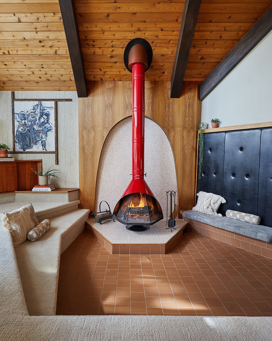
Fort Architecture’s remodel of the space was limited to surrounding the fireplace zone with tile and swapping out the carpeting for a cleaner, crisper-looking textured option. “You really want to have your family be able to congregate and sit on those steps,” says Marshall. And gather they do. The space is a tech-free zone (in other words, there’s no TV). “It’s where we just take in. I don’t feel like we get enough of those moments in life anymore, where you’re forced to stop and look at the surroundings you’re in,” says Irwin.
Asymmetry Over Open Concept
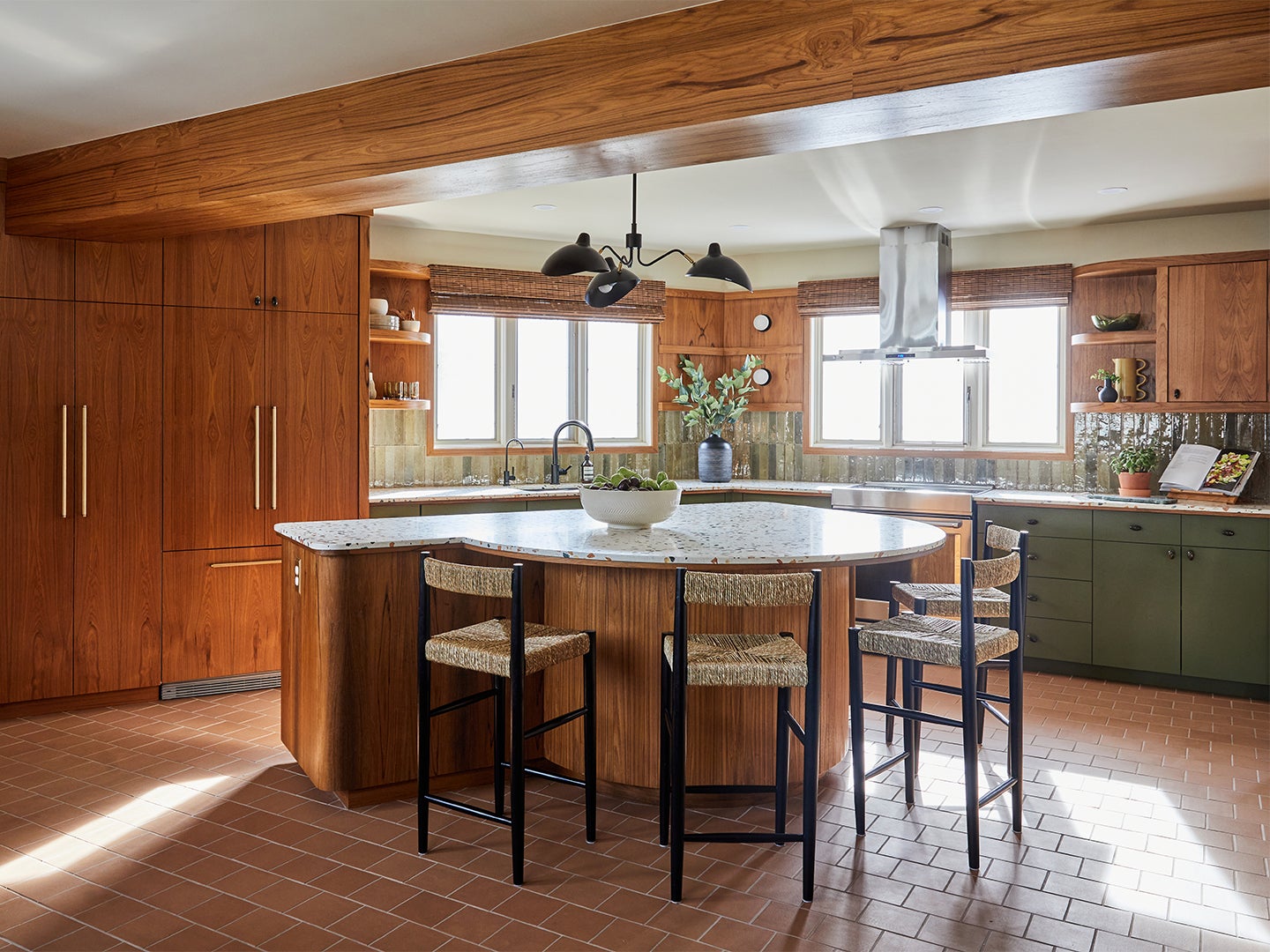
The only way to make the home’s unusual shape work was to introduce as many curved elements as possible to balance out all the jarring angles. Cue the irregularly shaped island. The semicircular side features counter stool seating and encourages people to converse and circulate around the space.
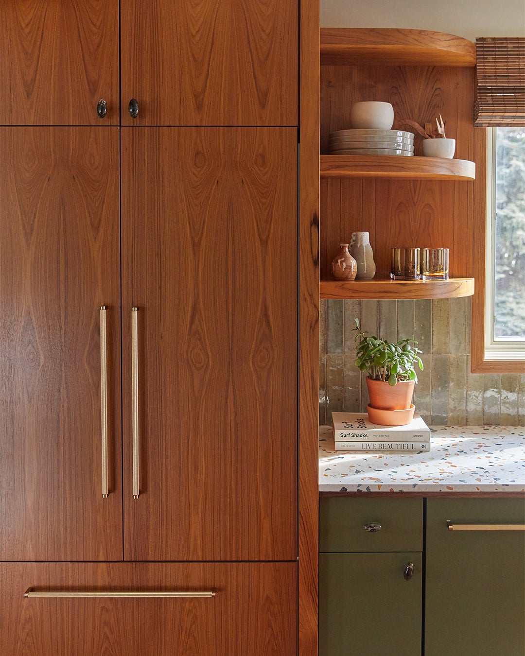
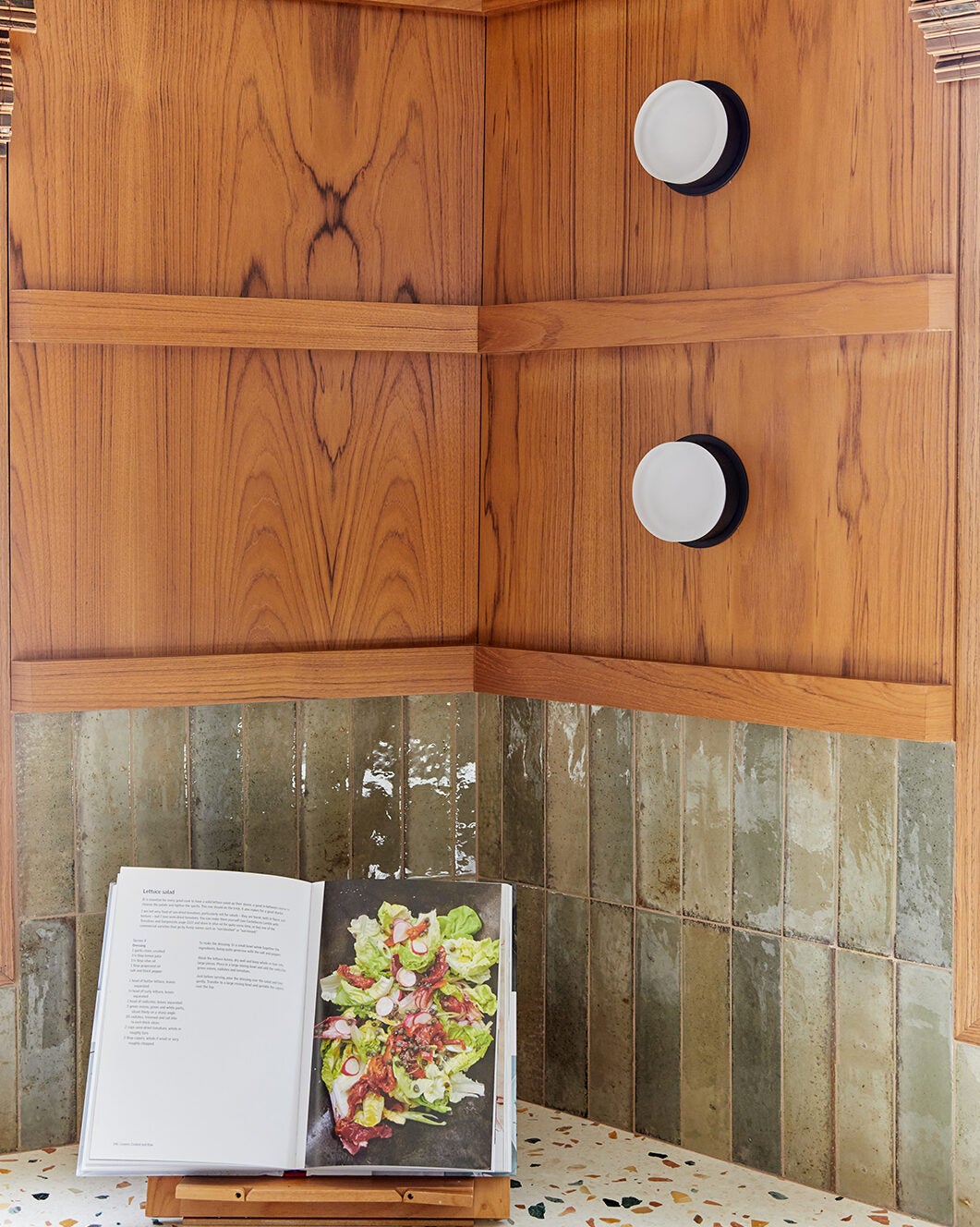
Bannon and Marshall sourced teak for the integrated paneled refrigerator and upper shelving to blend with the existing wood throughout the house and painted the new lower cabinets an olive hue that “feels contemporary but nostalgic at the same time,” says Bannon.
Ageless Terrazzo
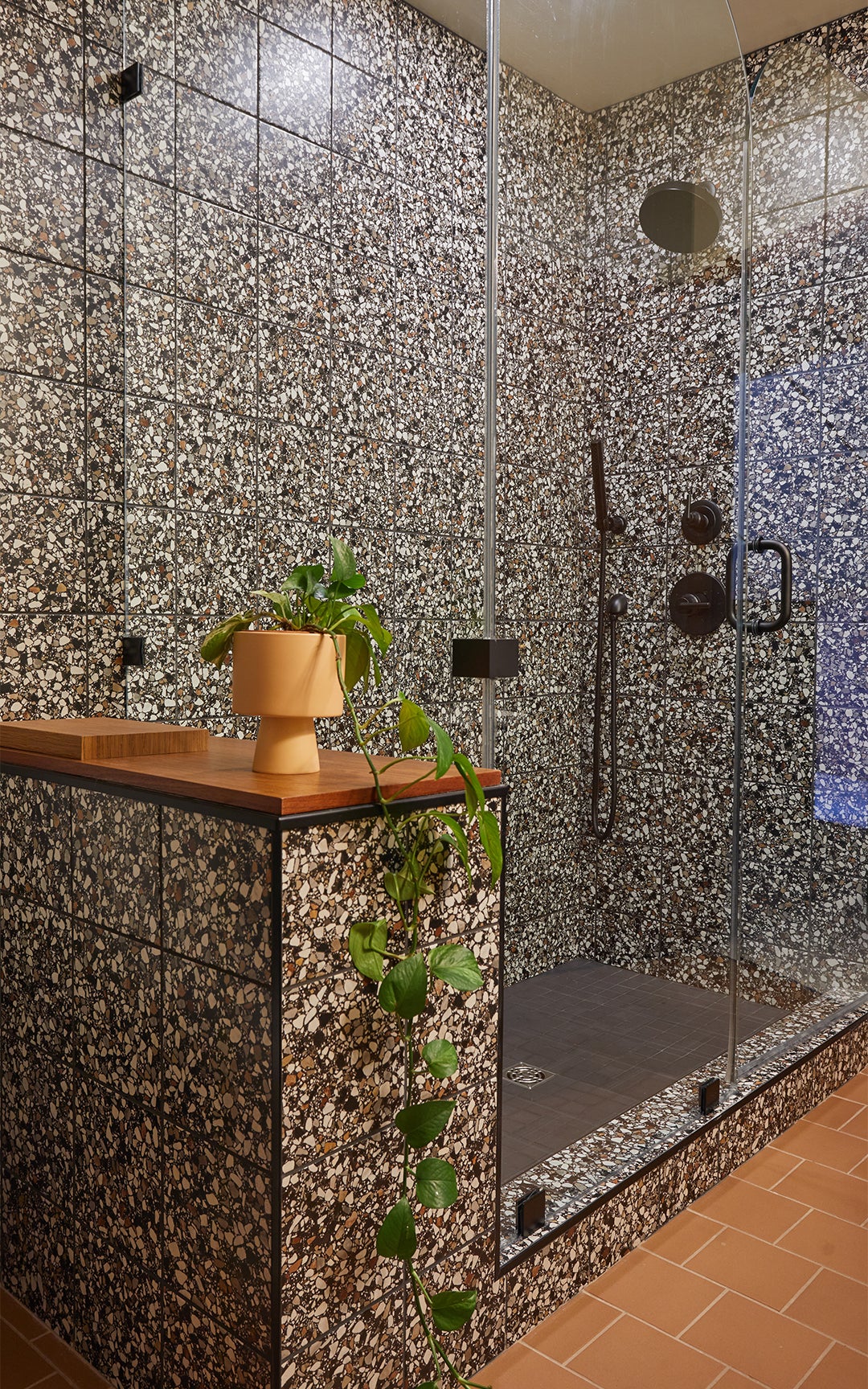
The resurgence of terrazzo played to the remodel’s advantage. While the groovy material is on trend now, whenever it happens to go out of style again, it won’t ever look like it here, given the house has such a strong ’60s perspective. The designers embraced an aggregate with flecks of green and marigold in the kitchen, playing off the wood elements and green cupboards, while in the main bathroom they struck a darker note with predominantly black tile.
Bedroom Jenga
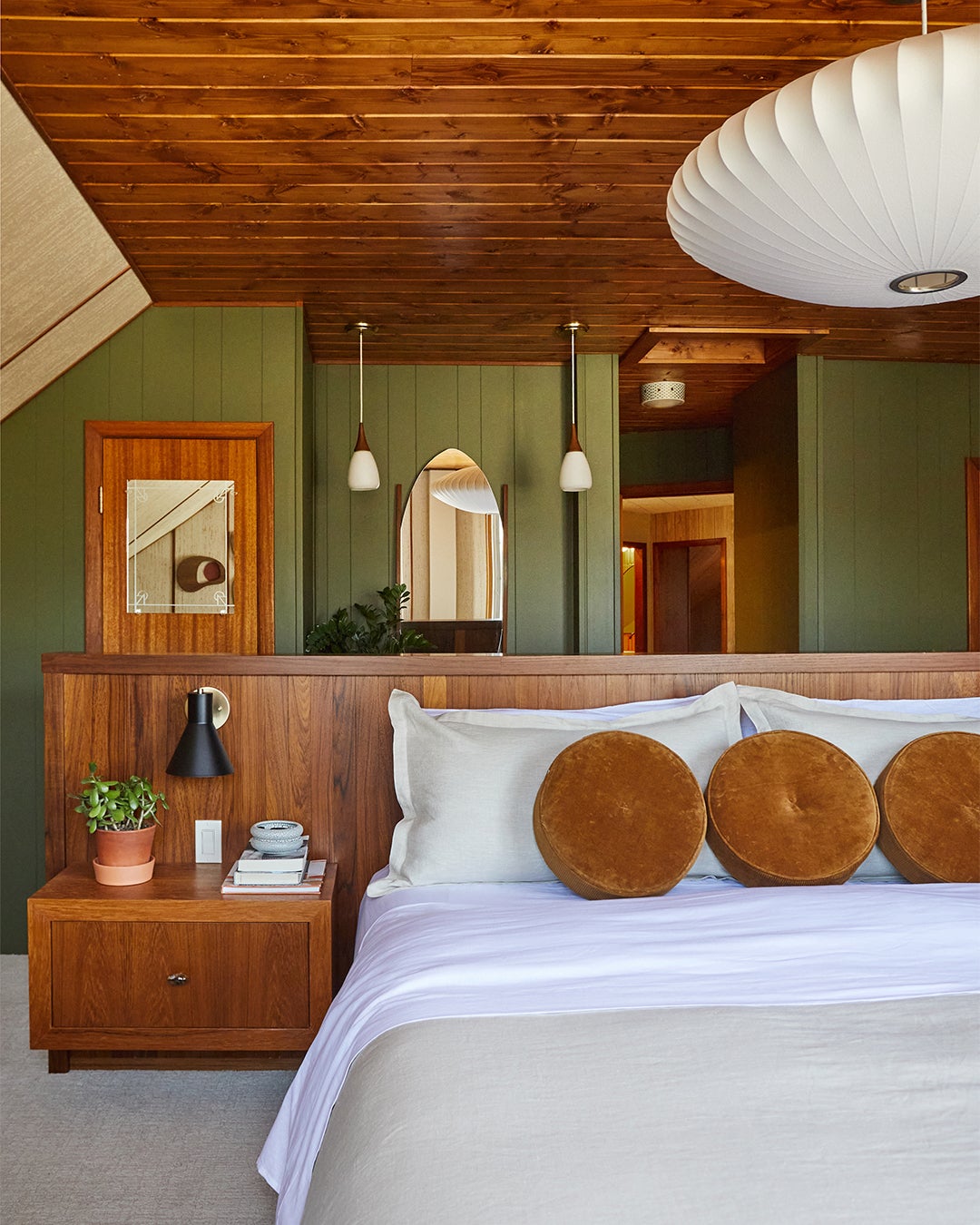
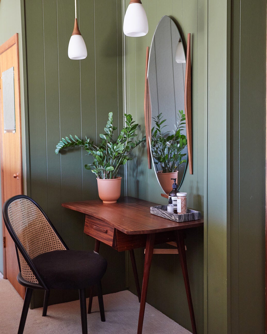
To offer Irwin and her husband more space in their bedroom upstairs, Bannon and Marshall combined two small bedrooms. Situating the bed up against the wall wasn’t an option given the sloped nature of the ceiling, so instead they devised a custom frame with an integrated headboard and nightstands to designate the sleeping zone and offer a barrier between the vanity area (another original score from the initial homeowner). When it came to additional lighting, the designers went classic with a Herman Miller pendant lamp, amping up the drama and emphasizing the vintage feel.
Fun(ction) House
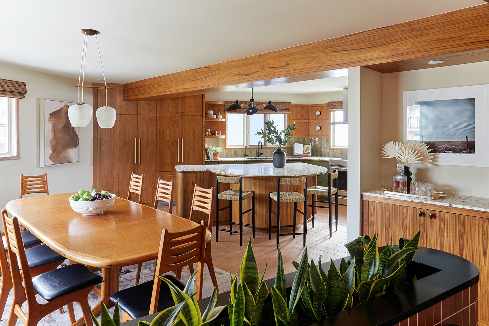
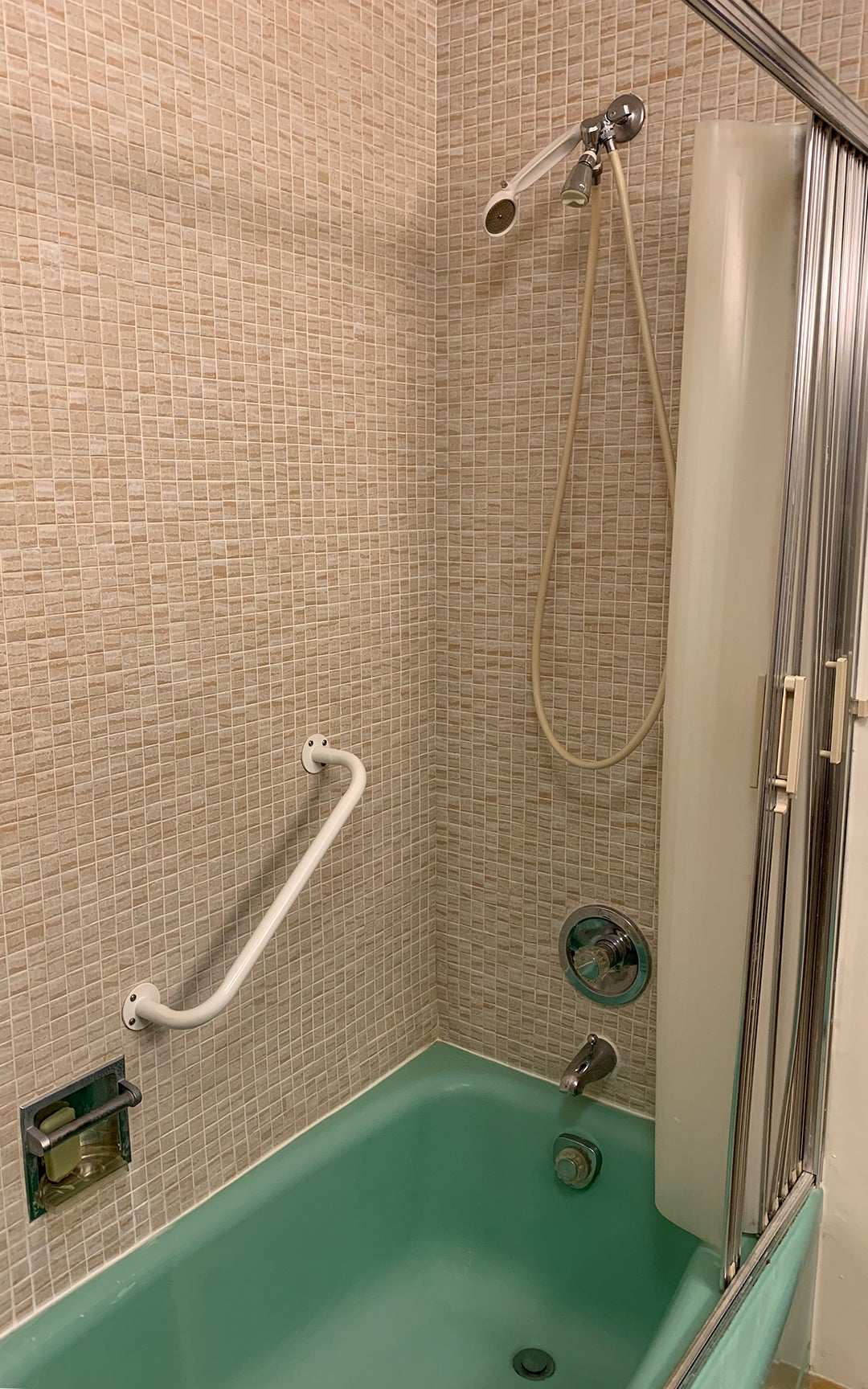
Living up to the home’s true intent, Irwin and her family decided to keep some of its quirky (but seriously functional) elements, like the wood laundry chute panel that’s next to the shower in the main bathroom and the dumbwaiter that allows them to send drinks from the kitchen to the living room. “Those little kitschy things were nonnegotiables,” says Irwin. “In hindsight, it was harder to design around them, but I’m glad we preserved them and continue to use them.”
The post When This Family Bought a Maple Leaf–Shaped House, They Inherited More Than Its Tricky Angles appeared first on domino.

