This Designer Mom Reimagined Her Home’s Wet Bar as a Playroom
Posted by admin on
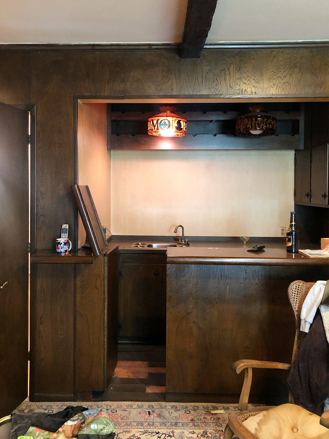
Studio AF founder Ariella Fried’s biggest revelation while renovating her Los Angeles ranch-style home came when she was designing the wet bar. Well, really she was redesigning the existing feature, trying to figure out how to make the dated, dark wood alcove feel chic with some new pendant lights and marble countertops. “Then I realized I could just gut it all out,” recalls Fried. “Sometimes when you see a space with a certain program, you think it has to be that way. You get stuck and just want to replace what you see.” Catching her mistake early, she put down the bar blueprints and started a new sketch—one for a playroom.
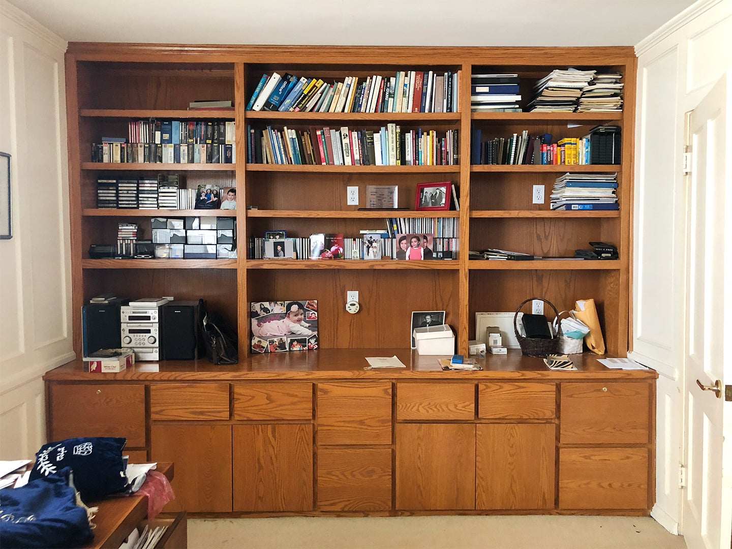
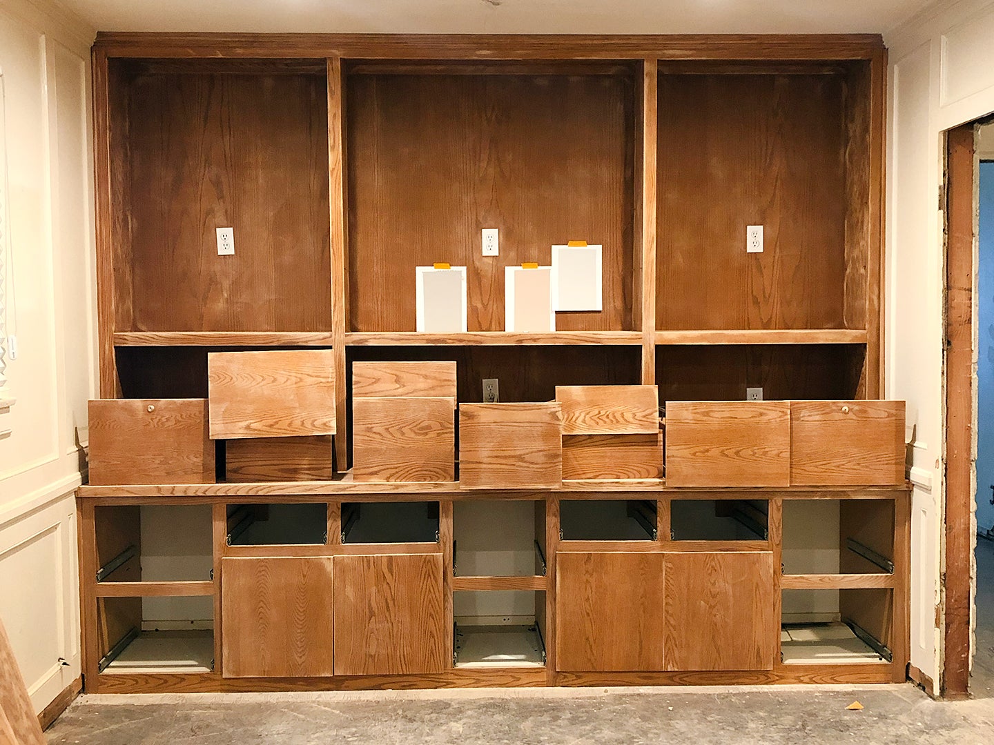
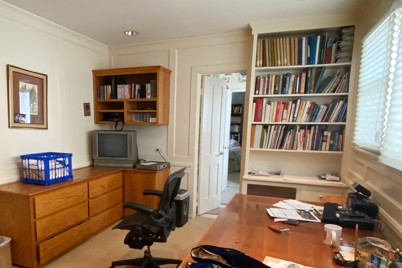
Fried wanted to create a formal play space for her now 2-year-old daughter, Claire, so she decided to rip out the cabinetry and plumbing and add drywall to the nook-like area. She took a similar approach with her little one’s nursery, too, which was a full-on office when the designer and her husband bought the home right when the pandemic hit. But this time she didn’t scrap everything. “The built-ins were the best find, because custom millwork can be so expensive these days,” she shares. “I tried to preserve it as much as possible.” While some rooms require a totally new perspective once you have a child, others just need a little tweaking. Read on to learn more about how she made these spaces toddler-proof.
The No-Commitment Playroom
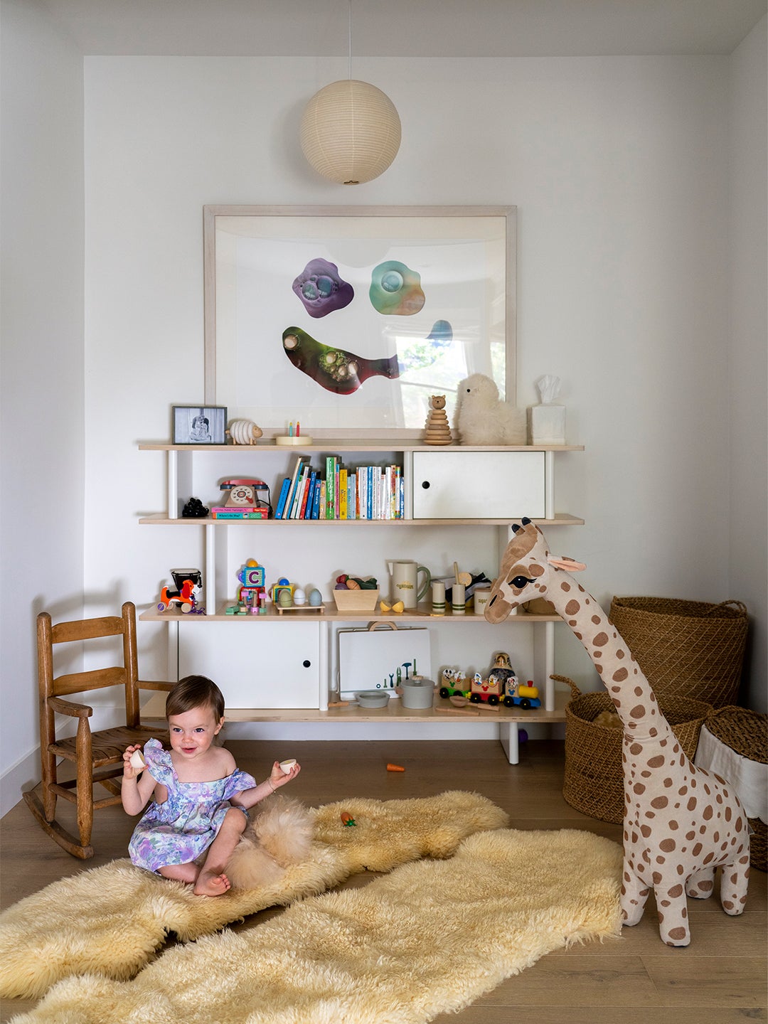
A perk of turning the old bar area into a play space is that it’s connected to the living room, so Claire is never out of sight when Mom and Dad are relaxing, but it’s tucked away so her toys don’t spill into the adjacent space. “We can still use the living room to entertain, and we didn’t have to compromise on furniture,” notes Fried. In her kiddo’s corner: a thrifted rocking chair (a free sidewalk find), cozy shag rugs that are perfect for the crawling stage, and a colorful smiley face print (it’s actually images of wet paint bubbles) by family friend and artist Aaron Axelrod. Now that the bones of the nook are essentially three blank walls, the spot can serve as a reading corner or just an extension of the living room in the future when Claire doesn’t need a dedicated play space.
The Bookshelf–Turned–Baby Station
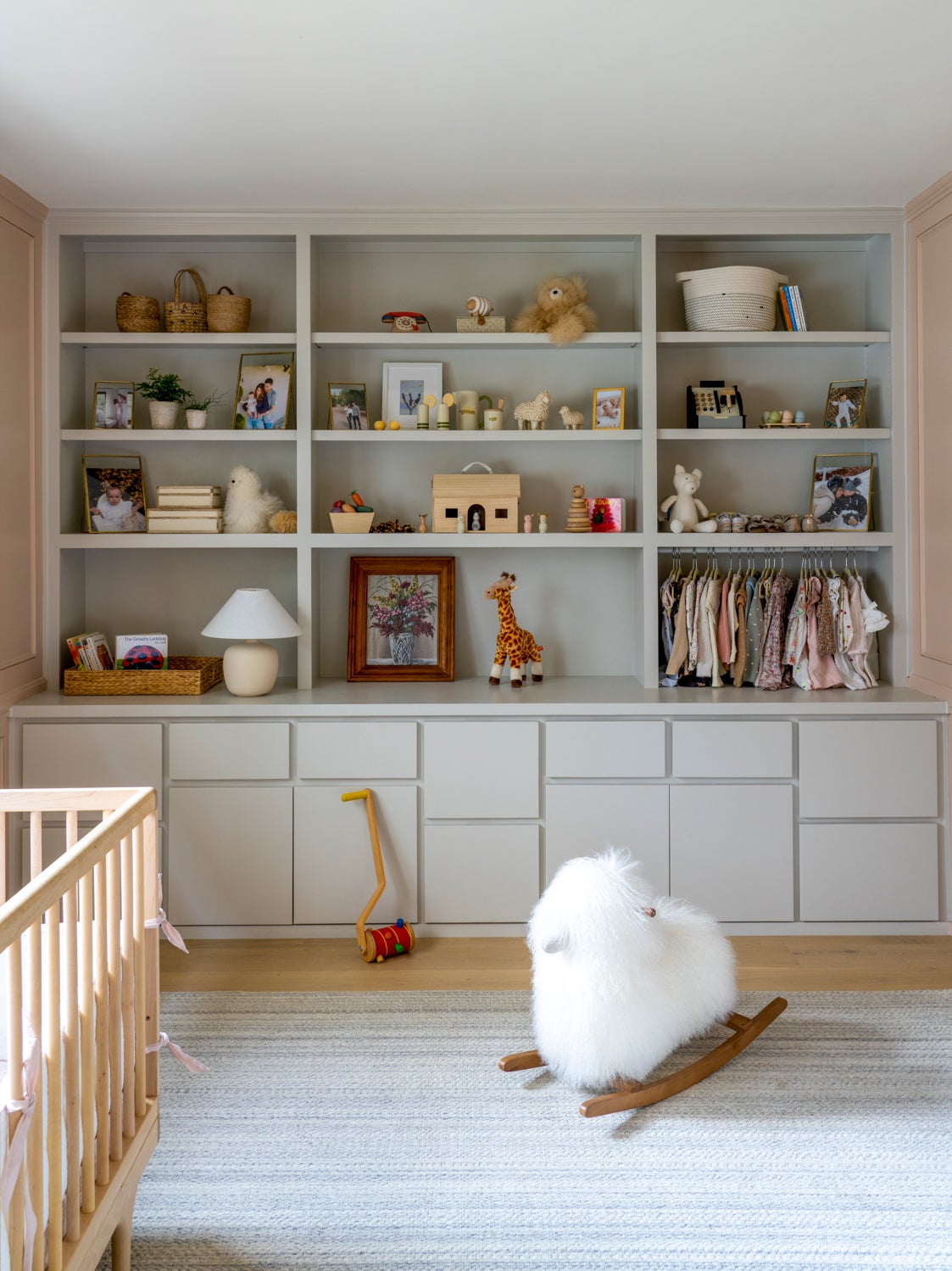
Given there was no walk-in or reach-in closet in Claire’s nursery, Fried sought to utilize every existing drawer and shelf within the existing bookcase. First, she had the structure stripped, sanded, and painted in Ammonite by Farrow & Ball and removed and patched outlets and lock keyholes. An unexpected bonus? The many oddly sized cubbies proved to be great for storing baby essentials. Even the trash can is disguised behind a lower cabinet. “I found a way to have a compartment for everything,” she says. Diapers, wipes—it all fits perfectly. As for Claire’s prettiest clothing staples, those now hang on a $10 tension shower rod underneath a shelf, nixing the need for a separate freestanding wardrobe or armoire altogether (at least while her wardrobe is this tiny).
The Adult-Approved Shade of Pink
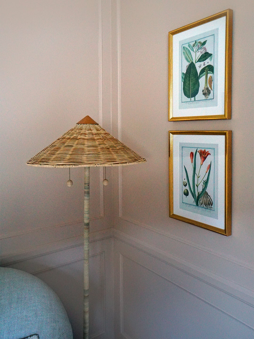
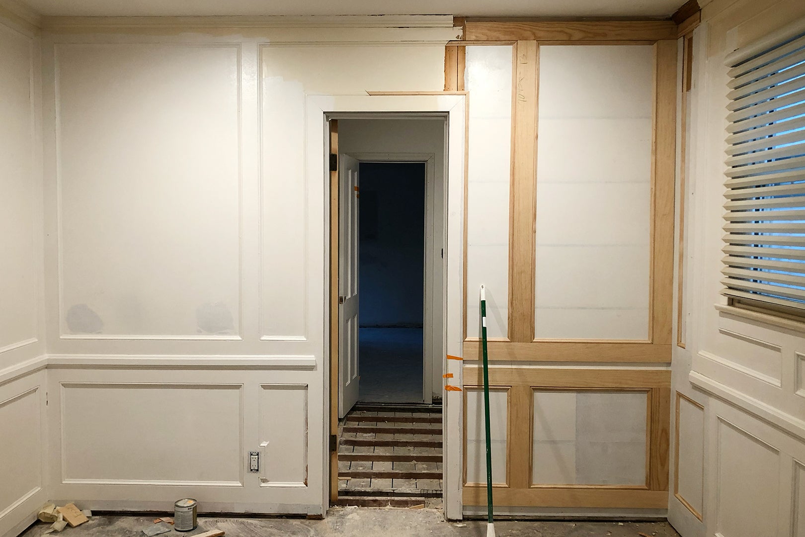
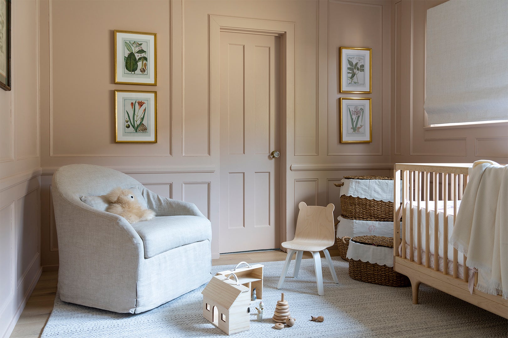
The one thing Fried gutted from the nursery was the built-in bookshelf on the opposite wall by the door that leads to the bathroom. After tearing out the unnecessary storage, she replicated the circa-1940s molding around the rest of the walls so it looked like it had always been that way (she chopped off a sample piece from every detail in the room and had it matched by a woodworker). Next up: She coated the walls in Setting Plaster, also by Farrow & Ball. “Everyone who comes into my house, the first thing they ask is what color pink this is,” says Fried. The dusty shade, which has a hint of yellow in it, is soft enough that it doesn’t feel babyish, so it can evolve with Claire’s bedroom decor as she gets older.
The British-Inspired Bathroom
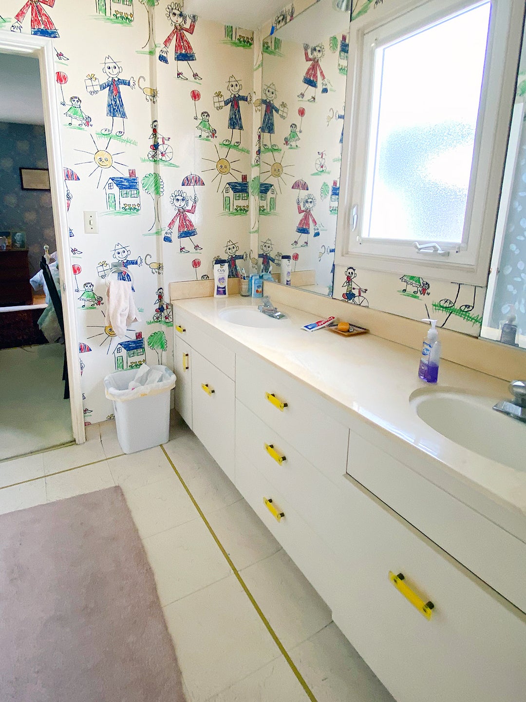
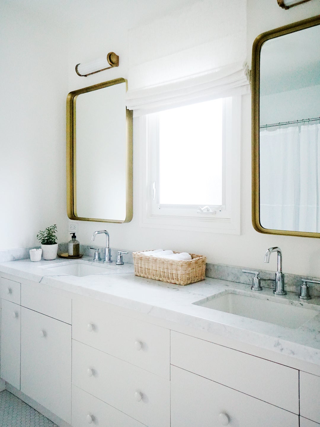
The Jack-and-Jill remodel happened on a tight budget (Fried didn’t want to spend $20,000 on the space, so she found a way to make it appear new without putting in a ton of work). The only details she replaced were the floor tiles, opting for 1-inch builder-grade white hex tiles that are classic and look more expensive than they really are. Then she swapped the vanity drawer knobs with inexpensive wood ones from Lowe’s and painted everything the same color. “It feels very English,” she says of the clean look. “I tried to simplify and not overdo it.”
The post This Designer Mom Reimagined Her Home’s Wet Bar as a Playroom appeared first on domino.

