This Actor’s Punk Remodel Involves Brass Sheeting and Black Soapstone, Naturally
Posted by admin on
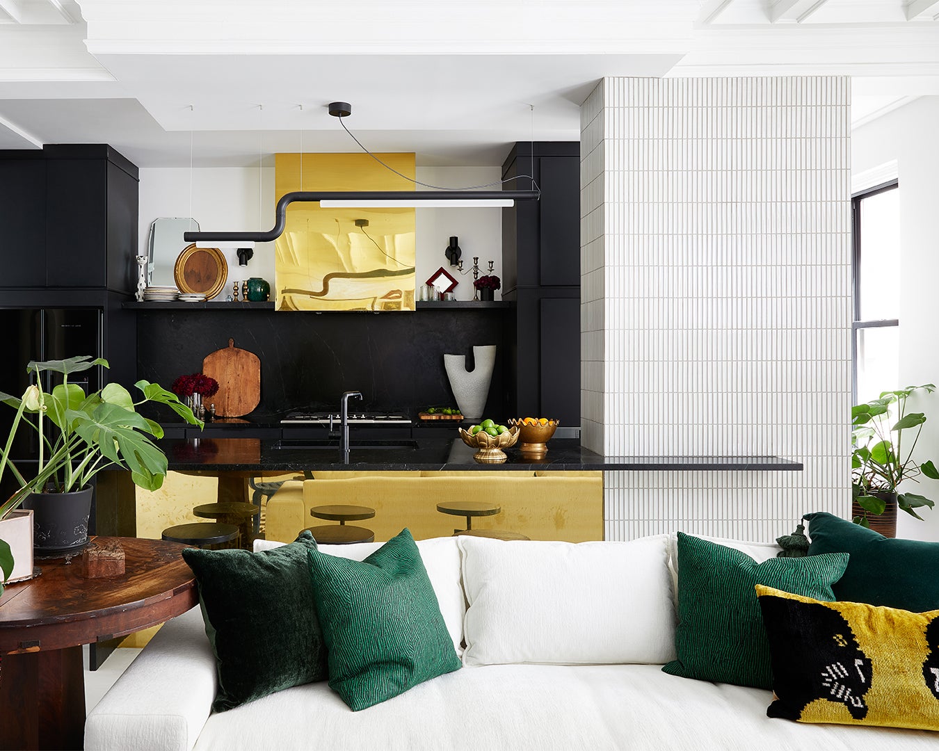
When Broadway actor and singer Betsy Wolfe sat down with her interior designer, Crystal Sinclair, to go over plans for her Upper West Side kitchen renovation, Sinclair was surprised to find a mix of inspiration. “Some of the photos she shared were very bohemian; some were so punk,” recalls Sinclair. But then Wolfe whipped out an image of Jo Sampson’s London kitchen, which features big lightning bolt–shaped hardware on the lower cupboards, and Sinclair had her own lightbulb moment. “That stuck with me,” she continues. “We wanted to create a space that felt vintage and fresh at the same time, sexy and spunky in a mature way…a space that makes you smile and curious about what’s around the corner.”
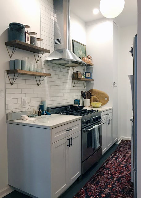
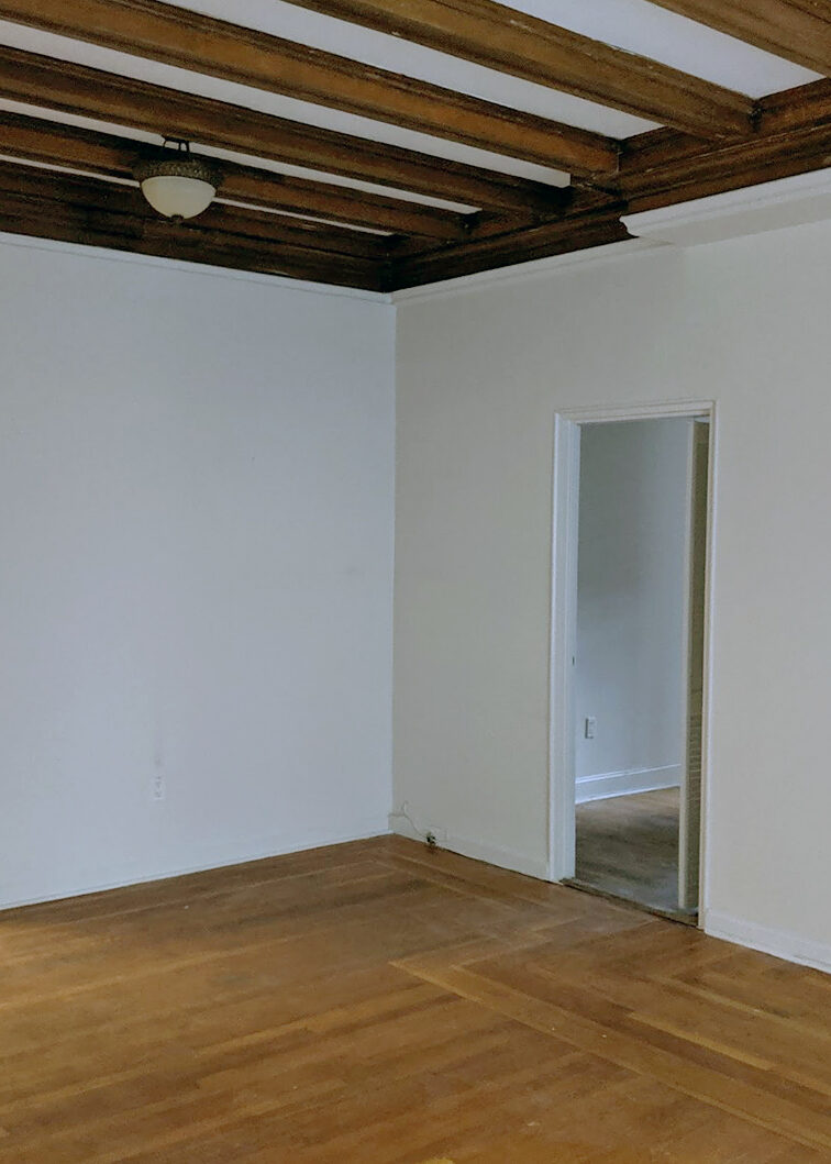
Before Sinclair could bring in any cool hits of brass, there was the matter of joining the apartment Wolfe and her husband, Adam Krauthamer, already owned with the one they had just bought next door. The merger was ideal, as it would leave the couple and their little one with two bedrooms and three bathrooms. The only thing was, it also would leave them with two kitchens. By gutting everything, Sinclair was able to turn one of the kitchens into the new primary bathroom and situate the new kitchen where a living room and bedroom used to be.
In other words, the initial construction phase was one big game of Tetris. Sinclair made the most of it in the end by doing things like cladding the structural wall in the new kitchen in tile. “We wanted to make it fun and intentional-looking versus something that was obstructing the view,” she notes. Ahead, she shares a few more clever design decisions she made in the new kitchen and bathroom.
Va-Va-Vent Hood
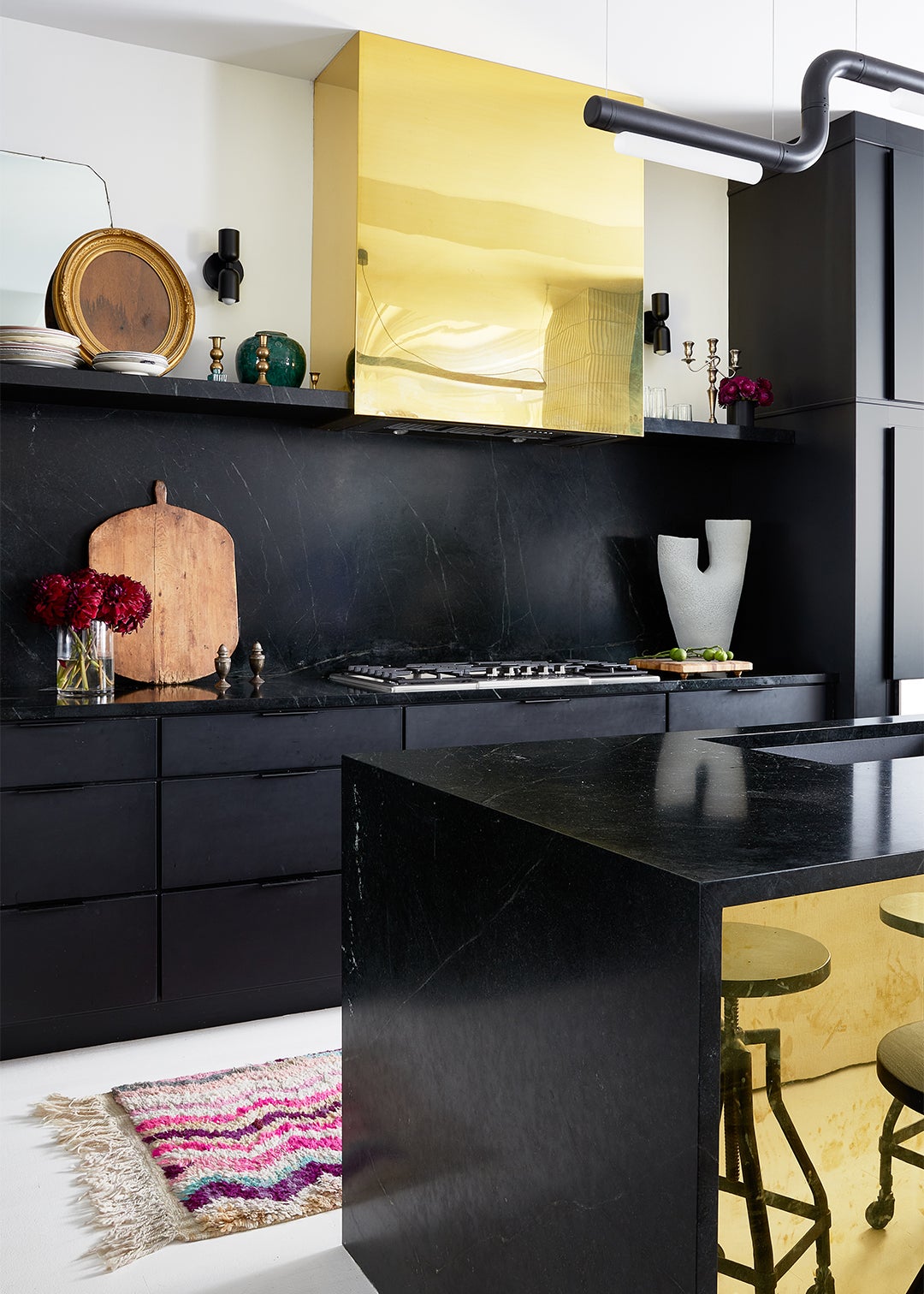
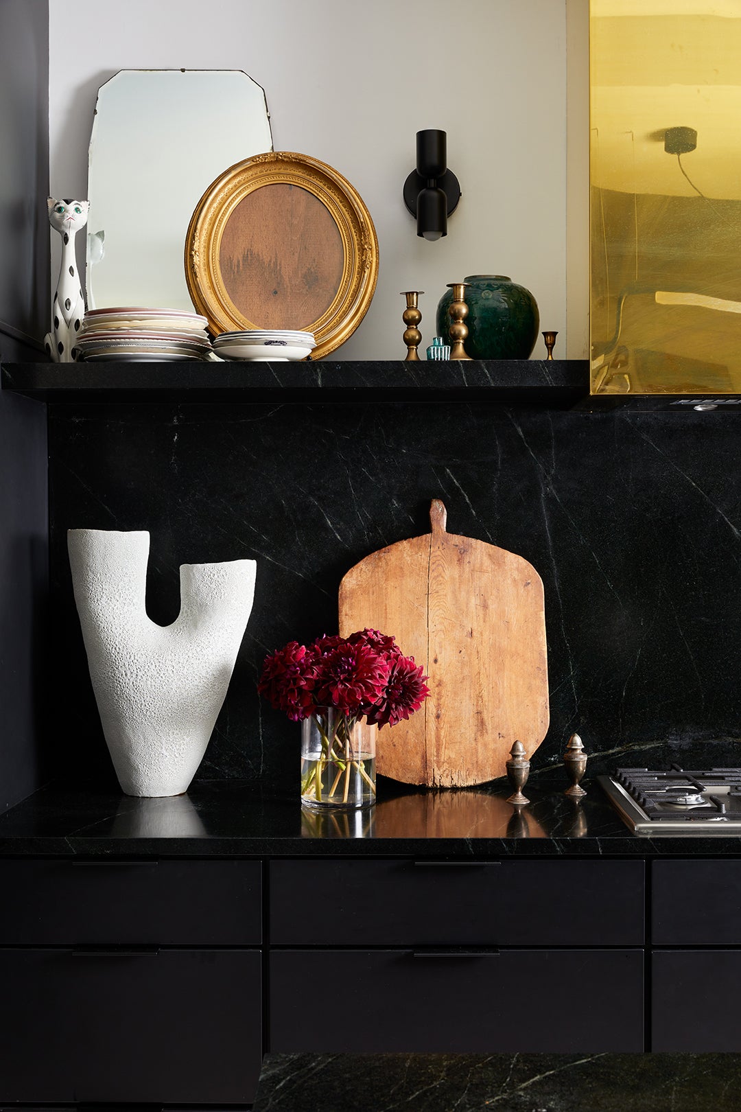
What drew Sinclair to Sampson’s kitchen was the overall punk-glam vibe, so while she wasn’t out to replicate the lightning-bolt hardware, she did want to go in a high-contrast direction. “It all started with soapstone,” she says, noting how the moody countertop and backsplash material is a nice break from the white living room floors and walls.
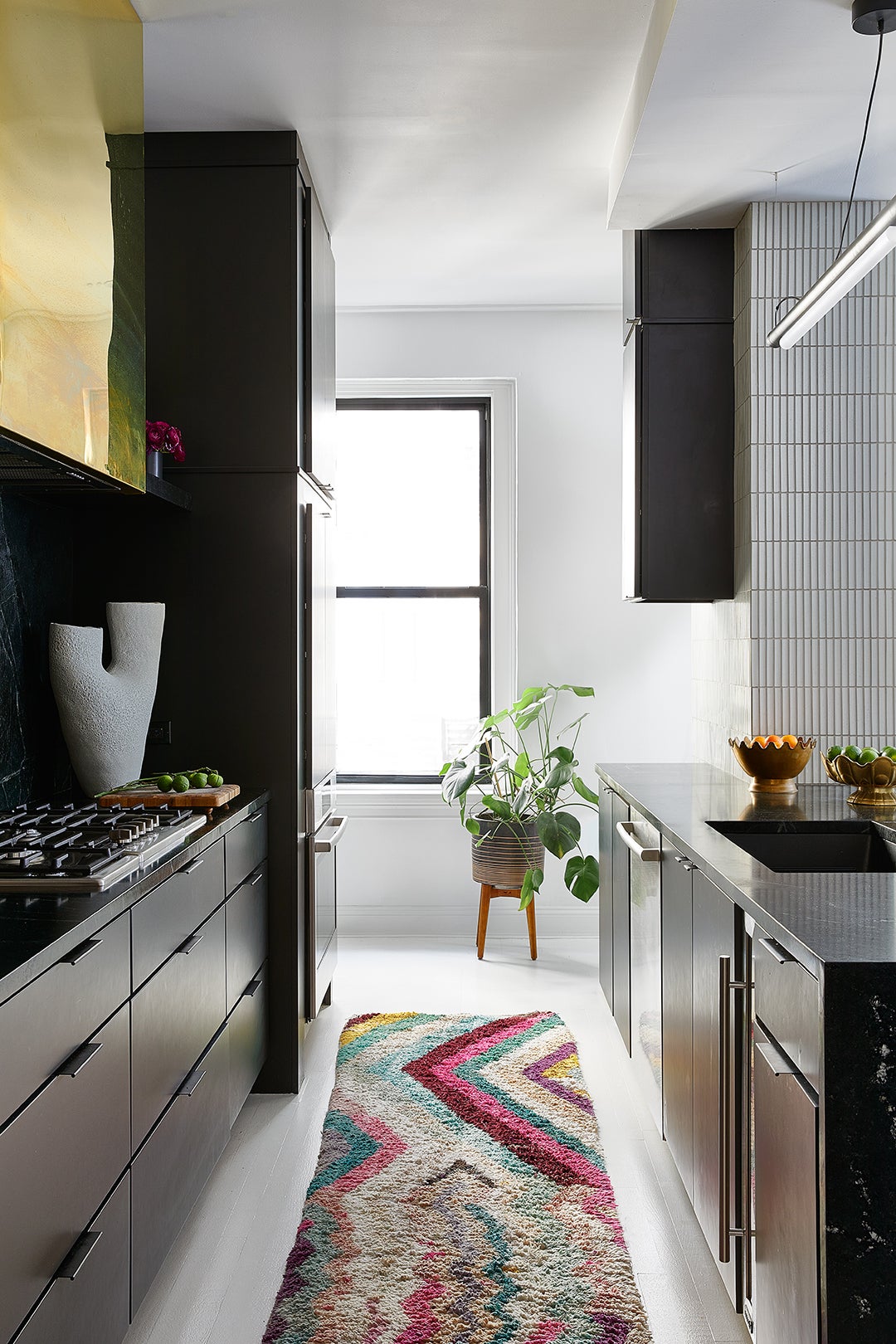
The next natural move was to go heavy on brass. “It’s not crazy expensive, but it’s definitely something to budget around,” shares the designer. Fabricating the vent hood was the priciest bit because getting the corners just right was labor-intensive, while the island piece was a straightforward sheet. “When Betsy’s now 2-year-old started walking, her hands were all over the brass, which Betsy absolutely loves because the metal changes and patinas over time,” shares Sinclair.
Breathing Room
Even though Sinclair had more room to work with after the two apartments became one, at the end of the day it was still a city kitchen with a galley-like layout, so maximizing every inch was the goal. To start, the designer ensured there was at least 42 inches of walking room between the peninsula and the wall cabinets. Her other must-have in a small kitchen? A supertall pantry cabinet. The one in this space is only 10 inches deep and about a foot wide, but it’s perfect. “It can hold cereal, paper towels, whatever,” she notes. And by opting for a wall oven, she was able to incorporate pots-and-pans storage underneath the cooktop.
Ahead of the Curve
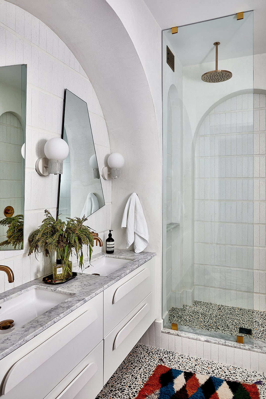
To give Wolfe’s long, white bathroom a jolt of personality, Sinclair framed the vanity with a protruding arch. At first her client was worried the addition would eat up precious floor space (because technically it does soak up some square footage), but the visual effect does just the opposite. “It makes the space look a little larger because it adds dimension,” Sinclair explains.
No More Mirror Image
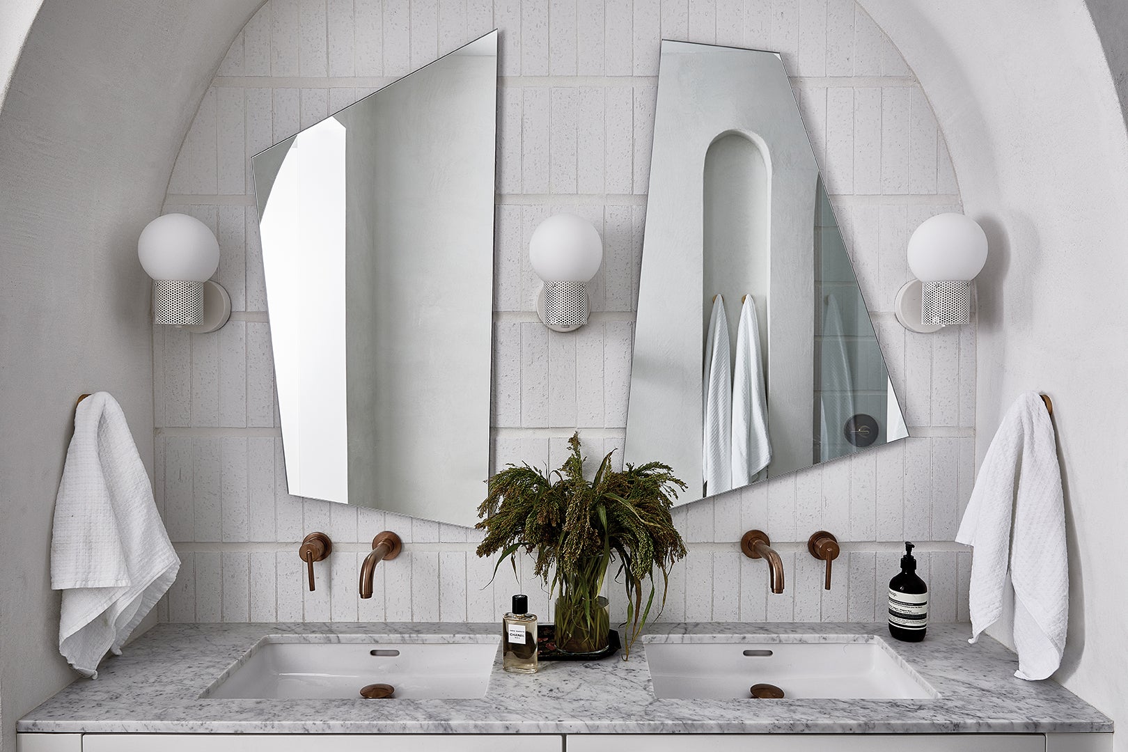
Arch mirrors felt like too repetitive of a choice for the vanity setup, and rectangular ones didn’t feel special enough, so Sinclair sketched out her own angular, asymmetrical versions. Then she handed her drawings off to a local fabricator, who cut them out of sheets of glass and attached them to 2-by-4s so the pieces appear to be floating on the wall.
A Handle on Things
What would a renovation be without an IKEA hack? The simple white floating vanity is from the Swedish retailer, but Sinclair jazzed it up with chic curved pulls from Australian brand So Watt. We’ve got no doubt this hardware will end up on someone else’s mood board down the road. And so it goes…
The post This Actor’s Punk Remodel Involves Brass Sheeting and Black Soapstone, Naturally appeared first on domino.


