

The Greens Have It In 2022! - Color of the Year
Posted by admin on

Greens are popular this year as the major paint companies announce their Color of the Year 2022! - carlaaston.com
We’ve all seen this coming, all those luscious subtle greens creeping into our Instagram feeds on cabinetry, textiles and wallpapers. Well, nothing cements this trend more than the big paint companies calling it out and stating it in a big way.
I’m not talking about Emerald Green or anything too bold, these are more muted greens that are showing up in interiors everywhere.
After being way done with sage green years ago (when it was paired with warm tones), this color sensation, paired with black, white, subtle warm grays and even some warm wood tones, looks incredibly fresh to me and more like a style that is easy to live with for a long time.
Like I shared in a blogpost on hunter green some years ago, an old school hunter green looks totally different paired with a crisp cool toned palette than it did nestled into a melange of warm tones during the “faux Tuscan” period.
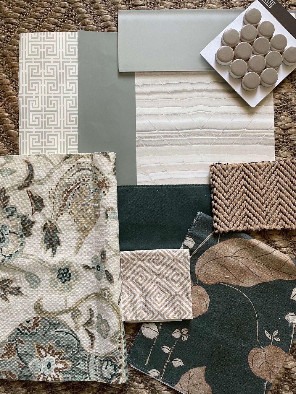
Sherwin Williams 2022 Color of the Year - Evergreen Fog
I love this color that Sherwin Williams chose as their COTY.
Evergreen Fog has a bit of a gray undertone, it’s not too warm. It’s the perfect value (lightness/darkness) to me, for a medium color. It’s value makes it look dark when paired with light colors and light, when paired with darks.
I really love colors that sort of sit in that middle ground. It makes it easy to use just about anywhere, on walls, cabinetry, even ceilings.
I’ve paired it with a few wallpapers and fabrics, below. I think it would work nicely on a bathroom cabinet, and would pair well with a cashew color, like below. It would even work with some travertine look tiles. This color palette would make that kind of pinky beige color of travertine look intentional.
Greens are popular this year as the major paint companies announce their Color of the Year 2022! Sherwin Williams, Evergreen Fog, COTY 2022 | Color Palettes and Color Schemes for Interior Home Decorating | carlaaston.com
It is slightly cooler toned than the Benjamin Moore one, below, so if you are on the hunt for a nice medium sage-y green that feels a little more neutral, try Evergreen Fog.
Benjamin MOore 2022 color of the Year - October mist
This green is a little lighter in value (lightness/darkness) than the SW color, and is slightly warmer. I’m pretty shocked that both of these big brands came out with colors that are so close to each other. They all must be seeing a lot of sales of green color paint!
With the warmth that this one has, I feel like you can lean into the avocado/olive tones some, and then pair it with dark gray-browns, whites and this lovely straw or mushroom shade. Some delicious wood tones would be nice too:-)

Greens are popular this year as the major paint companies announce their Color of the Year 2022! - Benjamin Moore, October Mist, COTY 2022 | Color Palettes and Color Schemes for Interior Home Decorating | carlaaston.com
Behr Color of the year 2022 - Breezeway
Behr also chose a green tone for their Color of the Year, Breezeway. It’s more minty and light….a pretty, soft shade that would make a great backdrop for several different palettes.
Wouldn’t it make a lovely color for a bathroom or a bedroom?
I have a wallpaper, white marble, brass finishes and a gold finished mirror frame assembled in a flatlay with it, below.
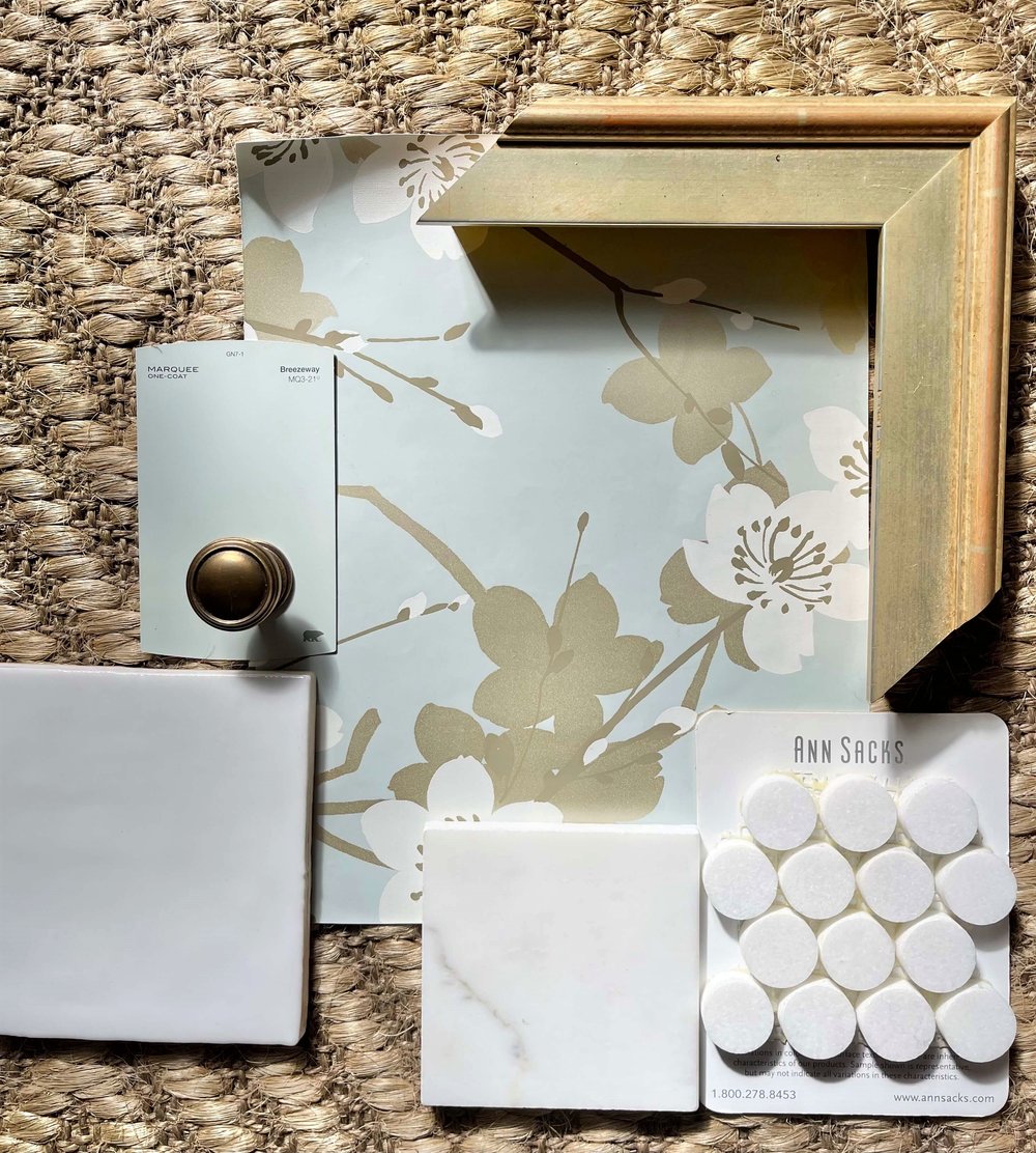
Behr Color of the Year 2022 - Breezeway | The Greens Have It In 2022! - COTY | Color Palettes and Color Schemes for Interior Home Decorating | carlaaston.com
Here are some minty fabrics paired with whites that would look great with this pretty color. Perfect for a bedroom!

Behr Color of the Year 2022 - Breezeway | The Greens Have It In 2022! - COTY | Color Palettes and Color Schemes for Interior Home Decorating | carlaaston.com
Pantone releases their COTY in early December every year, so I’m looking forward to seeing which color direction they will go. Look for that in the next few weeks!
The difference between paint companies that name colors of the year and Pantone, is that Pantone has a lot to do with other industries as well, like fashion, cosmetics, graphic design, etc. Pantone’s color selection may take time to filter into home design and decor.
Download my sources!
Curious about a specific fabric or wallpaper up there in these flatlays / moodboards? I’ve got the lists of sources with links, immediately available when you subscribe below.
Subscribe to my blog for design insights, advice and inspiration sent twice weekly to your inbox. You'll get the source lists for the fabrics, tile, and wallpapers above, when you sign up. The link pops up right here when you enter your email address below. (Don't worry, if you are already subscribed, you won't be subscribed twice!)Thank you! Here’s your Source List for the fabrics, tile and wallpaper shown in the images above. Thank you!
Check out more color schemes, flatlays and moodboards in these posts below.
Pin this to Pinterest to save for later reference!
