Studio Vaaro reconfigures House M using built-in storage volumes
Posted by admin on
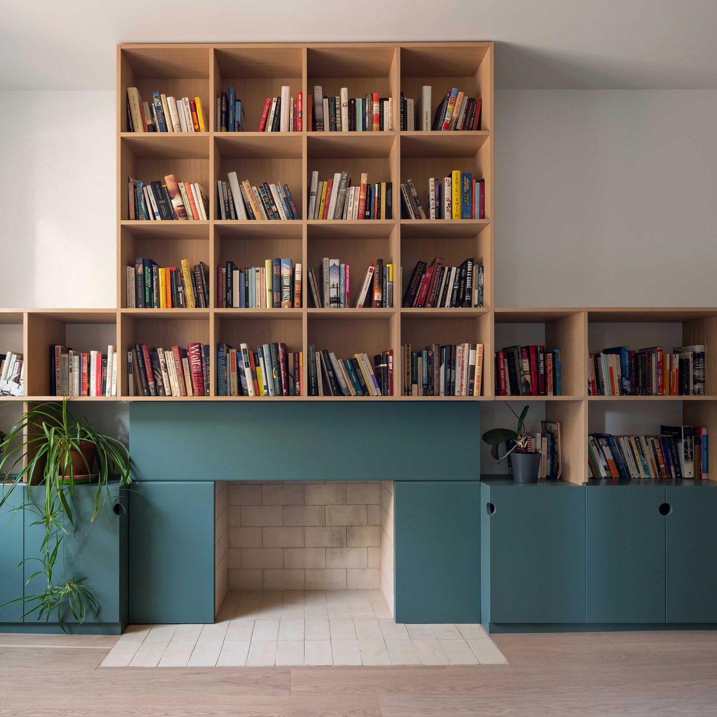
For the renovation of a house in Toronto's West End, local firm Studio Vaaro added minimally detailed millwork to form kitchen cabinetry, the staircase and a feature bookcase in the living room.
Studio Vaaro's overhaul of House M, a three-storey detached property that had been renovated and extended multiple times over the years, involved reconfiguring the layout to remove the awkward subdivided spaces.
"Our clients were a professional couple with two young children, who were looking for flexible and resilient spaces that could accommodate their home offices, overnight guests, and the changing needs of their growing children," said the studio.
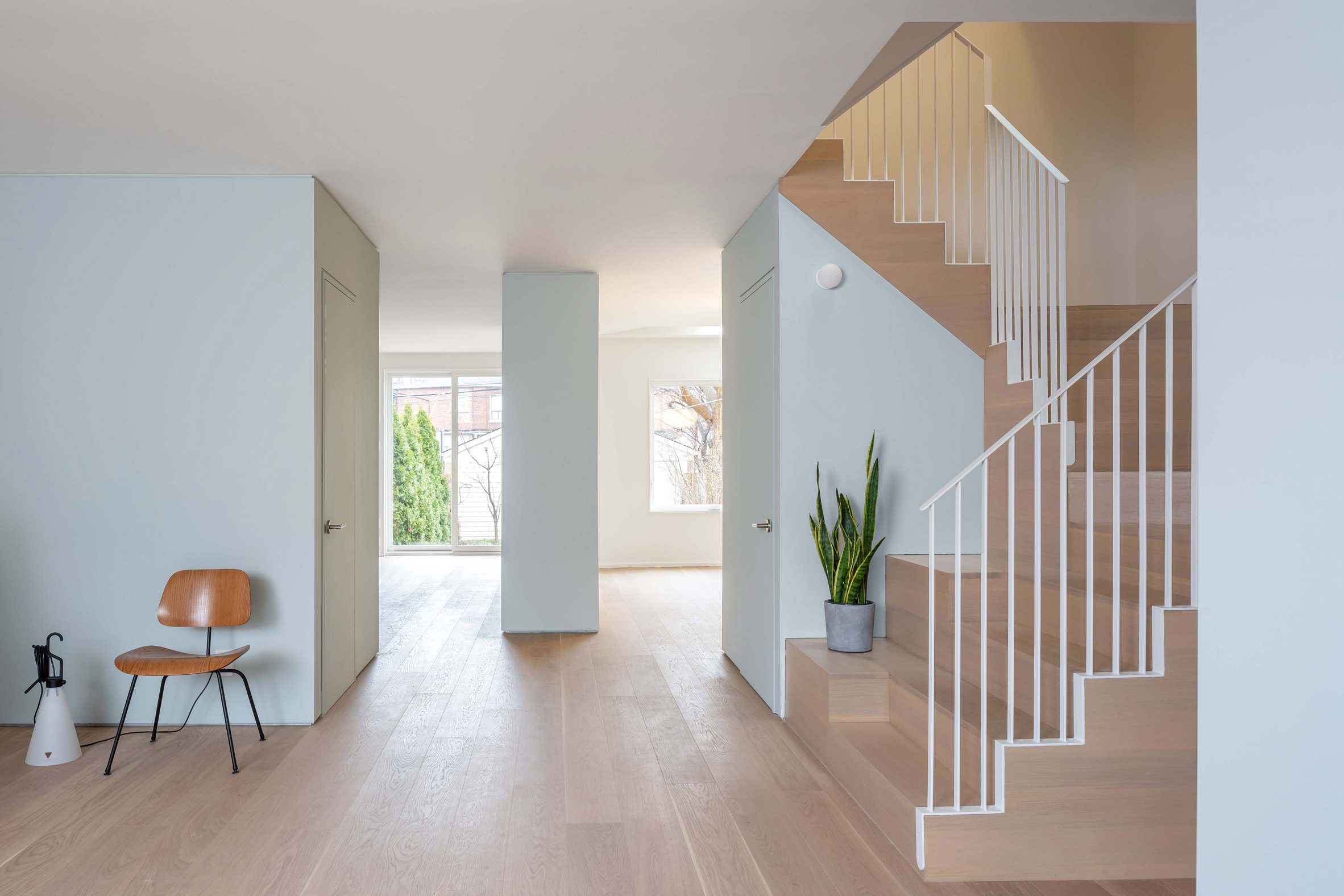
"We, therefore, developed a spatial concept based on 'functional volumes', in which well-proportioned spaces are partitioned by blocks of storage and service functions."
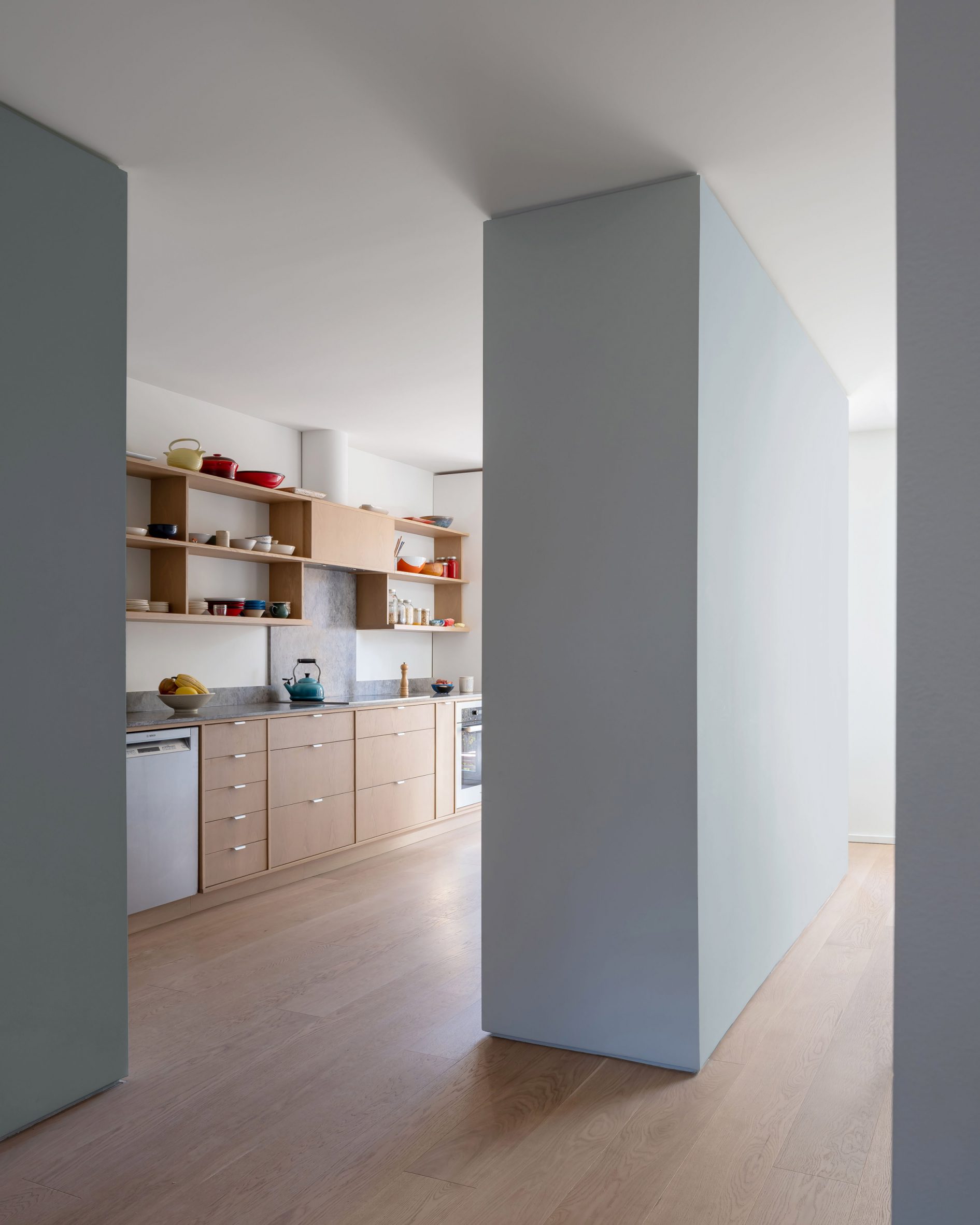
These built-in storage blocks partially partition four rooms on the ground floor while keeping an open flow between them.
Laid out in a diamond formation, all are coloured pale blue-grey to highlight their function against the otherwise white walls.
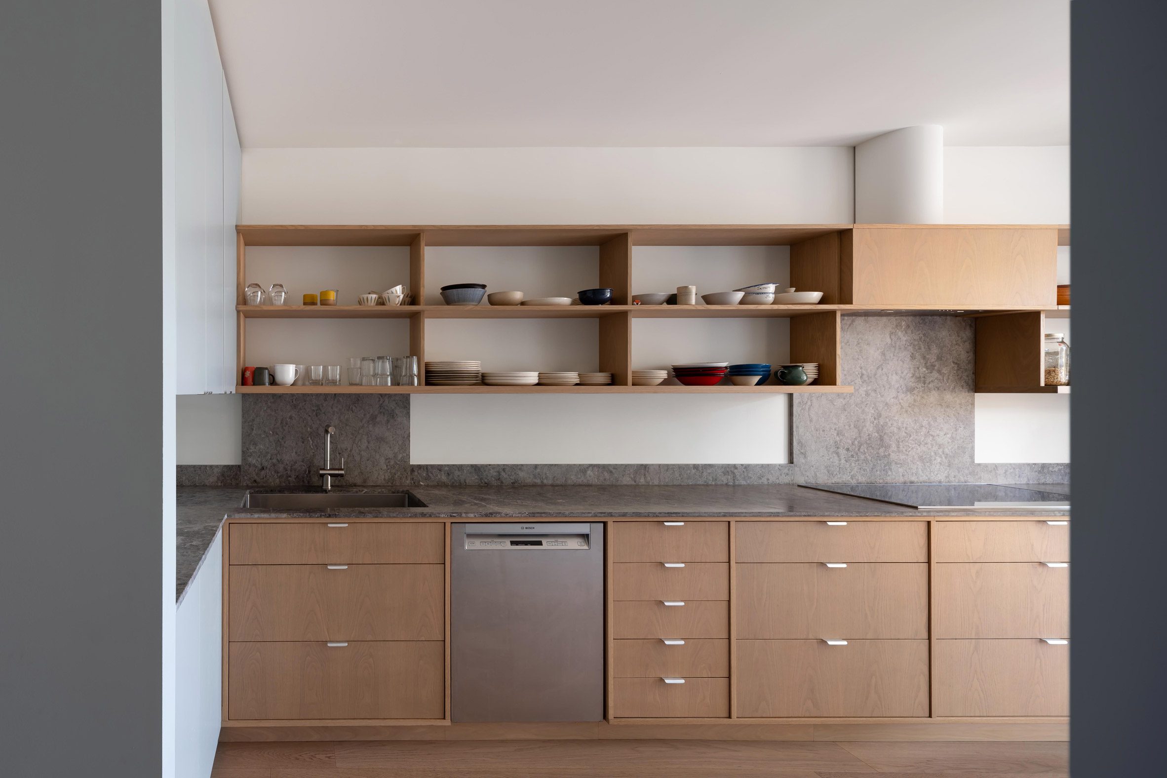
"The large amount of built-in storage ensures the rooms themselves are free of clutter and ready for use," said Studio Vaaro. "In line with the family's personalities, colour and playful details abound."
In the entryway is a coat closet that hides the view of the living room behind, where an oak bookcase sat atop a teal powder-coated fireplace covers almost an entire wall.
A powder room is placed between this space and the kitchen, also forming additional cabinet and counter space within its volume.
Further kitchen storage sits in front of the dining room, and another closet is tucked under the doglegging staircase.
"A 'mixing bowl' at the centre of the plan, at the base of the stairs, visually and physically connects all four spaces," the studio said.
Both the entry and the dining room volumes are pulled away from the home's exterior walls, allowing additional views between rooms.
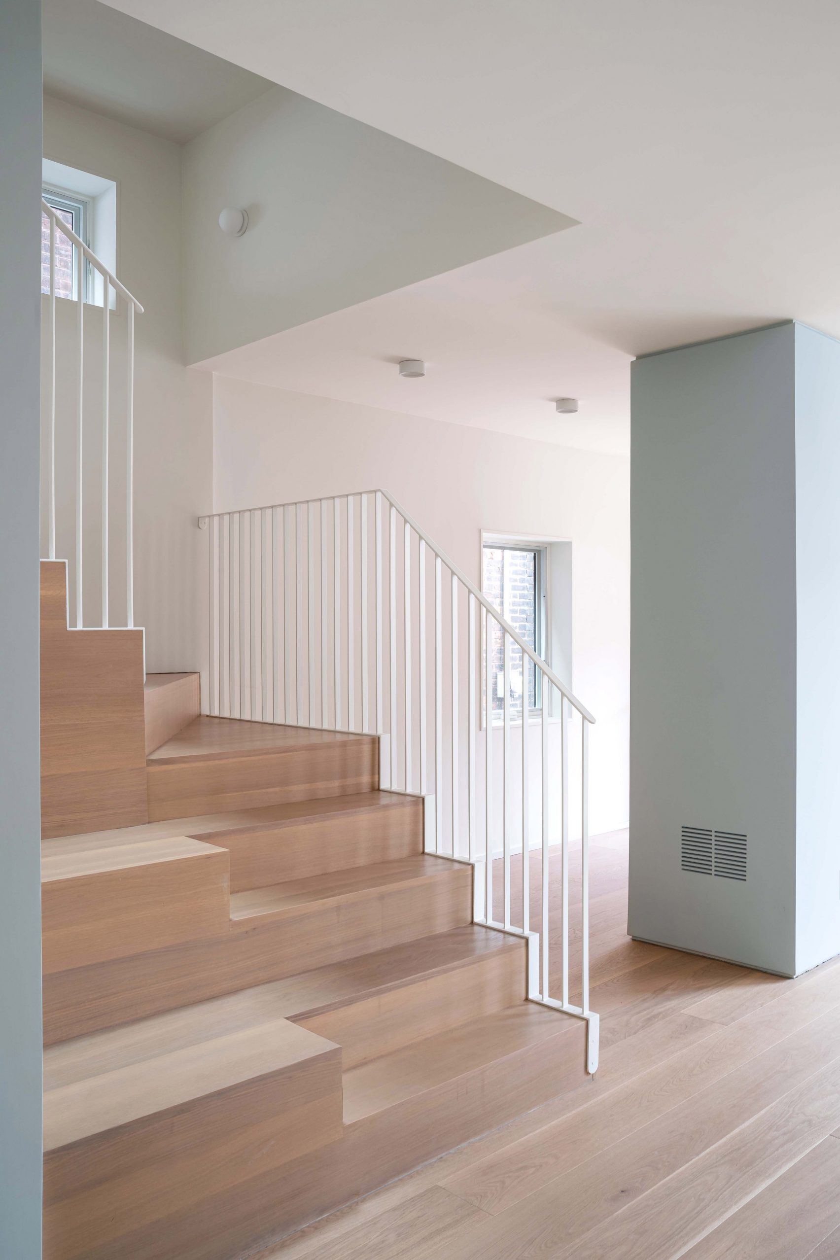
The remaining built-in furniture is oak to match the flooring that runs throughout, including kitchen millwork and the staircase, which incorporates oversized bleachers for displaying kids' artwork or creating extra seating during a party.
A white metal "picket" guardrail, softened with rounded details, allows light to pass down from the upper levels.
On the first floor, two parallel volumes separate the children's rooms at the front of the house and the primary suite at the back from the central corridor.
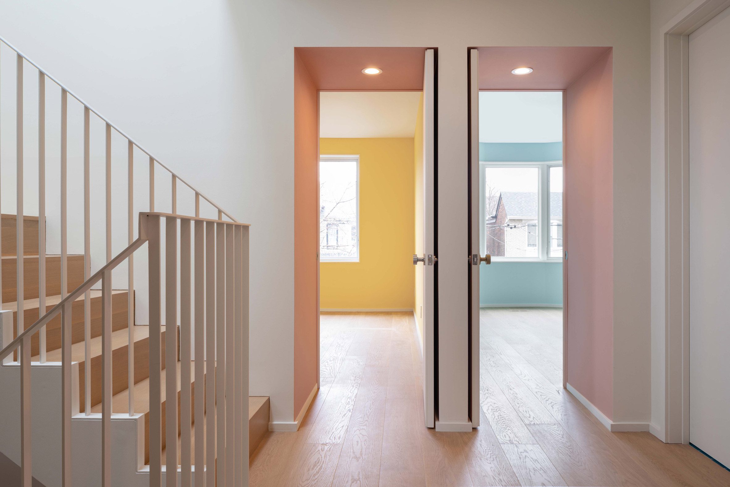
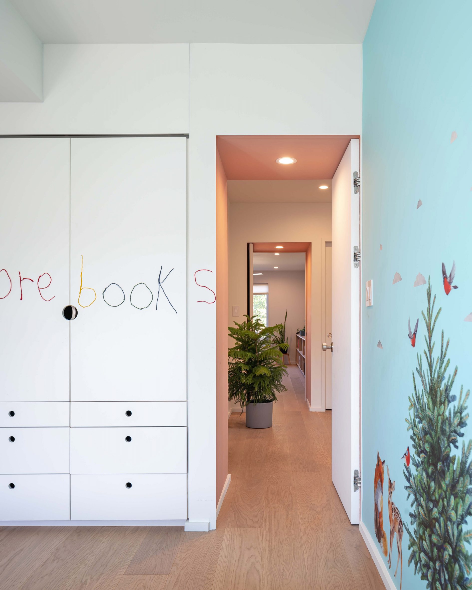
These create both storage for the rooms, and deep doorway portals that are highlighted in dusty pink.
Carefully considered details include recesses for the door handles, allowing the doors to open the full 90 degrees without banging into the wall.
Work and study spaces in the attic are minimally furnished, though feature built-in desks that step up to form shelves behind.
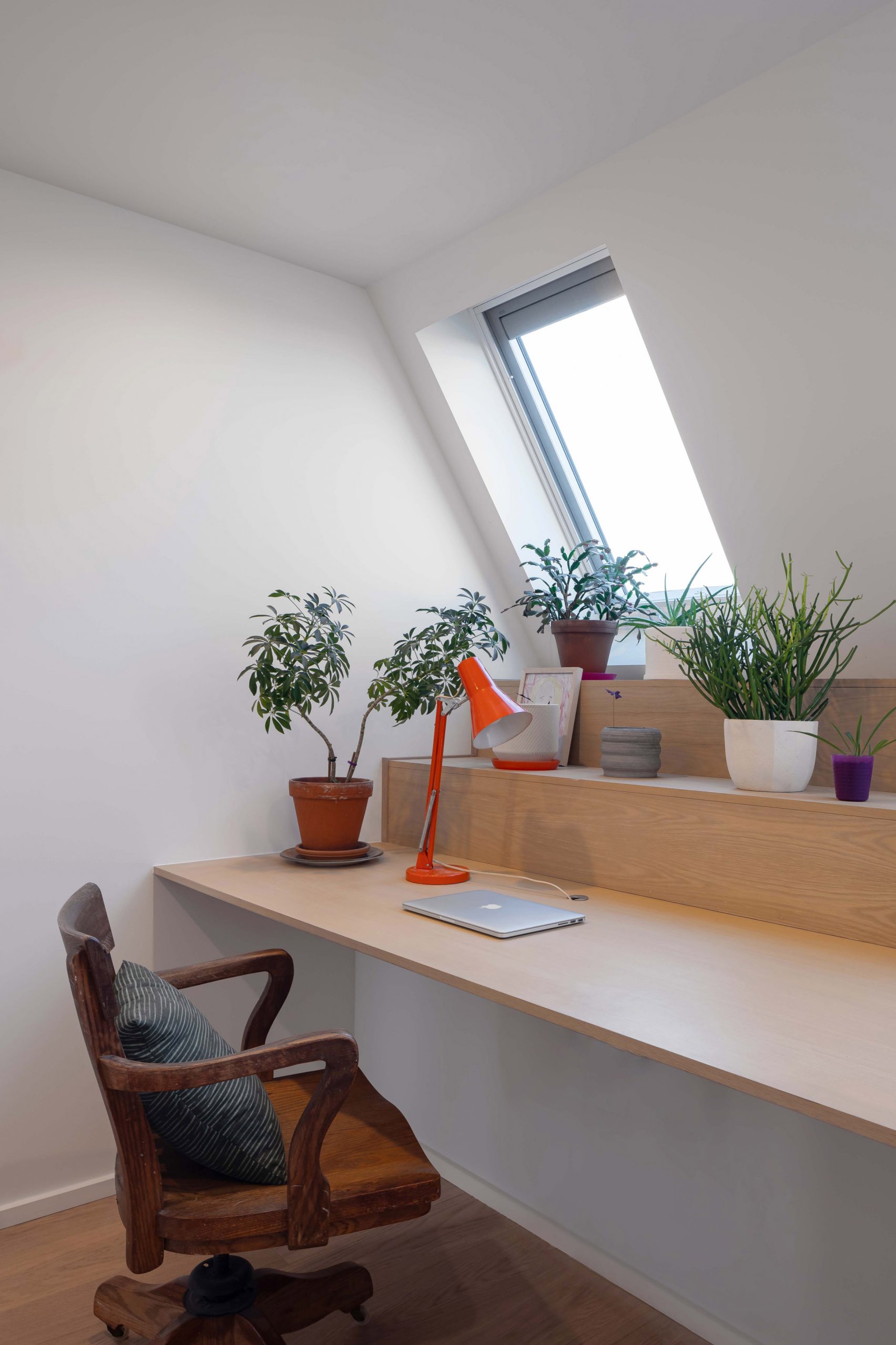
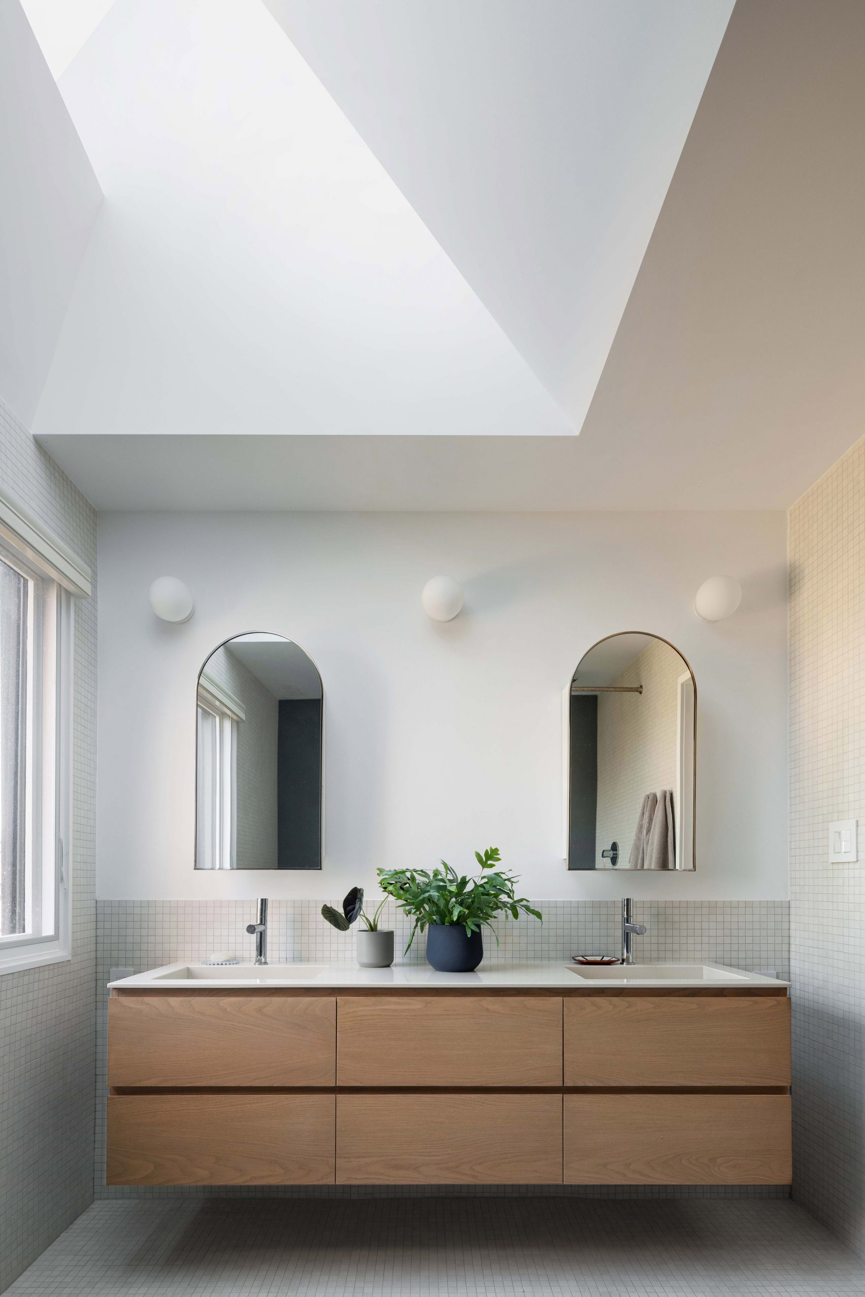
Skylights in the stepped, angled roof planes on all three floors bring extra light into the dining room, primary bathroom, and the stairwell.
Other Toronto homes that have undergone extensive renovations to make them better suited for their occupants include a 14-foot-wide house where pale woodwork forms storage to make more space, and another "disguised as a gallery" – both designed by StudioAC.
The photography is by Scott Norsworthy.
Project credits:
Team: Aleris Rodgers, Francesco Valente-Gorjup, Shengjie Qiu.
The post Studio Vaaro reconfigures House M using built-in storage volumes appeared first on Dezeen.
