Post-Reno, This Home’s Curvy Staircases Don’t Look Stuck in the ’90s Anymore
Posted by admin on
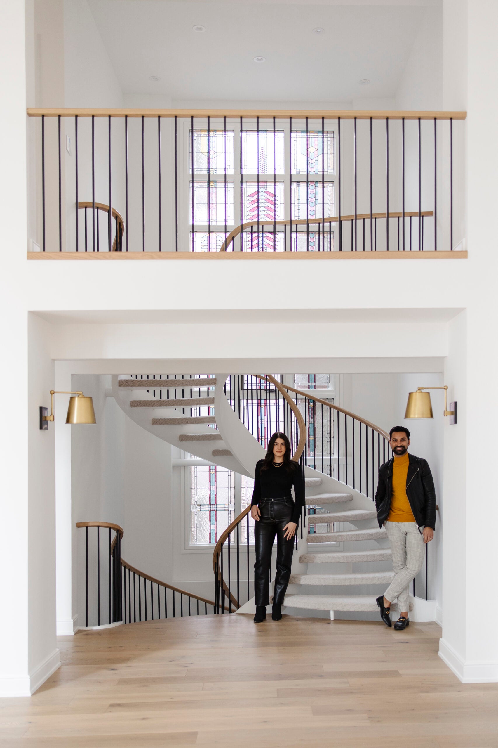
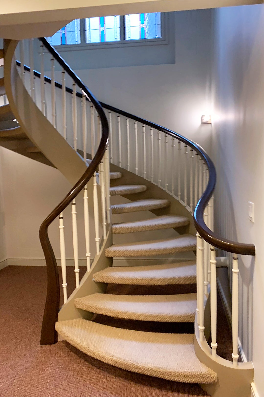
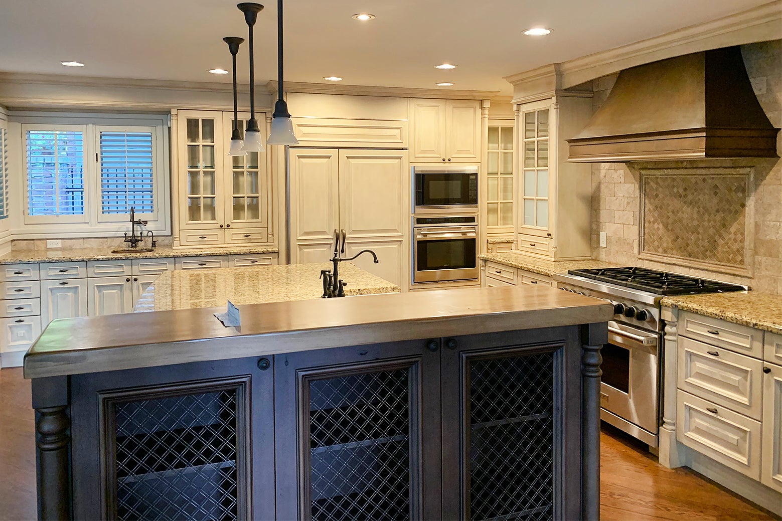
Alykhan Velji’s latest renovation project will look familiar to anyone who grew up in (or knew a friend with) a house built in the mid-’90s. When the Calgary-based designer and principal of Aly Velji Designs and his colleague, Erika Keskitalo, first stepped inside the expansive home, the kitchen was a sea of granite countertops and sandy-white cabinets, while the mezzanine-like second-floor hallway featured a long stretch of railing. There was also way too much stone happening. “At the time, everyone wanted to use stone and it was everywhere, but I think they overdid it a bit,” says Velji, who was tasked by a family of five to bring the dated space up to speed, starting with the central spiral staircase.
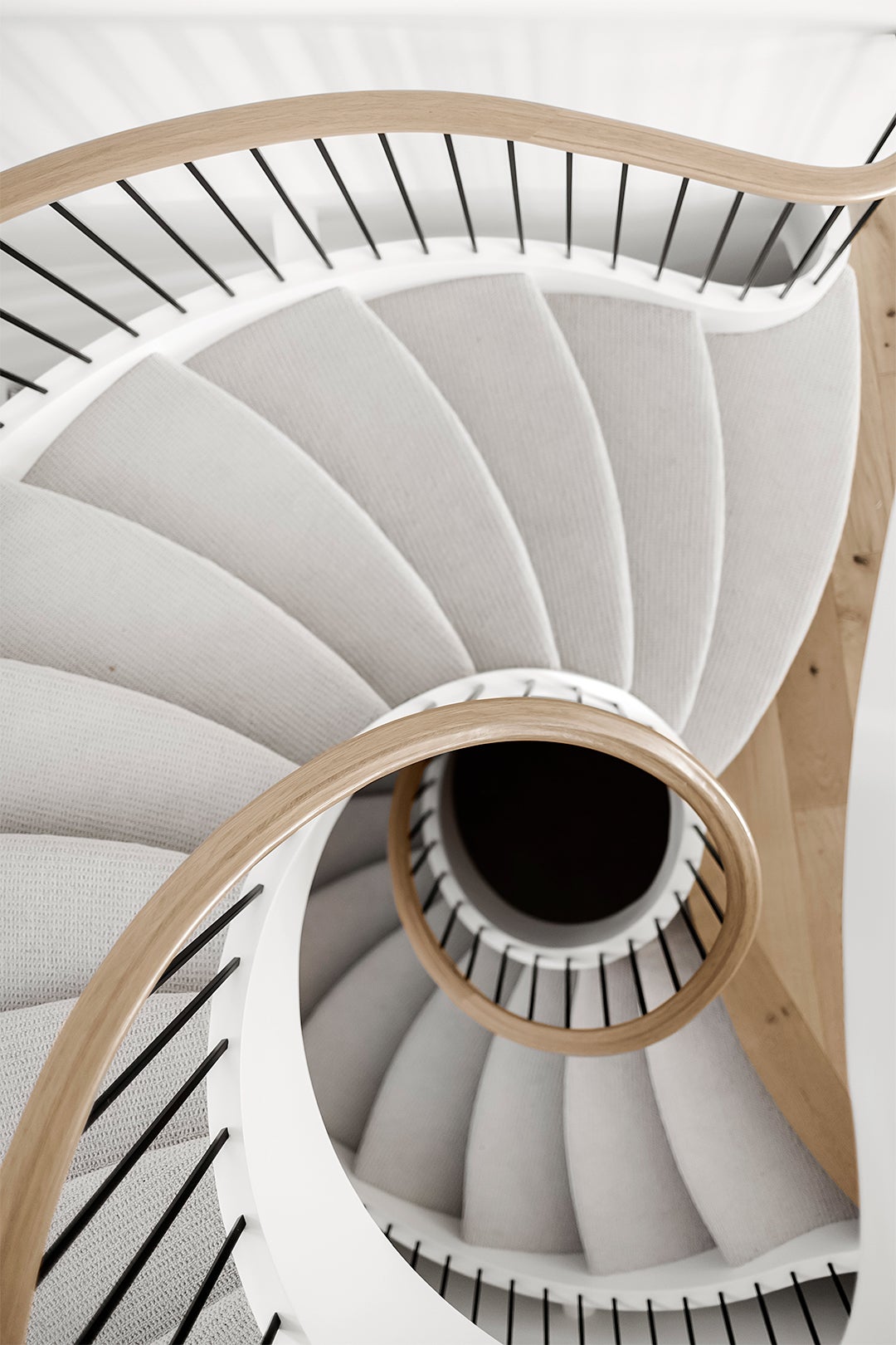
Rather than construct a streamlined, modern version in its place, Velji and his team, along with the builder, Rawlyk Developments, decided to revamp the existing structure’s railing, which extends down into the basement. It took two tries to nail the continuous swoop. “It was hard to get that exact curve,” notes Keskitalo. Once the fresh oakwood handrail and sleek black spindles were in place, they painted the stringers the same cool white as the walls and re-covered the steps in a soft cream (and kidproof) carpeting from Karastan Carpet. Next up: the second staircase. Yes, there are two!
Close the Gap
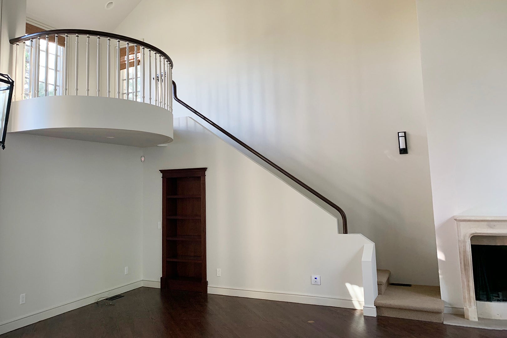
The additional staircase located in the breezy formal living space was a must-makeover: It wasn’t up to code. Velji focused on adding height to the railing and softening the shape with a swirl detailing on the post. Rather than leave the spindles exposed, they drywalled everything, including the part of the second floor that looked like an interior balcony. “It created a little bit of privacy and cleaned up the whole wall, while still allowing all the beautiful light to come through upstairs,” says the designer. Due to budget constraints, they weren’t able to replace the stone fireplace mantel, but a new plaster treatment on the massive wall gave the room the right hit of texture.
Paint It Black
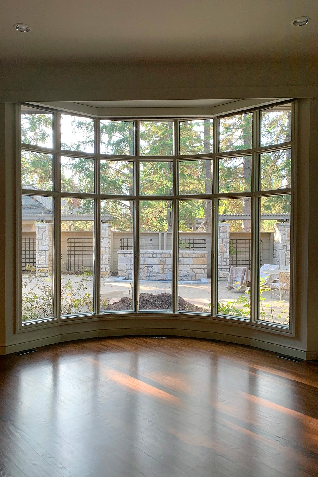
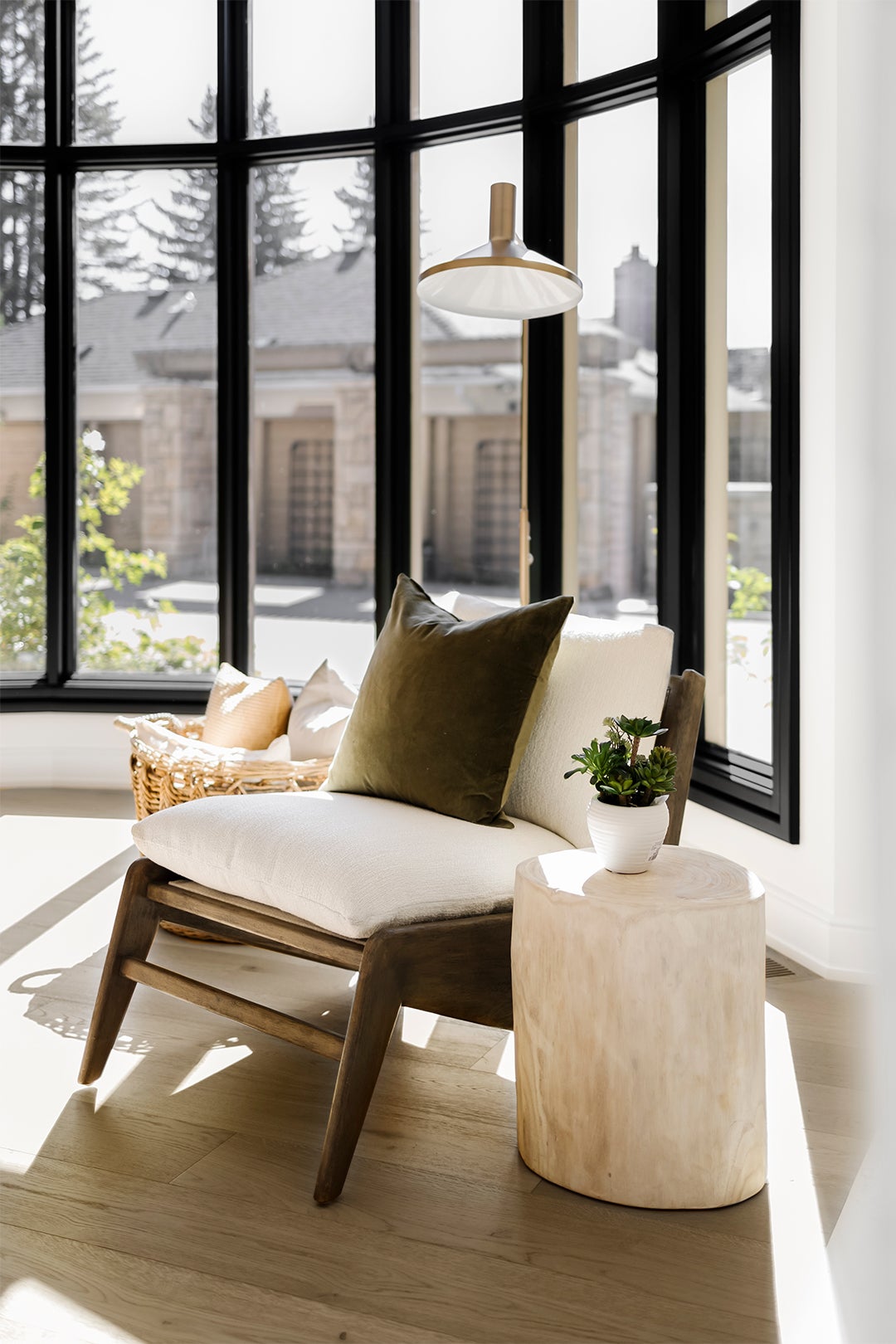
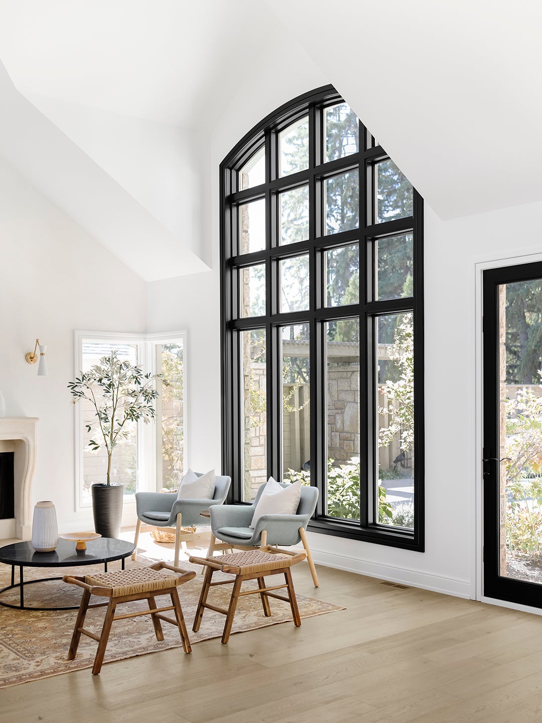
The home’s massive windows were a plus, but the white molding “didn’t have enough presence,” Velji points out. A few coats of Benjamin Moore’s Black instantly modernized the once snoozy trim work.
Channel Ancient History
Velji and Keskitalo’s material source list was subtly inspired by Mediterranean design—the B.C. kind. In the entry space, Centura’s Decoro tile takes on the look of a handwoven rug thanks to all of its intricate shapes, while the Arteriors wall sconces, now a favorite of the clients, remind everyone of gladiator armor. “This house has such an old-world, Roman-slash-European feel, so we didn’t want to lose that completely,” explains Keskitalo.
Lean Into Contrast
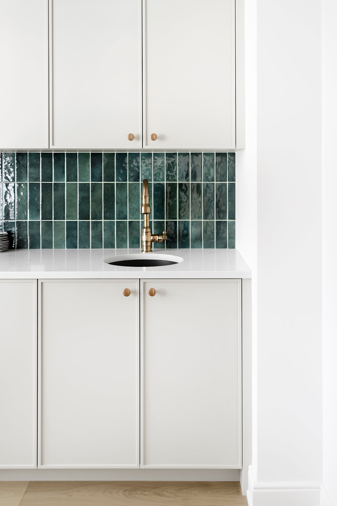
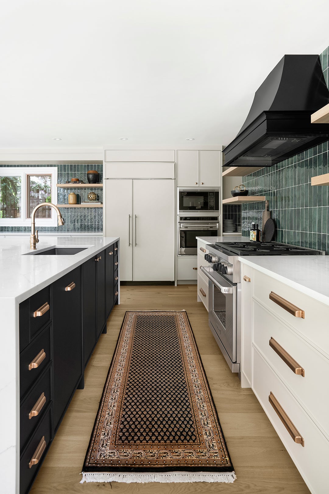
Velji pushed the clients outside of their comfort zone with the addition of the emerald backsplash tile in the kitchen, which adds another layer of contrast to the black and white cabinet scheme.
The layout of the room went pretty much unchanged for budget and logistical reasons. “Maintaining a nice flow between the fridge and the sink and the range was important,” notes Keskitalo. To make everyday life a little more functional, they replaced a tall cabinet with a secondary bar sink so the family can indulge their morning juice-slash-smoothie–making routine.
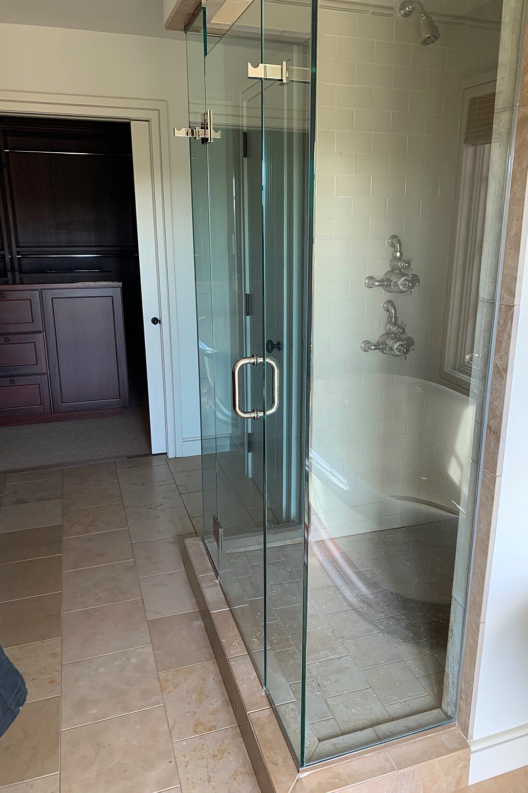
The main bathroom’s cosmetic refresh included graphic shower tile, 12-by-24-inch marble-looking floor tiles, and a new custom vanity that takes advantage of the narrow space’s longest wall. The white cabinetry also helps make the space look bigger than it really is.
Keep Awkward Niches
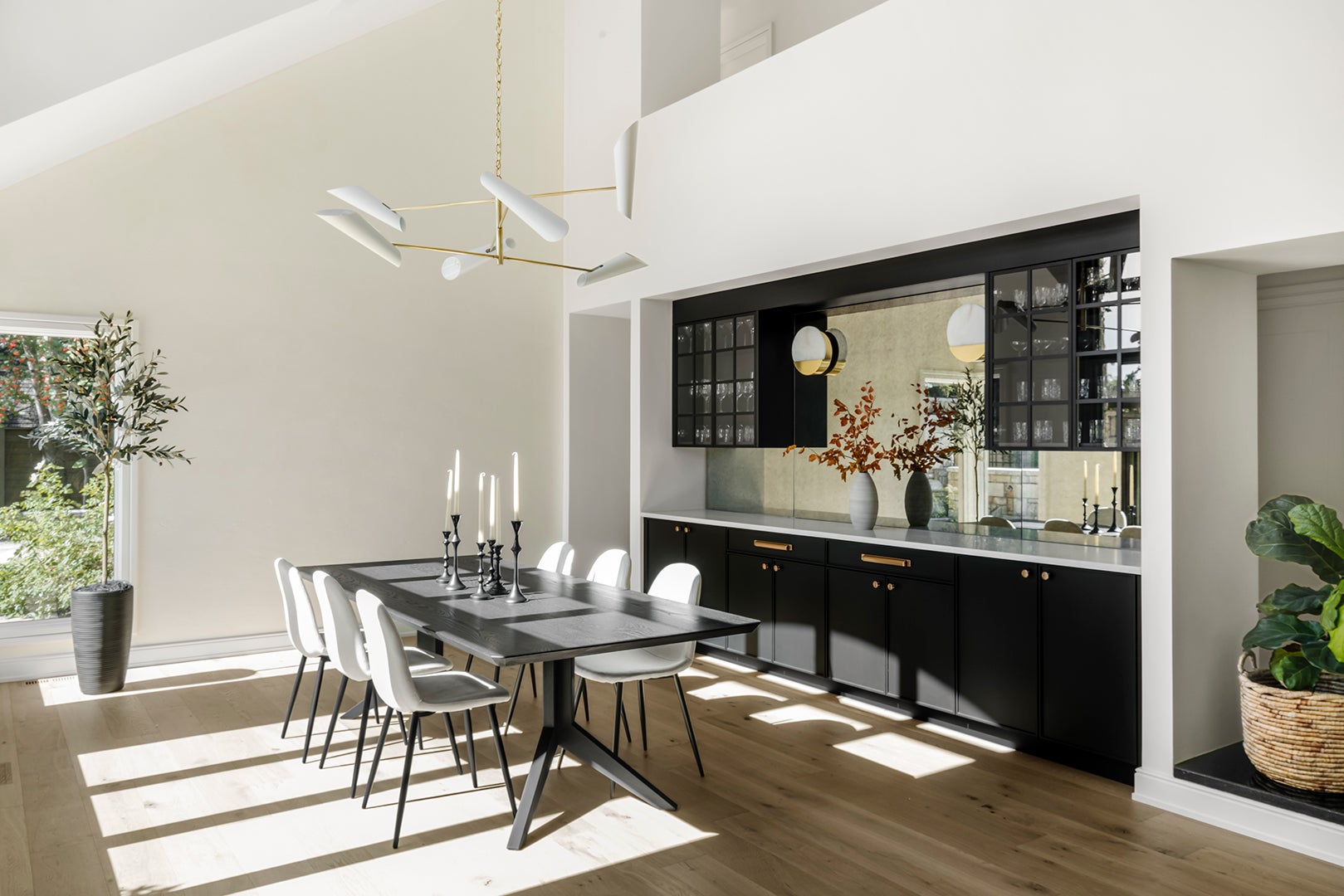
Velji kept the dining room in its spot but made it worthy of entertaining by building out a bar with custom cabinetry and an antique mirror backsplash. The space is also a prime example of making do with quirky architecture, like the rectangular nook that offers sight lines into the adjacent hallway. Instead of putting up a solid wall, the designers tucked a fiddle-leaf fig inside of the opening. “If we had closed it off, it would make the space feel too heavy,” says Velji. “We also thought, Well, why don’t we just keep that and see what happens?”
The post Post-Reno, This Home’s Curvy Staircases Don’t Look Stuck in the ’90s Anymore appeared first on domino.


