ONE ROOM CHALLENGE: MASTER BATHROOM- DESIGN PLAN {WEEK 2}
Posted by admin on
Hi friends, welcome back for my Week 2 update for the One Room Challenge! This Spring my husband and I are finally tackling a long overdue Master Bathroom Makeover. If you missed the proof of our dire renovation need, be sure to see all of the "before" photos in last week's post. After scarring you eyeballs with those beauties, let's focus on prettier things this week as I share our Master Bathroom design plan with you!
I believe I mentioned last week that part of the reason this makeover has taken so long to happen is totally my fault, I just could not decide on a direction I wanted to go with the design. It didn't help that I love so many different styles and designs, I just couldn't make up my mind! I knew I wanted it to be classic, timeless, and traditional, but for me that includes a huge dose of color as well. After years of browsing blogs, Pinterest (follow my Bathrooms inspiration board here), and magazines for inspiration, my creative wheels starting turning and things finally fell in to place. So without further delay... here's the plan!
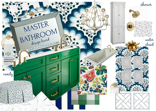
I think the green vanity was from an HGTV Magazine makeover and was the first piece to my puzzle. Pairing the playful blue and white wallpaper with it was a decision that quickly followed, and everything else kind of fell into place over time. I tried to represent all of the parts on this board as close as I could get them to what I'm actually using, but a few things might still change as I go along like fabric selections and accessories. It's not represented but walls that aren't getting wallpaper will be painted white.
Let me explain the pieces a bit by zone-
SINK VANITIES/TUB WALL- Both sink vanities will be painted Behr Crown Jewel and new countertops will be white quartz. This amazing wallpaper courtesy of Hygge & West will be installed only on the wall behind the sinks, including around the window. My board doesn't show the true scale of the paper, see an example in Ariel's darling home here. A new, streamlined whirlpool tub will be installed and I'll trim out the front side with decorative molding. It's not shown on the design board, but remember there's a large window over the tub so I'll do some sort of window treatment there, still deciding on that. We'll use a marble look porcelain tile on the floors and I'll use brass accents for the vanity lighting, hardware, and faucets.
WALK-IN SHOWER- Walls will be a slightly textured white oversized subway tile with light gray grout. Floors will be a white hex tile with a flower pattern using a gray tile periodically for the flower center. A niche will be added for bath products, and faucets and tile trim will be brass.
LINEN CABINET AND SHOE CABINET- Remember that the previous built in hamper against the shower will be removed and we'll add floor to ceiling cabinets with adjustable shelves there. The existing linen cabinet will get built up to the ceiling, and both cabinets as well as the front tub trim will be painted bright white with gold hardware.
WATER CLOSET- Similar to what I did in the Powder Bath, I'll add a lower molding treatment all around the water closet walls and paint it all out white. Above will be more of the blue and white paper circling the entire room. We'll switch out the light fixture in there with a gold lotus pendant that I've had in storage, and I've got some lattice frames to use for artwork in there. I'm planning to do a chippendale style design with the molding, and will do the same design on the front of the tub.
Now for some audience participation... there are a few decisions that I need to make soon but I need help!
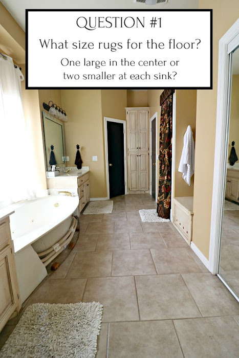
A few things to consider- I'll find some sort of patterned rug, I don't want a solid color and not "bath mat" type rugs. Something that can handle getting wet or toothpaste dropped on it but a bit more stylish.
I would LOVE to do one big rug in here. The room is so long and narrow though, 5' would be the max width it could handle. A 5x7 rug would basically just fit in front of the tub, with a few inches hanging over in front of each vanity. Ideally I would want it longer than that- like 9ish feet long but obviously that's not a standard size (not really interested in getting something custom bound, although I might need to look into that if I get desperate). Also, we really like the warmth/comfort of a rug under our feet while standing at the sink, so one big rug doesn't really give us that.
Another option is two smaller rugs, one in front of each vanity. Our vanities are different sizes so that makes it a little tricky. This would be my second choice, but I've never figured out how to make one rug big work. That's why I need your help! Anyone else have the same issue? Any solutions?
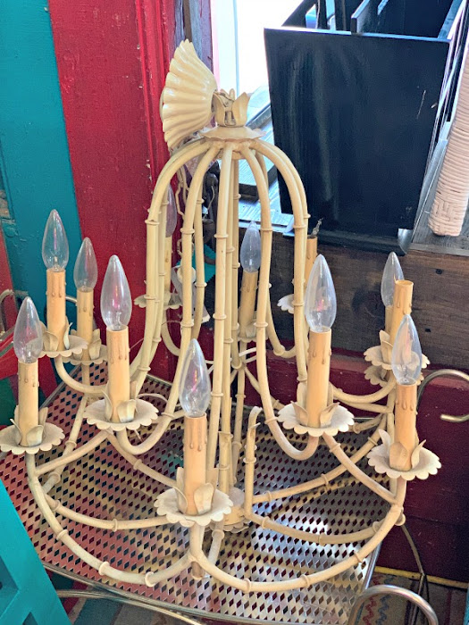
I recently found this chandelier at a vintage shop and scooped it up not knowing where I planned to put it, but the more I thought about it I'd really like to use it in the bathroom.
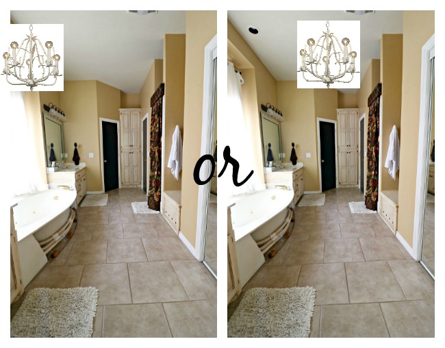
However, I can't decide where to put it. I wish my photo was pulled back a bit further, but I can't decide if I should center it in the room or hang it over the tub. Either way, we'll remove the two recessed eyeball lights currently over the tub window.
My gut feeling is that it would be more balanced to just center it in the room, especially since the tub isn't very wide I feel like it would be squished against that side. But, I'd love to hear your thoughts! (And yes, it will definitely be getting a spray paint job, not sure on color yet!)
So with all of that said, next week I'll start sharing demo and tile work, hope to see you then!
Be sure to check out the others participating in this round of the ORC, there will be some amazing makeovers to follow along with for sure!
ORC Media Sponsor: Better Homes and Gardens
I'd love for you to join my email list! You'll receive a notification straight to your inbox any time there's a new post on Dimples and Tangles. Simply enter your address below.
EMAIL

