A Beachside Home With Richly Layered Interiors + A Brand New View!
Posted by admin on
A Beachside Home With Richly Layered Interiors + A Brand New View!
Interiors
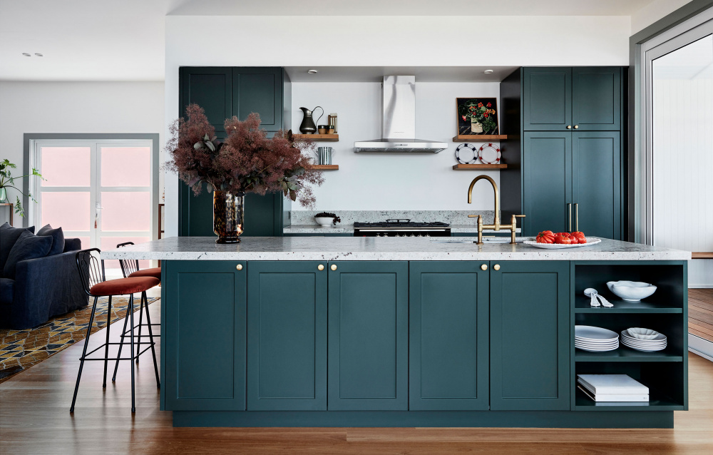
Rich are sumptuous interiors characterise this Wollongong home. Artwork by Anna Placidi. Photo – Maree Homer. Styling – Kerrie-Ann Jones
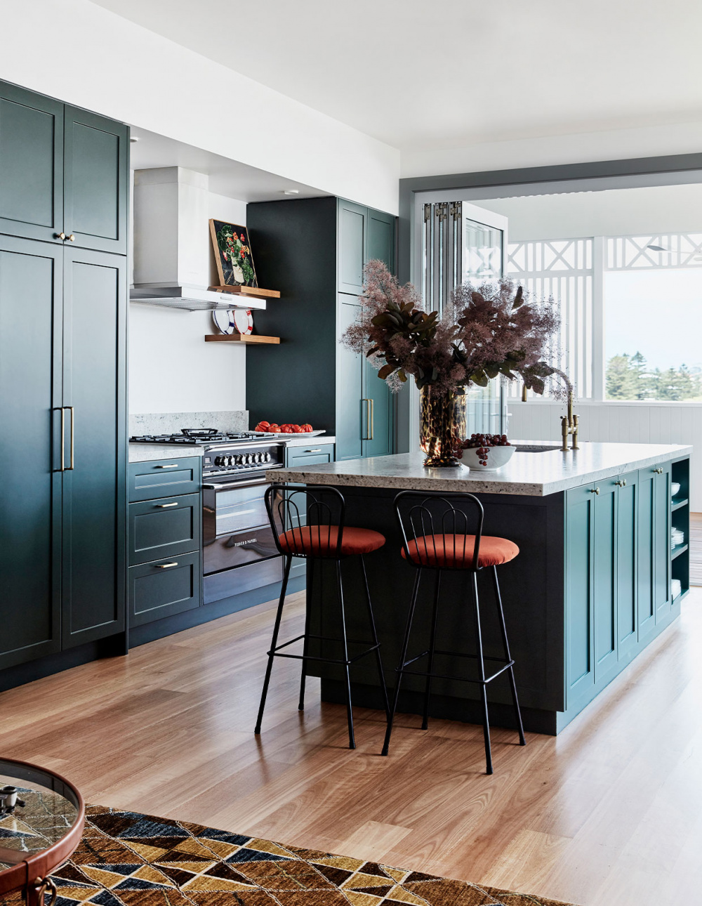
Deep green creates a strong counterpoint to the lightness of the new addition. Artwork by Anna Placidi. Photo – Maree Homer. Styling – Kerrie-Ann Jones
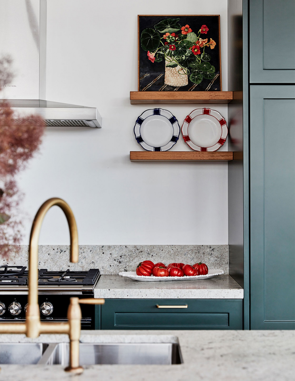
Artwork by Anna Placidi. Photo – Maree Homer. Styling – Kerrie-Ann Jones
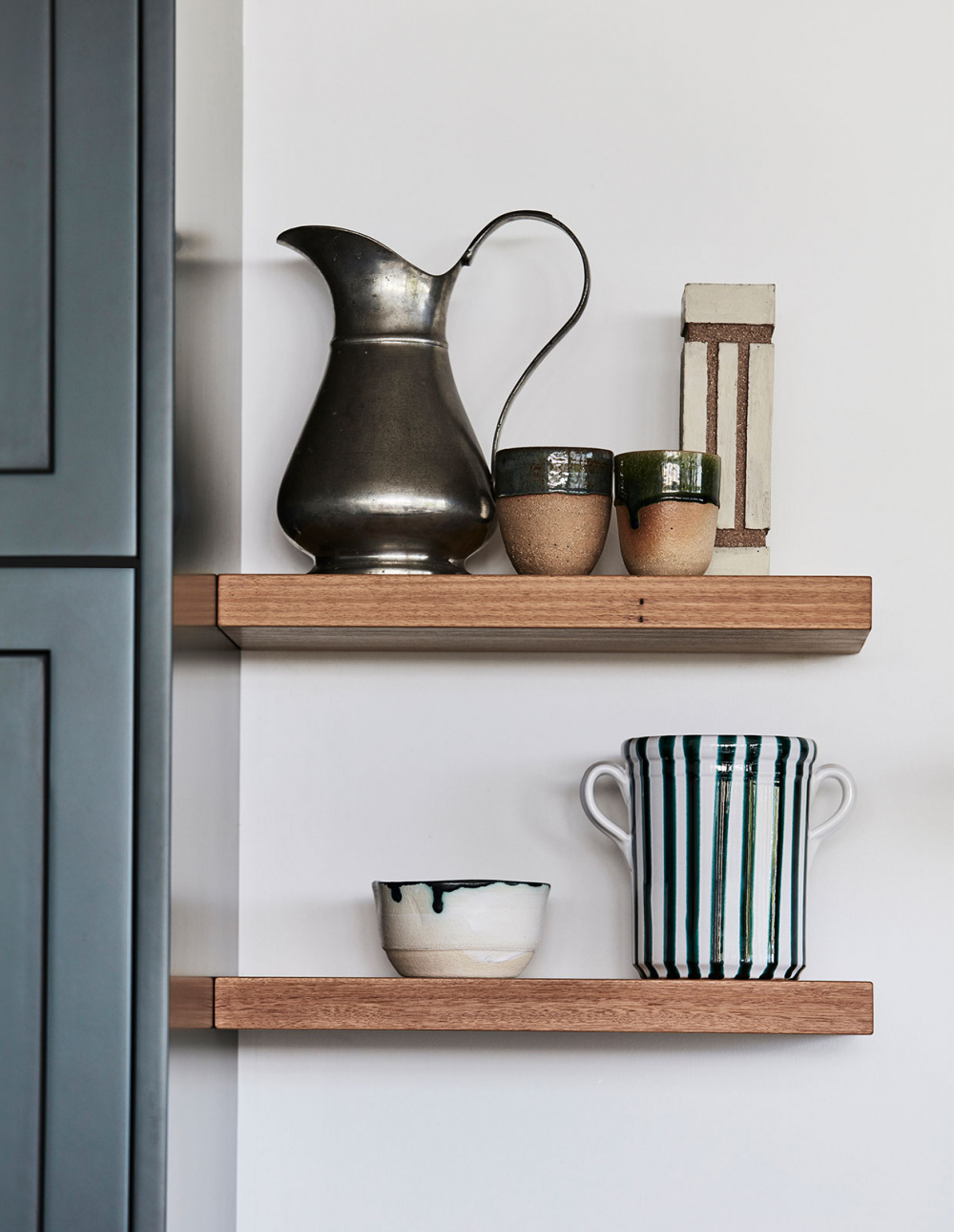
‘The original house was full of treasures and it was gusty and strong, we could see she wasn’t afraid of colour,’ says designer Dominique Brammah of the owner. Photo – Maree Homer. Styling – Kerrie-Ann Jones
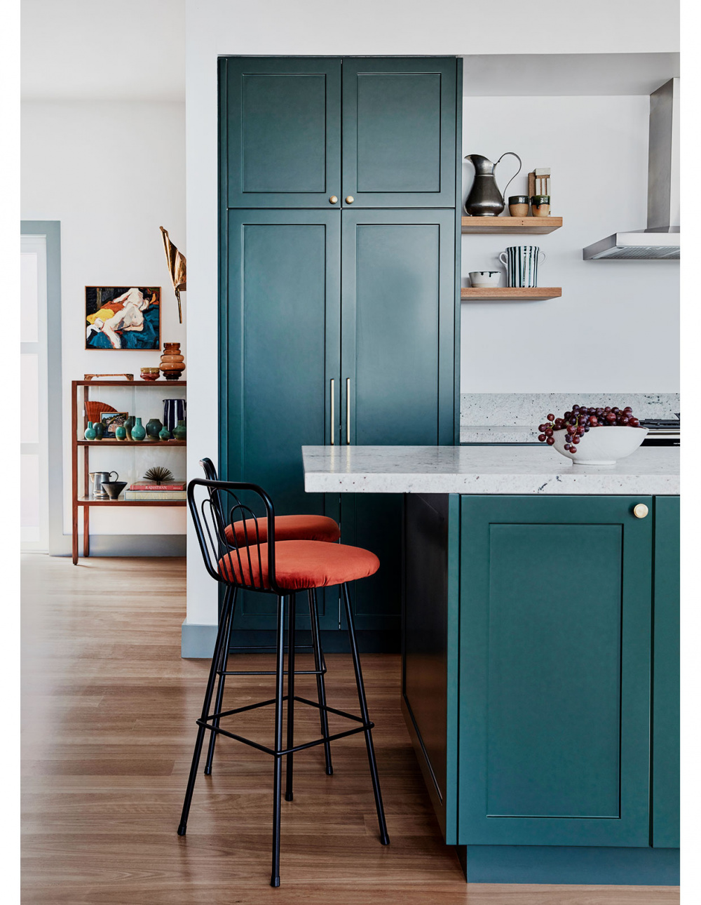
The existing 1930s home in Austinmer, Wollongong was richly decorated by its owner, but the floor plan was severely lacking. Photo – Maree Homer. Styling – Kerrie-Ann Jones
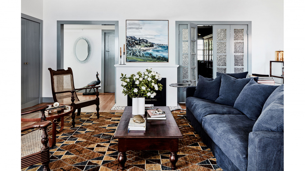
The updated living room. Artwork by Paul Ryan. Photo – Maree Homer. Styling – Kerrie-Ann Jones
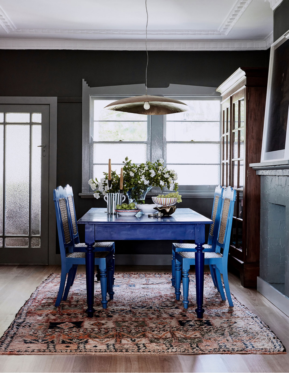
The updated interior palette takes cues from the owner’s existing decor and love of Sri Lanka, including the luxury hotel Amangalla in Galle where she previously worked. Photo – Maree Homer. Styling – Kerrie-Ann Jones
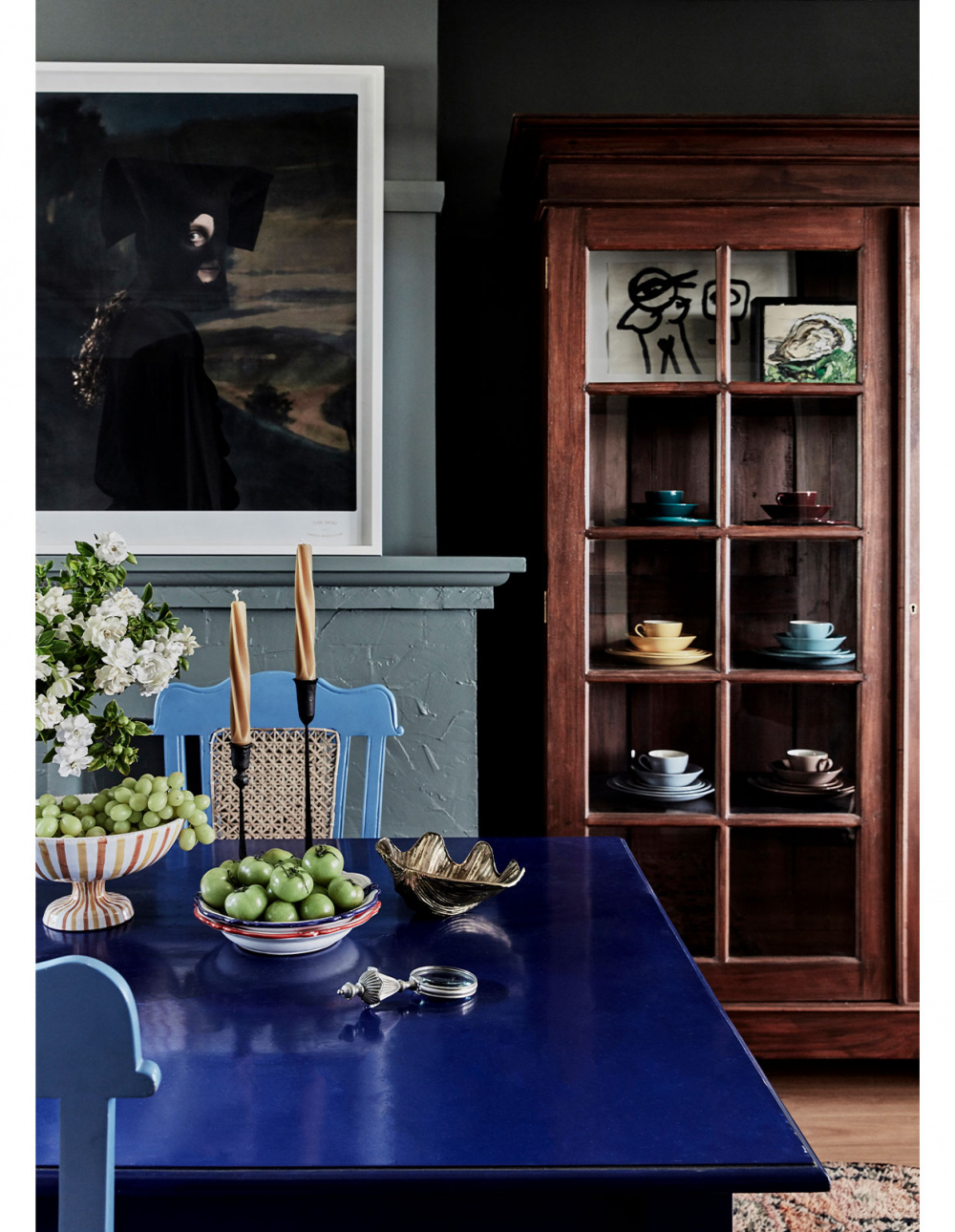
Large artwork ‘The Hoo’ by Jacqui Stockdale via Olsen Gallery. Artwork in cabinet from left to right: ‘Untitled’ by Noah Taylor, sourced by AM Art Projects. ‘Oyster with Lettuce’ by Nicholas Harding, sourced by AM Art Projects. Photo – Maree Homer. Styling – Kerrie-Ann Jones
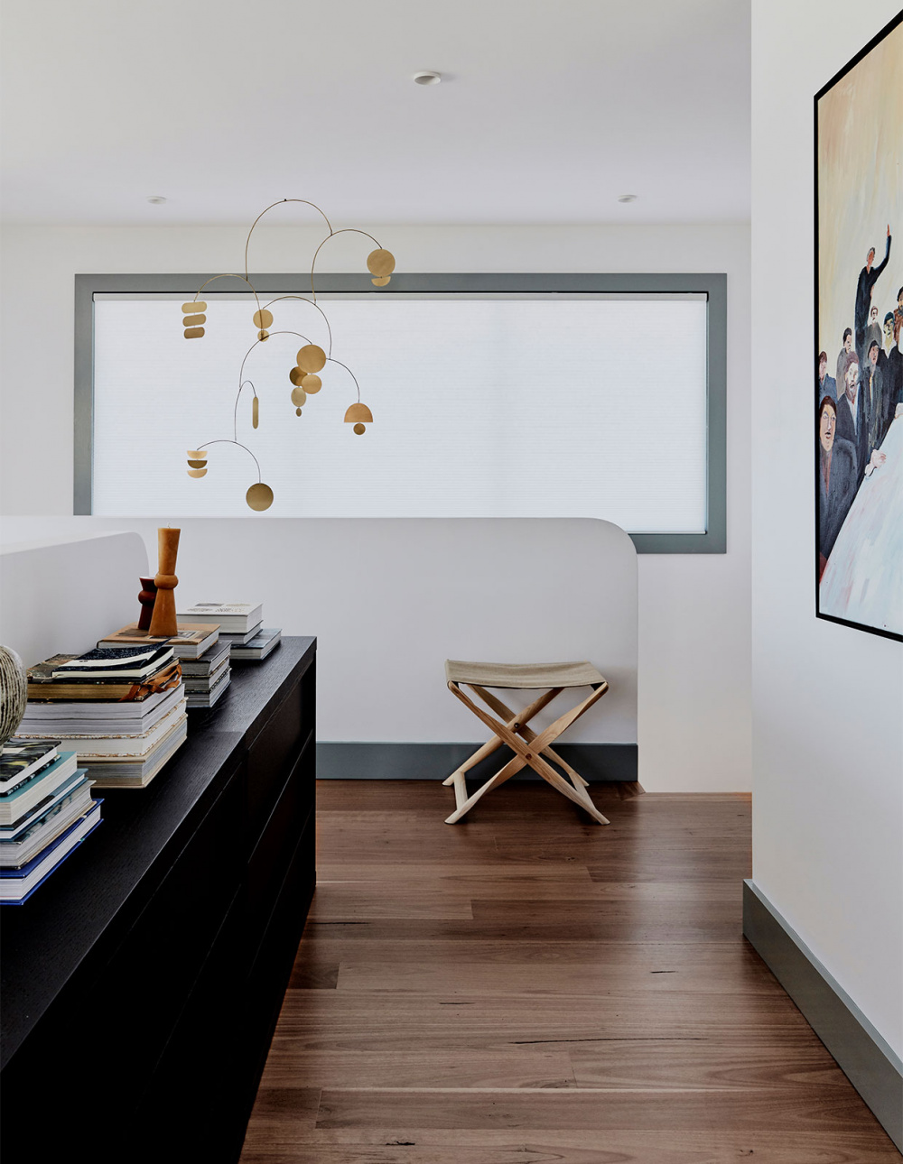
Painting ‘Nothing On The Table’ by Georgia Spain from Egg & Dart, and sourced by AM Art Projects. Photo – Maree Homer. Styling – Kerrie-Ann Jones
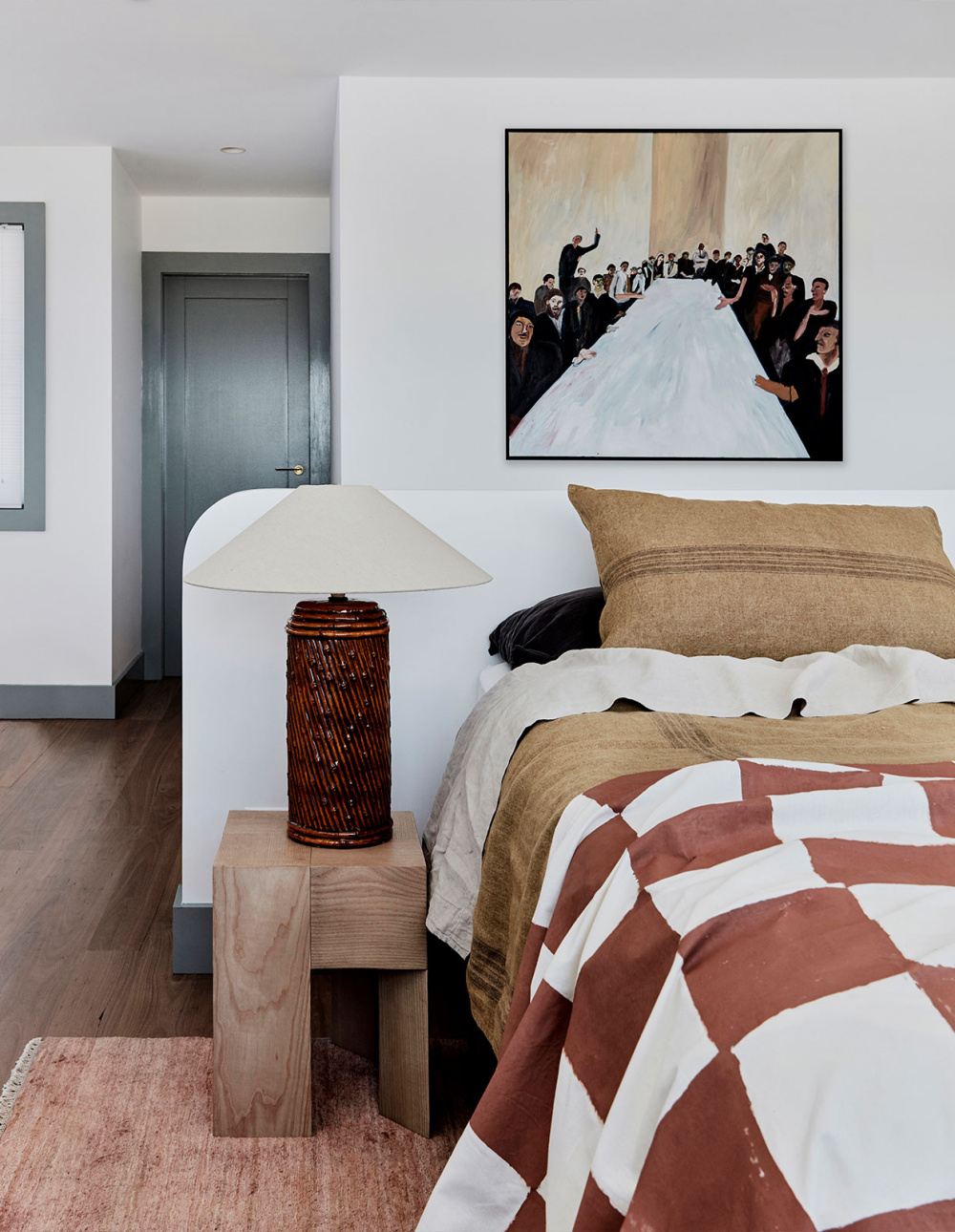
Sage green architraves, skirtings and doors create a sense of depth and interest to the timber work which might, more conventionally, be painted white. Painting ‘Nothing On The Table’ by Georgia Spain from Egg & Dart, and sourced by AM Art Projects. Photo – Maree Homer. Styling – Kerrie-Ann Jones
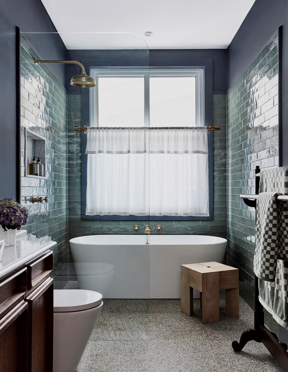
The bathroom ‘needed to read almost as an extension of the living spaces, furnished with the same character. We had a vision for it being a “wet room”, with pieces of furniture, minimal tiling, artwork and moody lighting, so it was about making it feel as un-bathroom-y as possible,’ says Dominique. Photo – Maree Homer. Styling – Kerrie-Ann Jones
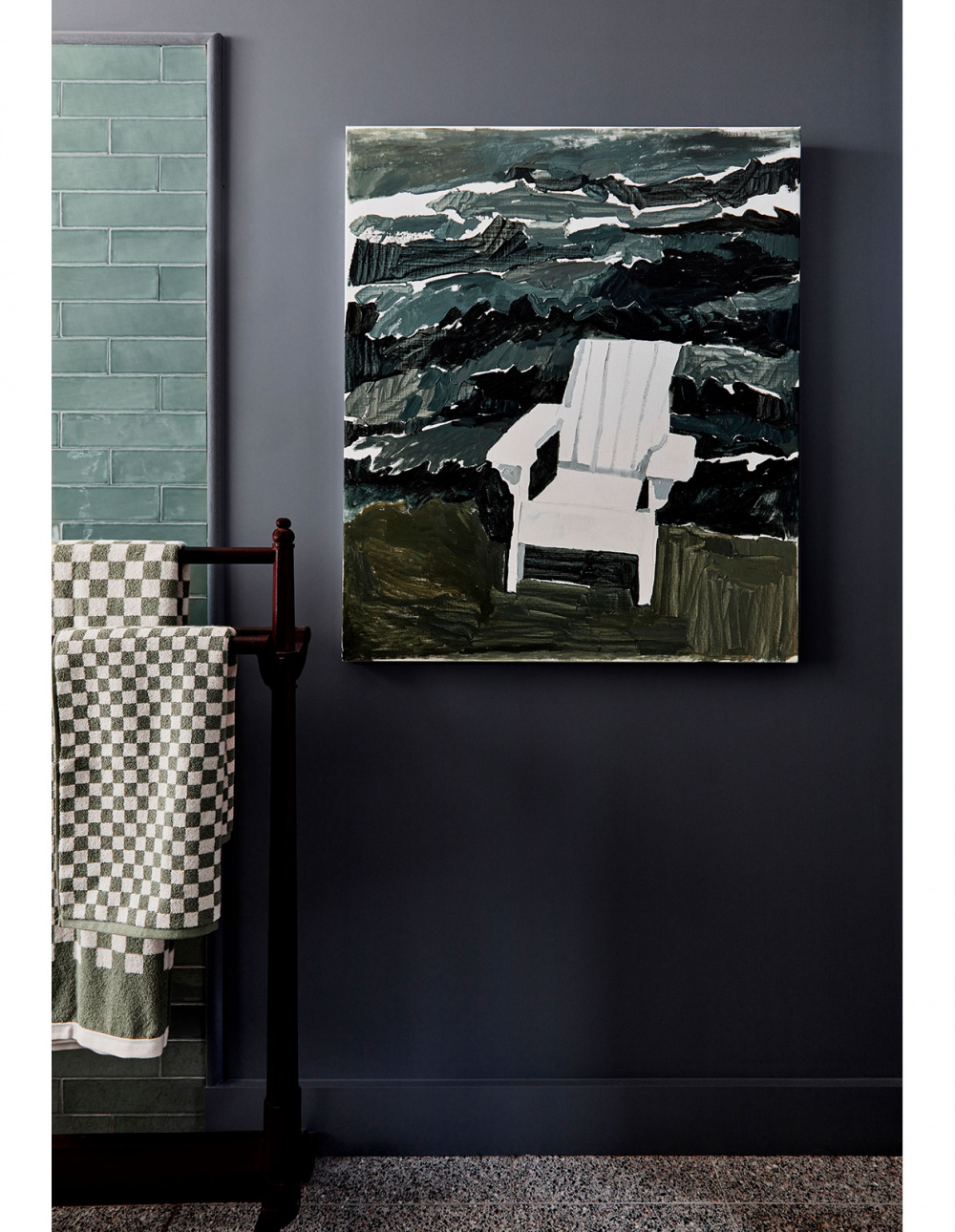
Artwork ‘Pine Chair’ by Clara Adolphs from Chalk Horse Gallery, sourced by AM Art Projects. Photo – Maree Homer. Styling – Kerrie-Ann Jones
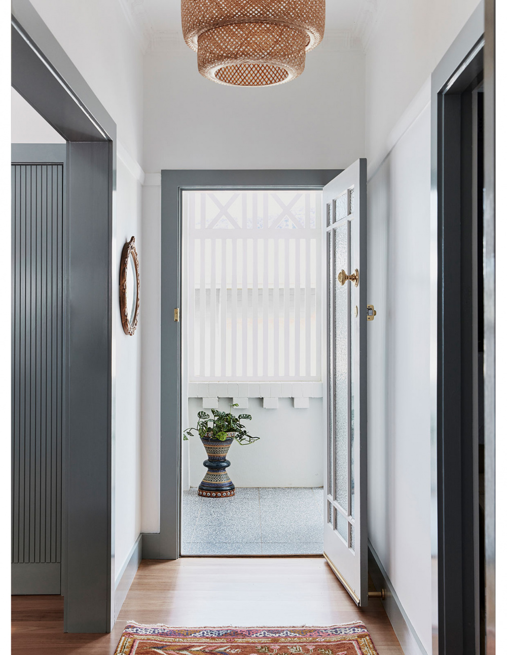
‘There was a love affair with the original house. There was sense of nostalgia almost at losing some of the old house, so it was about harnessing this love,’ says Dominique. Photo – Maree Homer. Styling – Kerrie-Ann Jones
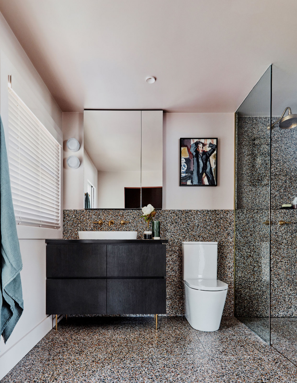
The new upstairs bathroom. Artwork ‘Woman IV’ by Robert Malherbe from Michael Reid Gallery, sourced by AM Art Projects. Photo – Maree Homer. Styling – Kerrie-Ann Jones

Duet along with draftsperson Nadine Ryan reconfigured the original floor plan, while adding a contemporary extension to the ground floor rear and a new second storey. COLORBOND® roofing in Shale Grey. Photo – Maree Homer. Styling – Kerrie-Ann Jones
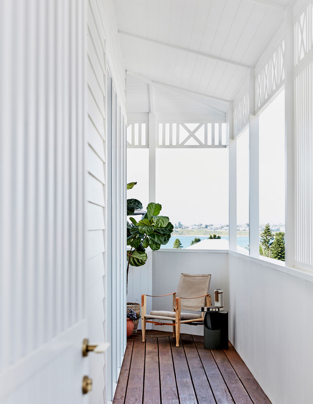
A large verandah wrapping around the long side of the building takes in the beach beyond. Photo – Maree Homer. Styling – Kerrie-Ann Jones
Co-director of design practice Duet Dominique Brammah calls this home a ‘trick’ due to its relatively compact floor plan, that manages to look and feel generous. ‘It’s a carefully arranged jigsaw puzzle and jewellery box of treasures,’ she says.
One year ago, this was not the case. The existing 1930s home in Austinmer, Wollongong was richly decorated by its owner, but the floor plan was severely lacking. Its main crime – no beach views.
‘There was a supreme desire to do EVERYTHING possible to capture the view,’ says Dominique. ‘The original house was incredibly beautiful but it wasn’t overly compatible with the contemporary way of living in open spaces, not in rooms.’
To achieve this, Duet along with draftsperson Nadine K Design reconfigured the original floor plan, while adding a contemporary extension to the ground floor rear and a new second storey. A large verandah wrapping around the long side of the building takes in the beach beyond.
‘It wasn’t a huge new ostentatious renovation; it was considered, sensitive and respectful, but importantly, it wasn’t shy,’ says Dominique. ‘It’s got guts and heart and it has made the original house shine even brighter.’
The updated interior palette takes cues from the owner’s existing decor and love of Sri Lanka, including the luxury hotel Amangalla in Galle where she previously worked. For example, the sage green architraves, skirtings and doors were inspired by the hotel, creating a sense of depth and interest to the timber work which might, more conventionally, be painted white.
Many of the furniture items were also collected from Sri Lanka. ‘It was far from a blank slate, which made for the most wonderfully rich collaborative and rewarding design conversation,’ says Dominique. ‘The renovation had to provide a strong backdrop for the beauty of her things to shine in a new space, but do so far from the “white box default mode.”’
The designers and the owner became lifelong friends over the course of this project, which is reflected in the highly personalised result. As Dominique says, ‘It is so HER house.’
