5 Year Before and After Home Tour
Posted by admin on
A before and after home tour of our brick colonial house 5 years after moving in with recaps of countless DIY home improvement projects and decorating tutorials.
It’s so hard to believe that 5 years have already passed since we moved into this house! And yet it feels like so much longer than that at the same time.
Sometimes it’s hard to see the progress of how far we’ve come day-by-day, but those small tasks of painting a door, changing a light fixture, or finding a secondhand table have added up to a MASSIVE change over time.
We definitely make a lot of messes in our home, and life is far from picture perfect.


Our Before and After Home Tour
Maybe I should have dubbed this as a “before and progress” home tour rather than a before and after because we definitely aren’t finished with this place. When we moved into this brick colonial house in Rock Hill, South Carolina, Olivia was just 4 years-old, and Robert was commuting to Charlotte every day for work.
Now, Olivia is 9, Regan is 3, and Robert and I share about our DIY journeys on this blog together full time.
Not a day goes by that I’m not so absolutely grateful for this house we’ve slowly made into our home and for all of you who have cheered us on along the way.
I hope all of the projects we share encourage you right back. Considering we hardly knew anything about home improvement when I started this blog back in 2013, if we can figure out the DIY journey along the way, I have total confidence that you can too.
House Exterior
Before and After


Paint Colors | Romabio Bianco White Limewash (brick) | Behr Cracked Pepper (doors, shutters, and gutters) | Behr Ultra Pure White (trim)
House Exterior Tutorials
- FAQs About Our Limewashed Brick
- What to Know When Building a Vinyl Fence
- DIY Front Flower Bed Makeover
- 6 Small Front Porch Ideas on a Budget to Add Instant Curb Appeal
- Stencil Painted Porch Floor Makeover
House Exterior Sources
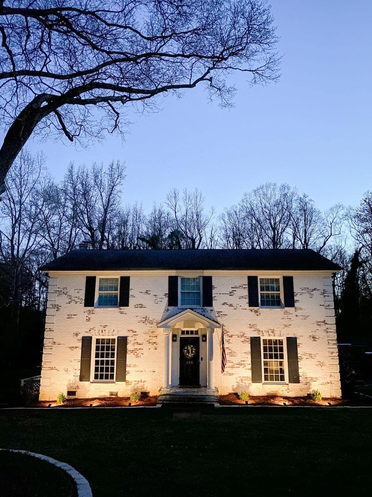
We gave our house exterior quite the dramatic transformation right in the very first year by doing a Romabio brick limewash all over our orange brick and painting the shutters, doors, and gutters in satin Behr Cracked Pepper.
We replaced the old rotting wood fence with this white vinyl Plygem fence. And we added some curb appeal with this stone edging around our flower beds.
I shot these before and after photos of our house in November and totally spaced on shooting some current ones when sharing our latest front porch spruce up. But nothing other than the green foliage has changed.

Foyer
Before and After

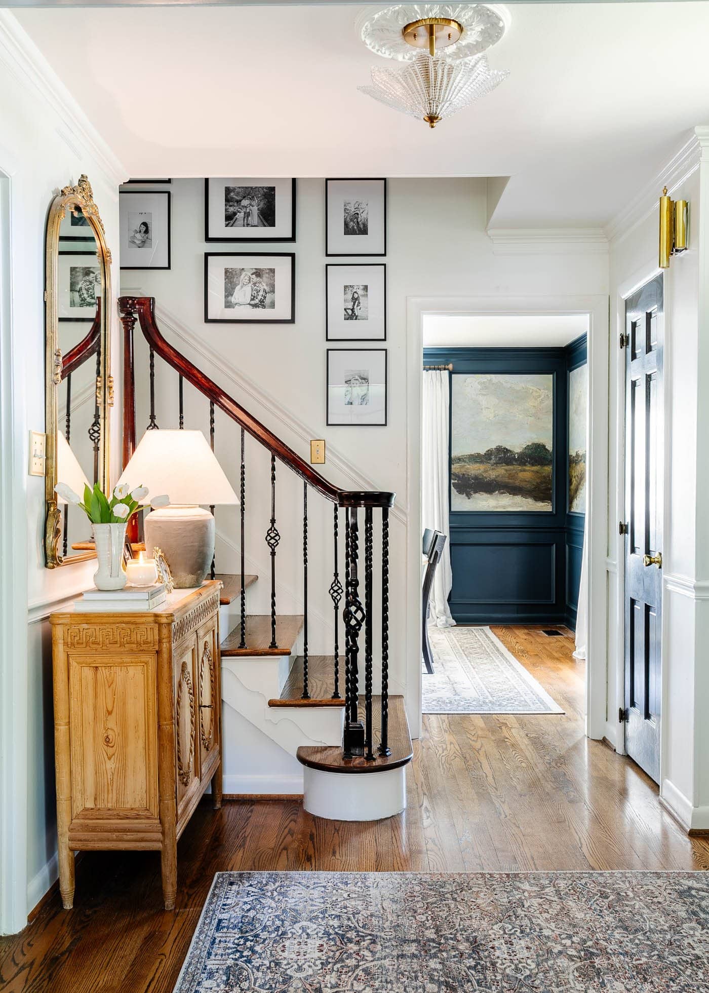
Paint Colors | Benjamin Moore Chantilly Lace (walls) | Benjamin Moore Wrought Iron (door) | Romabio Blue Ridge Parkway (dining room)
Foyer Tutorials
- How to Find the Best Deals on Facebook Marketplace
- Our Updated Family Stairway Gallery Wall
- Old Meets New Foyer Ideas & Reveal
- Entry Table Decor – How to Style Step by Step Like a Pro
Foyer Sources
The foyer / front entryway has always been a challenging space since it has very limited natural light, but by painting the yellow walls Benjamin Moore Chantilly Lace, it feels so much brighter and more open now.
We put up this vintage style glass light fixture, hung this gallery wall featuring all of our favorite family photos, and hauled in this carved wood cabinet I found on Facebook Marketplace.
My favorite part is this view peeking into our dining room.


Eventually, I’d love to paint the stair banister, replace the balusters with ones that are more streamlined, and maybe add a stair runner.
This mirror helps bounce light from the opposite transom above our front door to trick the eye into thinking this entryway is a little bigger. I love how the mirror’s carved details mimic the details in the cabinet.
Our original hardwood floors from 1960 were refinished before we moved in, but their closest match is Minwax Provincial, a great medium, neutral brown that doesn’t lean too gray, too yellow, or too red.
I still just can’t get over the dramatic before and after of this space.

Home Office
Before and After

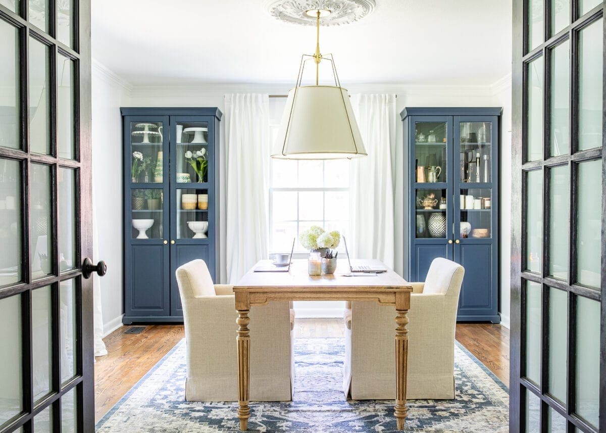
Paint Colors | Benjamin Moore Hale Navy (cabinets) | Benjamin Moore Chantilly Lace (walls and trim) | Benjamin Moore Wrought Iron (doors)
Home Office Tutorials
- How to Build a DIY Closet
- Easy DIY Closet Shelves & Bifolds to French Doors
- Hale Navy IKEA Cabinet Makeover
- Work Table Makeover & Customizing Unfinished Furniture
- DIY Large Scale Wall Art from a Shower Curtain
Home Office Sources
Right beside the foyer is our home office where we’re able to close the French doors with frosted window film to keep our creative messes out of sight. Just adding the closets and doors alone made this such a huge before and after transformations.
These IKEA cabinets I painted Benjamin Moore Hale Navy provide much needed decor storage for seasonal items or accents we use in friends’ room makeovers.
I love having this work table so that we can sprawl out large craft projects or Robert and I can both have enough room to work together.
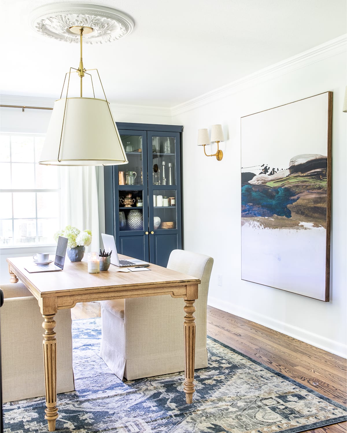
We painted the walls Benjamin Moore Chantilly Lace; the doors are Benjamin Moore Wrought Iron. I gifted the old chandelier to a friend so it wouldn’t go to waste and replaced it with this more modern pendant light.
To add some oversized art on this large blank wall, Robert and I made art using a shower curtain.
Robert and my brother Kevin built these closets so that we could utilize larger storage as well.
These rolling arm chairs are so much more comfortable than a regular office chair but still have great function with their mobility.

Dining Room
Before and After
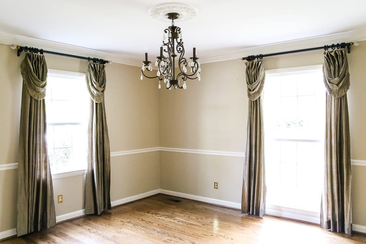

Paint Colors | Romabio Blue Ridge Parkway (walls) | Benjamin Moore Simply White (ceiling)
Dining Room Tutorials:
- Antique Painting Mural Wallpaper
- Our Classic Modern Dining Room Furniture with Bassett BenchMade
- Shaded Chandeliers for All Budgets: Splurge vs Save
- How to Decorate a Buffet & Style Anything
- Footed Grasscloth Buffet Makeover
- DIY Picture Frame Molding
Dining Room Sources
This dining room started out on the very neutral side, but it has become one of my favorite wow-factor spaces in the entire house!
We painted the walls a deep, rich navy in our color Romabio Blue Ridge Parkway. These peel and stick murals add so much drama!
I found the perfect faux linen curtains on Amazon, and we hung up this leather and brass shaded chandelier I found on Facebook Marketplace for a steal.
The heirloom quality dining table and dining chairs are so well made and sturdy, and this indoor/outdoor rug makes food cleanup a breeze.
On the other side of the room, we cut down and painted this secondhand buffet cabinet for some much needed servingware storage.

Kitchen
Before and After


Paint Colors | Benjamin Moore Chantilly Lace (walls) | Benjamin Moore Simply White (upper cabinets) | Sherwin Williams Billiard Green (lower cabinets)
Kitchen Tutorials
- DIY Pressed Tin Kitchen Backsplash
- How to Install a Herringbone LVP Floating Floor Over Tile
- How to Paint Kitchen Cabinets Like a Pro
- DIY IKEA Pantry Cabinet Using Hemnes
- How to Preserve and Frame Letters and Handwritten Recipes
- Window Film Ideas to Create Decorative Glass Around Your Home for Less
- Best Places to Buy Furniture Hardware and Kitchen Cabinet Pulls
- Our Full Kitchen Organization Makeover
Kitchen Sources
Our kitchen used to be one of my least favorite rooms in the house, but we have really figured out how to make it work by painting the lower cabinets Sherwin Williams Billiard Green to work with the existing green and gray leathered granite countertops.
We covered the backsplash tile with pressed tin paneling to be more simplistic and suit our style better.

To work around the existing floor tile, we laid down a floating LVP herringbone floor since we can’t demolish the old tile underneath until a real renovation. I’m so in love!
We assembled these IKEA Hemnes cabinets and painted them to match our lower cabinets to serve as a pantry since we don’t have a dedicated pantry space. This command center wall lets us drop our mail and keep our family organized.
One day we will take on a larger remodel in this kitchen but all of the small changes over the years have added up to this space we really enjoy and feels like a reflection of us.


Breakfast Nook
Before and After


Paint Colors | Benjamin Moore Chantilly Lace (walls) | Romabio Celtic Stone (doors) | Benjamin Moore Southern Vines (banquette)
Breakfast Nook Tutorials
- DIY Faux Marble Dining Table in Under an Hour
- How to Install a Herringbone LVP Floating Floor Over Tile
- Corner Banquette Makeover + How to Redirect Air Vents Under Cabinets
- Gorgeous Banquette Bench Seating for All Budgets
- Free Oil Painting Kitchen Art Prints
- How to Reupholster Dining Chair Seats + Faux Bamboo Chair Makeover
- Inexpensive DIY Batten Wall Using Lattice Strips
- The Best Vintage Wall Sconces for All Budgets in Every Room
Breakfast Nook Sources
This is our latest room makeover project that caused quite an undertaking by requiring us to move a door. But it made the most sense to create a better traffic flow in this small breakfast nook.
I found the banquette on Facebook Marketplace that fit the corner of the room perfectly, which I painted Benjamin Moore Southern Vines. This frosted glass bifold French door still allows a little much needed natural light from the laundry room into this space.

We continued the LVP herringbone floor in here, painted the walls Benjamin Moore Chantilly Lace, and painted the doors Romabio Celtic Stone.
Adding lattice strips for batten walls provided tons of character. We built the bistro table by repurposing an IKEA countertop, and I refinished the dining chairs using ones I found secondhand.
The charming chandelier and vintage style sconces are the icing on the cake to provide cozy lighting in this windowless corner.

Laundry Room
Before and After


Paint Colors | Sherwin Williams Slate Tile (walls) | Benjamin Moore Simply White (ceiling and cabinets) | Benjamin Moore Wrought Iron (door)
Laundry Room Tutorials
- 7 Laundry Room Organizing Solutions
- DIY Moroccan Vinyl Tile Floor
- 18 Favorite Peel and Stick Vinyl Tiles
- Vintage Clothesline Laundry Room Art Printable Set
- French Bifold Door
Laundry Room Sources
This laundry room was the most basic of basic when we moved in, so we painted the walls Sherwin Williams Slate Tile to give it a punch of color. The peel and stick floor tiles allowed us to do a quick cosmetic change without needing to rip out the existing vinyl flooring.
We swapped the fluorescent light with this more modern globe light. And I hid the electrical box using free printable laundry art mounted in picture frames with magnets on the backs. It’s amazing how just changing the wall color can create such a huge before and after.
Eventually, we would love to move the laundry room to a newly built addition and turn this existing laundry room into a butler’s pantry / scullery kitchen next to the main kitchen.

Living Room
Before and After


Paint Colors | Benjamin Moore Swiss Coffee (walls) | Benjamin Moore Simply White (trim and ceiling) | Benjamin Moore Wrought Iron (doors and windows) | Romabio Avorio White Limewash (fireplace brick)
Living Room Tutorials
- Pottery Barn Sofa Review: What You Should Know
- Our Brutally Honest Review of the Samsung Frame TV
- How to Display TV Art on Any Smart TV + Free Art
- Our Brutally Honest Review of Our Tyler Pottery Barn Recliner
- Our Favorite Designer-Look Modern Recliner Chairs
- Our Secondhand Marble Coffee Table Score and Favorite Marble Tables
- How to Mix and Match Throw Pillows
- Best Rated Fandeliers + How to Paint a Chandelier Ceiling Fan
- Audubon Bird Art Gallery Wall and Free Printable Set
- DIY Window Seat From a Kitchen Cabinet
- DIY Lime Washed Brick Fireplace
Living Room Sources
This living room has been through a TON of changes over the years, but this version of it is by far my favorite.
We painted the walls Benjamin Moore Swiss Coffee, which has a slight bit of warmth to feel inviting against the dark charcoal Benjamin Moore Wrought Iron windows and doors.
I limewashed the brick fireplace in just an afternoon. And since it has to be a focal point, we opted to hang a Samsung Frame TV above.


These Pottery Barn York sofas are SO comfy as are the buttery leather recliners. The nesting end table and marble top coffee table were both Facebook Marketplace finds.
Since we wanted to compromise on a ceiling fan and chandelier, we found the perfect solution with this fandelier I painted gold.
For the back wall / back door entryway, I hung up these free printable Audubon prints.
I’ve toyed with the idea of adding some sort of ceiling treatment like planking or shallow beams, but we’ll see.


Playroom
Before and After


Paint Colors | Benjamin Moore Swiss Coffee (walls) | Romabio Carolina Sky (cabinets and mantel) | Benjamin Moore Simply White (trim) | Benjamin Moore Wrought Iron (doors and windows)
The playroom has come such a long way from the bright yellow it was painted before. We painted the walls Benjamin Moore Swiss Coffee to carry in from the living room, and the doors are Benjamin Moore Wrought Iron, done using my favorite French door painting trick.
I limewashed the brick fireplace here as well. We built the toy cabinets using IKEA Billy bookcases, and we painted them with Romabio Carolina Sky.
For a statement making piece of whimsical vintage art, we hung up this tapestry. And we added whimsical lighting by making this sunburst light fixture from a mirror frame.

We hauled in this washable rug and utilized these chairs and this rotating coffee table with tons of storage for toys and craft supplies.
In the corner, we have this secondhand armoire we used to create a Narnia-inspired reading nook that the girls love using as their play hideout.
I would love to add a little more storage with built-in shelves on some of the other walls to make an entertainment center later on.

Half Bath
Before and After


Paint Colors | Benjamin Moore Hollingsworth Green (beadboard) | Benjamin Moore Simply White (crown and ceiling) | Benjamin Moore Wrought Iron (door)
Half Bath Tutorials
- Faux Marble Tile Floor
- Weathered Gray Wood Look Vanity Makeover
- Beginner’s Guide to Hanging Wallpaper
- Dry Brushed Black Mirror Makeover
Half Bath Sources
We haven’t really done anything new in this half bath powder room in four years, but it works well for us!
I painted the existing bead board using Benjamin Moore Hollingsworth Green, hung up black and white floral wallpaper (that is unfortunately now discontinued), and replaced the beige tile floor with this faux marble hexagon tile.
I painted the cherry stained vanity using my favorite faux wood finish technique, and I painted the mirror frame a brushed black.
Replacing all of the fixtures with brushed brass added some warmth to the space.
I’ve though about replacing the vanity for one more our style (especially since the black granite countertop is difficult to keep clean), but that might not ever actually happen.

Hallway
Before and After


Paint Colors | Benjamin Moore Chantilly Lace (walls and trim) | Benjamin Moore Wrought Iron (doors)
Up the stairs is this hallway that we painted Benjamin Moore Chantilly Lace to help brighten it up. The doors are Benjamin Moore Wrought Iron for contrast.
We hope to remove that attic fan one day, but the simple task of fixing the attic door and replacing the attic door string with a hook made such a difference.
I added this free printable landscape art at the end of the hallway along with this wireless picture light to help illuminate that side of the space.


To add some interest, we rolled out this runner rug. And more art and a potted artificial tree took care of the rest.
This bell light fixture adds a little dose of charm too.

Girls’ Bedrooms
Olivia’s Bedroom
Before and After


Paint Colors | Behr My Sweetheart (walls) | Benjamin Moore Simply White (trim and ceiling)
Olivia’s room has been through a few changes over the years since we love being able to have a space that grows with her. When we first moved in, we made a DIY ballet barre for her to practice dance moves.
But since then, we’ve implemented a homework desk, swapped the canopy bed for a boho rattan headboard, and added more boho style touches like this rock collection shadow box using ones she found while gem mining in the North Carolina mountains.

We painted the walls Behr My Sweetheart for just a slight blush tone. My mom and I installed this butterfly kaleidoscope wallpaper. And we added this ceiling fan since she’s gotten more hot-natured over the years.
Olivia is very into having “collections” so we give her lots of space to keep them like a memo board to display art work, under-bed storage for her book collection, and a hurricane vase for her shell collection.

Regan’s Bedroom
Before and After


Paint Colors | Romabio Barefoot Dance (ceiling) | Magnolia Home True White (walls and trim) | Benjamin Moore Stonington Gray (doors)
Regan’s bedroom is on its second look too since transitioning out of the nursery phase into a “big girl” bedroom now that she’s almost 4.
Olivia and Regan love having sleepovers with each other and with friends/cousins, so we decided to use twin beds with a pull-out trundle underneath to serve this purpose.
We refinished the hardwood floors, and painted the ceiling with one of our colors from our paint collection called Romabio Barefoot Dance. We installed picture frame molding years ago painted with Magnolia Home True White, and updated it recently using this chinoiserie wallpaper.
The vintage style metal headboards and bedding came from Walmart, and I incorporated this multicolored rug for a little pattern play.

For the rest of the furniture, I found this dresser and nightstand on FB Marketplace and cleaned up the wood to look new again.
It adds so much vintage charm to this little whimsical space.

Guest Bedroom
Before and After


Paint Colors | Benjamin Moore Swiss Coffee (walls) | Benjamin Moore Winter Gates (trim) | Benjamin Moore Wrought Iron (doors)
The guest bedroom was a challenge for us in the beginning because it was rather small and had an off-centered window in the only logical place we could fit a queen-sized bed.
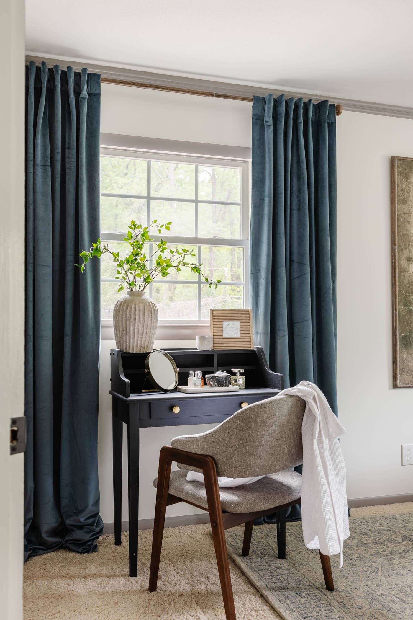
But by hanging these velvet curtains all across the back wall and placing a secondhand cane headboard in front to prevent any blocked natural light, we were able to make it work!
One of my favorite tricks for making this small bedroom seem bigger was by hanging up this oversized art.

Even though we still need to refinish the hardwood floors underneath this old carpet, adding a wool rug on top helps to elevate the space.
In front of the other window, I found this secondhand desk that works great as a makeshift makeup vanity if guests ever need it to get ready.
We love treating our guests to lots of amenities to help them feel at home, so we throw in extra toiletries, a clean robe, and the Wi-Fi password in a frame here too.
Shared Bathroom
Before and After


Paint Colors | Benjamin Moore Stonington Gray (walls) | Benjamin Moore Simply White (ceiling and trim) | Benjamin Moore Wrought Iron (door)
Shared Bathroom Tutorials
- How to Turn a Console Table Into a Bathroom Vanity
- DIY Personalized Step Stools
- Black and White Bathroom Decor Swaps for a Classic Refresh
- Girls Bathroom Decor Details and Sources
- Kids’ Bathroom Organization Tour
Shared Bathroom Sources
When we moved in, this shared bathroom in the hallway for the kids and guests to use was just beige on beige on beige.
We gave it a quick refresh for the first couple of years using mainly just paint by painting the tub, shower, sink and countertop. I freshened up the tile by painting the grout lines. We painted the walls a deep teal called Magnolia Home Weekend, and I painted the bathroom cabinets.
Since then, we gave this bathroom a massive remodel. We tried to stick with very classic tile to stretch this remodel for decades by using this retro hexagon tile on the floor and artisan glazed subway tile on the walls.

We were able to stay within a reasonable budget by using these marble panels in the shower/tub combo and painted the walls Benjamin Moore Stonington Gray and doors Benjamin Moore Wrought Iron.
This bathroom’s size and shallow depth created a challenge for us and a traditional bathroom vanity wouldn’t fit, so we turned a console table into a bathroom vanity instead.
These beaded mirrors give it a feminine touch for the girls. And this tightrope walker art gives the space a childish, whimsical nod.

Primary Bedroom
Before and After


Paint Colors | KILZ Rebel (walls) | Benjamin Moore Simply White (trim, doors, and ceiling)
Primary Bedroom Tutorials
- 7 Tricks for How to Make a Bed Fluffy for Less
- DIY Traditional Grid Molding Focal Wall
- DIY His & Her IKEA Closets Using Billy Bookcases
- Upholstered Combination Beds
- DIY Cane Nightstand Makeover
- DIY Mirrored French Closet Doors
- How to Quickly Beef Up Crown Molding and Baseboards
Primary Bedroom Sources
Our primary bedroom has seen a couple of versions too before painting the walls completely black a couple of years ago using the color KILZ Rebel. It was a bold, daring design decision, but we have never slept better since going dark in this space!
We balanced the black walls by adding these French bifold doors with antique mirror film and painting them Benjamin Moore Simply White to match the trim. We balanced it with these white velvet curtains and these blackout window shades in the color Bonaire Flaxen for airiness and texture as well.
Robert is definitely the hot-natured one of the house, so adding this black and brass ceiling fan was a must.

We found this upholstered wood poster bed at a local consignment shop 5 years ago and have loved it ever since!
Adding a king-sized bed in this small bedroom was a challenge, so we got by with adding these small nightstands and wall-mounted swing arm lamps to save space.
I implemented some of my favorite budget bedding tricks for extra fluffiness too.

En Suite Bathroom
Before and After


Paint Colors | Benjamin Moore Chantilly Lace (walls, trim, and ceiling) | Benjamin Moore Wrought Iron (door)
En Suite Bathroom Tutorials
- Marble Tile vs Marble Effect Tile: Which Is Best?
- Wood Bathroom Vanities We Love For Every Budget
- 10 Spa Bathroom Ideas to Create Luxury for Less at Home
- Best Places to Buy Furniture Hardware and Cabinet Pulls
En Suite Bathroom Sources
Our en suite bathroom went through a refresh phase for the first couple of years as well before an HVAC leak required us to take on a full renovation. We were definitely not prepared for it, but we could not be happier with the end result.
Choosing marble look porcelain tile over real marble tile was definitely the right choice for us in terms of cost and maintenance. But we splurged on a real marble countertop to create the scalloped backsplash of my dreams.
We really didn’t change the footprint of this bathroom much at all, but by adding glossy white tile and a seamless glass door in the small shower, it created the illusion of more space.


To bring in some warmth amidst all of the white, we added this wood bathroom vanity with warm brass fixtures for balance.
The Venetian mirrors weren’t our first choice thanks to supply chain delays, but they ended up being so perfect here! We added a little interest and traditional style by incorporating picture frame molding here as well.
Because this bathroom is on the small side, we had to get creative with storage, so including this double hamper and hanging open shelving here helped with that.
In a perfect world, we would have loved to include a toilet closet separate from the rest of the bathroom, but adding a wooden toilet seat helped make it work in terms of visual appeal.
My favorite finishing touch is the glass knob on the shower door.
Home Gym Shed
Before and After


Home Gym Tutorials
- DIY Faux Brick Walls
- How to Gradually Build a Home Gym for Every Budget
- At Home Gym Shed Makeover on a Budget
Home Gym Sources
This shed in our backyard was a total afterthought that we used for random storage for years. Then, last year, Robert had the idea to repurpose it into a home gym!
It turned out even better than we imagined! We ripped out the ceiling and reinforced the roof to provide more space, and we added faux brick panel walls. To save money, we mixed together leftover cans of black paint and white paint from previous projects to reuse on the ceiling and walls.
Robert found the floor mats secondhand on FB Marketplace.


To keep air flowing, we added this industrial style retractable blade ceiling fan, and we hung up these large black framed mirrors for checking our form during workouts.
Robert already had most of the workout equipment that he’s collected used over the years from secondhand sporting goods stores and online listings.

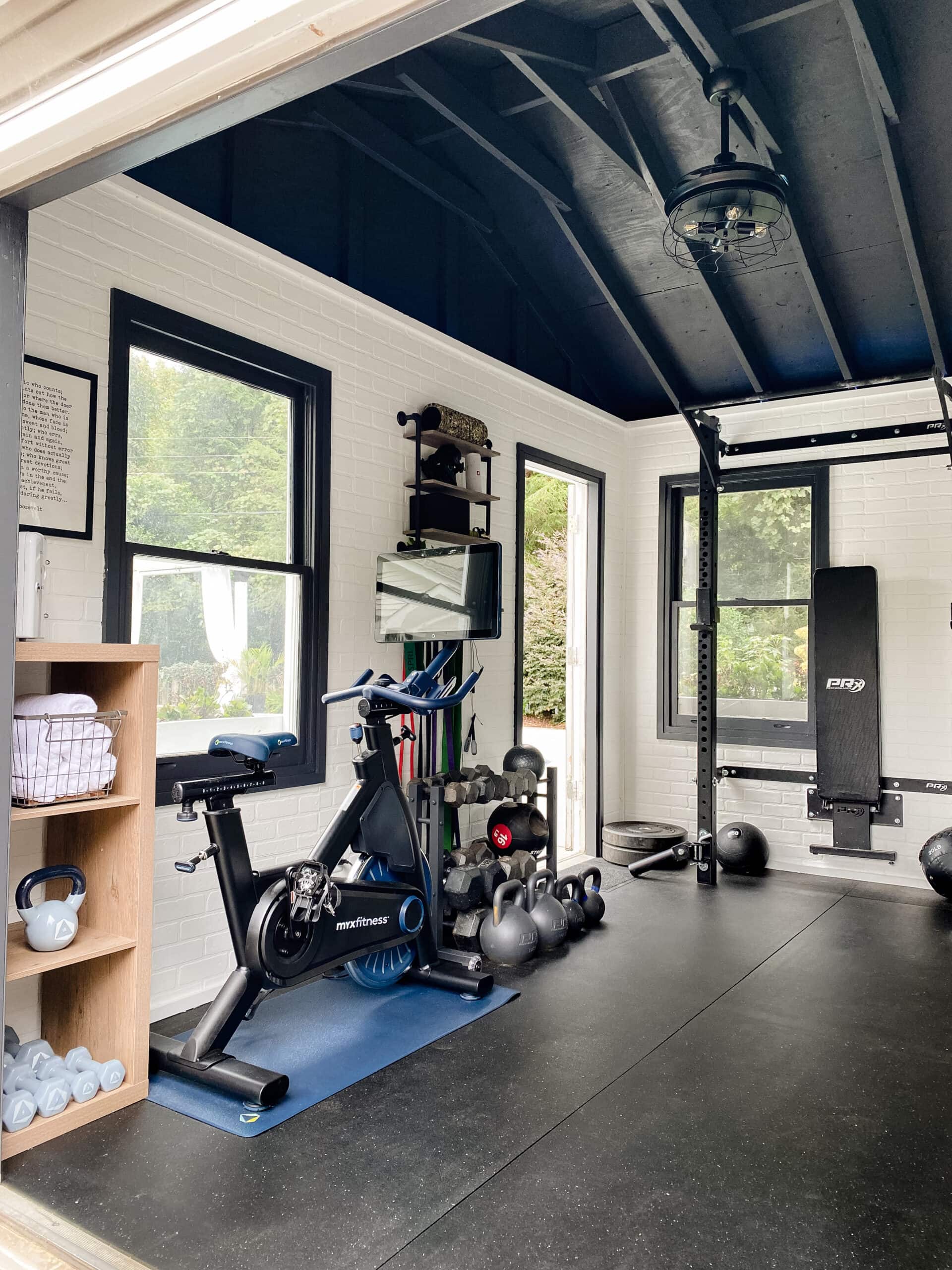
On the other side of the gym, we added much-needed storage like this cube shelf for holding gym rags, disinfesting wipes, and a mini fridge.
We added this wall shelf for hanging resistance bands and holding a Bluetooth speaker, clock, and handheld equipment.
The only piece of workout equipment we had to buy new was this MYX cardio bike.

Back Porch
Before and After


Paint Colors | Behr Ultra Pure White (trim and railings) | Benjamin Moore Palladian Blue (ceiling)
Back Porch Tutorials
- Our Back Porch Refresh
- Haint Blue Porch Ceiling Makeover
- Mantel Decor and Outdoor Faux Fireplace
- Floral Block DIY Outdoor Rug and How to Make a Stencil with Cricut
- 7 Ways to Repel Mosquitos from a Porch
- DIY Outdoor Curtains for Under $100
- How to Restore Wood Outdoor Furniture
Back Porch Sources
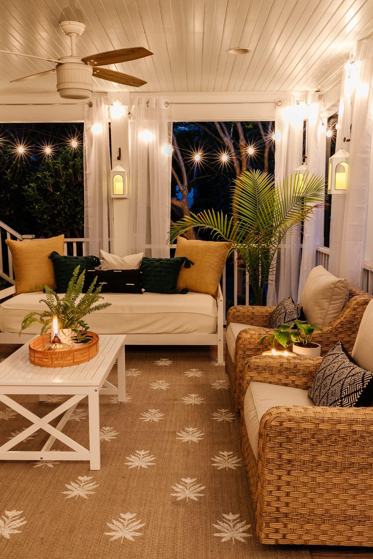
This back porch was one of the biggest buying factors for us when purchasing this house. It’s such a charming spot to gather with friends or sip coffee on a sunny, bright morning.
We painted the ceiling Benjamin Moore Palladian Blue, one of our favorite “haint blue” colors keeping in tradition with Southern porches (if you’ve ever been to Charleston or Savannah… you know what I’m talking about).
We added this comfy day bed and resin wicker conversation set last year, and I painted the plain outdoor rug with this floral block stencil pattern.
The string lights add a cozy glow in the evenings, and the mosquito net curtains help keep the bugs at bay in the warmer months.
Swimming Pool
Before and After


Swimming Pool Tutorials
- DIY Painted Concrete Pool Deck and Patio
- DIY Pergola Cabana
- The Best Better Homes and Gardens Patio Furniture
- How to Paint Vinyl Siding & Pool Shed Makeover
- Swimming Pool Liner Makeover
- Our Modular Outdoor Kitchen Built in a Day!
- How to Hang Outdoor String Lights Anywhere in a Backyard
- How to Clean Outdoor Cushions and Furniture
Swimming Pool Sources
Our backyard swimming pool has been a massive project, but doing lots of it ourselves one DIY project at a time has really paid off over the years.
We were able to replace the swimming pool liner, paint the vinyl shed, paint the concrete deck, and add a modular outdoor kitchen.


To add some poolside shade, we constructed this DIY pergola cabana and added outdoor sectional dining sets for doubling as lounge areas and patio dining.
Since the lighting in our backyard is limited, we added lots of string lights all over to enjoy especially in the summer months for night swims.


Backyard
Before and After


On the grassy side of the backyard, we removed LOTS of snaky overgrowth and bushes to provide more outdoor living space and room for the kids to run.
We built a fire pit with a surrounding pea gravel area for lounging and a DIY bocce ball court that can convert into a horseshoe pit.

Replacing the old rotting wood fence made a massive difference out here, and we placed a playground and trampoline in the side yard for the kids.
Backyard parties have gotten even more awesome out here over the years. It’s been SO much hard work, but we are so happy with how it has all come together.

If you need more info about any of the spaces in our home, you can see all of our room reveals here with breakdowns of decor sources, furnishings, and DIY tutorials.
We have no intention of moving anywhere any time soon (if ever) because we are so absolutely in love with this house, especially after all of the work we have poured into it. These before and after home tours always blow us away every year because it’s such a celebration of every exhausting step along the way.
The “afters” are still “progress” because I totally believe in allowing a home to grow and change along with us and our needs as the kids get older and our family evolves over time.
We’re still making plenty of messes, living in each moment, and embracing the non-picture-perfect days all the time over here. (Maybe this also calls for a “real life” messy home tour? It’s been a while since I did one of those, and I think it’s over due.)
There are still plenty of projects on the horizon at this house, at friends’/family members’ homes, and who knows where else.
No matter where life takes us, we are so excited about where the next 5 years take us, and we are so thankful for all of you who have been a part of this journey to get here.

The post 5 Year Before and After Home Tour appeared first on Bless'er House.
